|
|
| Image |
Comment |
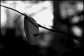
| 03/05/2006 10:50:57 PM | Last One Hangingby cfischlComment: *Critique Club*
Per your request, here is an in depth critique from the critique club. To me, the black and white treatment doesn't add anything to the photo. There are no textures that were enhanced, nothing for the lack of color to draw our eyes to and the overall photo seems too dark really.
The focus seems ok on the little leaf and the background is blurred nicely, but the dark areas of the background blend in too well with the dark coloring of the leaf, and kind of make the leaf have to compete for attention with the background.
Overall, the photo lacks interest. I'm not drawn into the photo and held there at all.
The shadow on the leaf is a distraction to me, unless you meant for that to be the main subject of the photo. Without much photographer's comments, it's hard to tell what your intentions were with this photograph.
The crop seems just a little too centered. I think I'd like for there to be a dramatic angle or something to add a bit of interest to the photo.
Maybe something to show us that he really is the last one hanging, or something to add to the story.
~Heather~
|  Photographer found comment helpful. Photographer found comment helpful. |
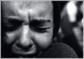
| 03/05/2006 08:34:01 PM | Anguishby bucketComment: *Critique Club*
The lack of comments on this one surprises me. Glad I get the opportunity to add my words here.
I looked at the photo, then read your comments. Without seeing the comments, it's hard to tell that we are looking at a girl in the embrace of another person. Not knowing this, makes the photo seem odd. It makes one question...why is the right (our left) side of her face chopped like that. Why is her shoulder up so high by her face? Those questions are answer by the comments. Thank you. However, for the photo to speak on it's own, I think maybe if we were to see a bit more of the scene, it would make a bit mroe sense to us. Back it up a bit and show a bit of the other person. I know I would personally like to see the whole mouth. There is much emotion there, and it's muted by the fact that it just dissapears off the edge of the photo.
You already know focus is softish. Bad lighting, handheld, once in a lifetime shot, you know what happened, and you know what could have made it better. No need to badger you about it.
The background works very well. Nothing distracting there. Blurred very nciely to keep the focus on the main subject.
I like the coloring of the photo as well. Nice tonal range and I think the choice you made enhances the feeling of sadness in the photo. Very good photo and editing for the challenge.
Overall, very emotional shot, good for the challenge, but I want to see just a bit more.
~Heather~ | | Photographer found comment helpful. |
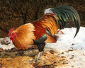
| 02/25/2006 04:05:37 PM | "John-Boy! Have you fed the chickens yet?"by sajinComment: *Critique Club*
This is a very well done photo. The focus and clarity are good. I love the details shown in the feathers and color. Very nice presentation of the rooster.
Lighting is also really good on the rooster, no distracting shadows or bright spots.
The couple things I notice that I think might have improved upon the shot are the division line in the background. it's almost right smack in the center of the photo, which to me doesn't create a good balance in the upper and lower halves. The lower half seems heavy to me.
Also, the crop. I might have liked to see a little more room in front of the rooster, or maybe back it up a bit or take it from a slightly angled position. Something to add a little tad bit of extra visual appeal to the already beautiful rooster.
The leaf 'coming out of the rooster's butt' is a little distracting since it is almost the same color as the rooster's feather's in that area and almost blends in there making a break in the rooster's form. I thin that leaf might be best cloned out.
Otherwise, excellent shot, lovely texture and detail. Beautiful animal. ~Heather~ | | Photographer found comment helpful. |
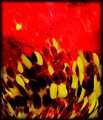
| 02/19/2006 02:38:05 PM | Hot Colorsby gwendyComment: *Critique Club*
This photo is very busy. Definately abstract, but not that attractive to me.
The colors don't seem like the pop as much as I would like them to. The red is nice and vibrant, but the yellow is just kind of dull. I think that if the yellows stood out more against the red, that it would help to add some visual appeal.
It's hard to critique the technical aspects of an abstract, especially with the lack of phtoographer's comments, I can really only offer my opinion since I don't know for sure what your intentions were with this photo.
If I were to guess, I think this would be a blown glass paperweight or something similar.
It's interesting, but just doesn't hold my attention long.
~Heather~ | | Photographer found comment helpful. |
| 02/19/2006 02:23:55 PM | Gold & Blueby GIS_boyComment: *Critique Club*
Without any photographer's comments on this, i can only offer my critique based on personal opinion alone, since I have no clue what you were trying to accomplish with this photo.
That being said, I think it's an interesting abstract. Someone suggested that it may be a cactus, but I don't see that. I see something metal here. Not sure what, but somethig metal.
The colors are neat, and the lines add something to the photo, but for me, it lacks something that really makes it pop. It's hard to give technical review on an abstract, but I see your focus is good, and the angle of the object isn't boring, but still lacking something for me. Overall, nice colors, focus and angle.
~Heather~
Edit to add that I saw your Alien Remnants photo and THAT one really stands out to me. I much prefer that one. I like the lines, the color and that one holds my interest much much more than this one does. More to look at, I think. Message edited by author 2006-02-19 14:26:04. | | Photographer found comment helpful. |
| 02/19/2006 02:17:58 PM | Cosmicby InnaNComment: *Critique Club*
How do you touch base on the technical aspects of an abstract? Tough one.
I will say that I love the color, the way that the slight variations of the color flow through the photo is nice, I like the background with the forground colors and I think the soft focus works really well to create an abstract feel.
Placement of the subject (curved line) is great. Not dead center, but off center works really well to create some visual appeal.
I think with abstracts, you gotta go mostly with visual appeal, and to me, this photo has just that. I really love the colors and the overall feel and flow of the image.
Not really much to add, due to your lack of photographer's comments, I am not really sure what you personally were going for, so I wouldn't be able to tell you if you succeeded in YOUR goal, but the image is appealing.
~Heather~ | | Photographer found comment helpful. |
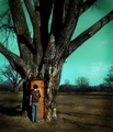
| 01/30/2006 01:09:45 AM | Portalby stare_at_the_sunComment: Love the image, don't love the color of the sky though. I'm sure it was meant to look like a fantasy type shot, but I'm just not a fan of the color. The rest is really neat though. Lovely Tree. | | Photographer found comment helpful. |
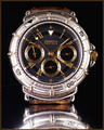
| 01/30/2006 12:45:36 AM | 5 minutes Leftby barndogComment: At first glance, I think you'll get hammered cause the 'subject' couldn't be more centered. For those that actually look at the photo though, i think they will see where you were going with it. I think most people will be looking at the watch as the subject, and therefor wont get the connection to the challenge, but it's nice out of the box thinking.
Focus is nice, and lighting is good as well, except for the white spot near bottom left. Lighting is a bit harsh righ there. Nice color, interesting watch. I do think though that the 'off center' is going to be too subtle. ~Heather~ | | Photographer found comment helpful. |
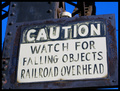
| 01/22/2006 10:47:27 PM | Photography may be hazardous to your healthby quiet_observationComment: it's a nice sign. The color looks a little off though. Not sure, but it just looks a bit TOO blue. Focus and clarity are nice, and nothing distracting. The subject doesn't have a high visual appeal to me personally, however, technically well done. | | Photographer found comment helpful. |
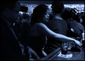
| 01/16/2006 02:46:34 AM | Le Bleu Nuitby pawdrixComment: This fits the challenge very well. Perfecly actually. While technically well done, I think the photo lacks a real interest. Looks like a photo of a girl picking up her cell phone? The lighting is more on her arm, which leads me right to her arm, and away from her face, which to me is way more interesting than her arm. I wish there were a bit more light on her face. So that I wouldn't be looking at the arm. The background is nicely blurred, and I like the lights in the bckground. The thing growing out of the guys head on the left is bothersome, if not down right hilarious. He looks like a rhino. lol. I like the blue tones. It gives the photo a point of interest, but unfortunately, it doesn't hold my attention long. Light on the face, not on the arm, would have changed this dramatically in my opinion.
~Heather~ | | Photographer found comment helpful. |
Home -
Challenges -
Community -
League -
Photos -
Cameras -
Lenses -
Learn -
Help -
Terms of Use -
Privacy -
Top ^
DPChallenge, and website content and design, Copyright © 2001-2025 Challenging Technologies, LLC.
All digital photo copyrights belong to the photographers and may not be used without permission.
Current Server Time: 04/01/2025 09:59:30 PM EDT.
|