| Image |
Comment |
| 04/27/2005 12:14:06 AM |
|
 Photographer found comment helpful. Photographer found comment helpful. |
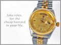
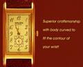
| 04/27/2005 12:01:41 AM |
Fake Rolexby alanfreedComment: I absolutley love this and its well done. I'd prefer a larger font with better placement. Capitalization would help too. Crisp shot and great comp. Very funny too. |
| Photographer found comment helpful. |
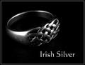
| 04/26/2005 11:57:20 PM |
Irish Silverby banmornComment: Fantastic comp and great font, I'd like to get more contrasr to show the ring off more. It should stand out. With a couple of revisions it would work. |
| Photographer found comment helpful. |
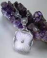
| 04/26/2005 11:52:20 PM |
Sales Event: Tropical Goldby khrysComment: This is a very crisp shot! I don't get what being sold here. the necklace should be more prominent. Text is very nice and well placed. |
| Photographer found comment helpful. |
| 04/26/2005 11:44:21 PM |
Gruenby graphicfunkComment: Very crisp and fantastic comp. Text is wordy and vague and also seems tilted. but the font and color are perfect. Nice match on the background color. Overall a very good job. |
| Photographer found comment helpful. |
| 04/26/2005 09:09:00 PM |
Smithsby justinbrookComment: Nice Job! Fantastic comp and Text Placement. Direct and to the point, no doubt what's being sold. Bottom font color needs to be darker (maybe both) and capiltalized.Good message. |
| Photographer found comment helpful. |
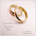
| 04/26/2005 09:05:13 PM |
Grandma's Atticby tfarrell23Comment: Crisp shot and great comp. Font should be fatter (is there a bold? or ad it after you save for web) I can't figure out what you're doing with address and why it is consistant. But I like this ad. |
| Photographer found comment helpful. |
| 04/26/2005 08:57:30 PM |
Skull Ringby pawdrixComment: Nice shot, nice font and shaodows. The comp needs to leave more room for text and the skull ring need to be sharper. |
| Photographer found comment helpful. |
| 04/26/2005 08:55:14 PM |
Visit Arizonaby justineComment: I love AZ! I can see details and the shot is very crisp. It is, however, very crowded and a little dark. The font need revision and needs to be more consistant to work in this composition. |
| Photographer found comment helpful. |
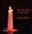
| 04/26/2005 08:40:23 PM |
Be the light...by ShamanComment: This has great composition,The DOF is great but I'm not sure what you're trying to sell. There needs to more focus and emphasis on the product. |
| Photographer found comment helpful. |
Home -
Challenges -
Community -
League -
Photos -
Cameras -
Lenses -
Learn -
Help -
Terms of Use -
Privacy -
Top ^
DPChallenge, and website content and design, Copyright © 2001-2025 Challenging Technologies, LLC.
All digital photo copyrights belong to the photographers and may not be used without permission.
Current Server Time: 04/19/2025 08:49:04 AM EDT.