| Author | Thread |
Comments Made During the Challenge  |
|
|
05/01/2005 11:39:19 PM |
| Super idea and exellent presentation. Could not be better. |
|
 Photographer found comment helpful. Photographer found comment helpful. |
|
|
05/01/2005 02:44:49 PM |
| Candle looks nice, but it's hard to see the detail in the jewelry. |
|
| Photographer found comment helpful. |
|
|
05/01/2005 12:02:12 AM |
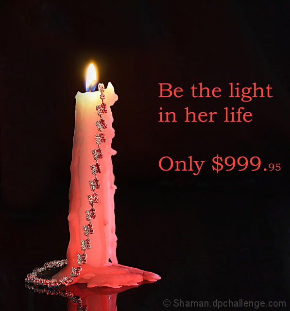
| That's quite expensive for a candle...*just kiddin* ;) Lighting is interesting and the reflection gives this shot something interesting, just wished there'd be a little bit more. Too bad we don't see the jewel that much. Text is too intrusive for my taste and the colour is a bit harsh for the candle's pinkish look. 6 |
|
| Photographer found comment helpful. |
|
|
04/30/2005 02:30:35 PM |
| Great concept and photo, my only complaint is the jewelry is too small and isn't the center of attention as it should be in a print ad |
|
| Photographer found comment helpful. |
|
|
04/30/2005 12:50:15 PM |
| Nice concept. Not a fan of the Red type. |
|
| Photographer found comment helpful. |
|
|
04/30/2005 09:19:31 AM |
|
| Photographer found comment helpful. |
|
|
04/30/2005 03:56:42 AM |
| very eyecatching and origunal 10 |
|
| Photographer found comment helpful. |
|
|
04/29/2005 07:58:28 PM |
| Technically very nice. Only here I think the text does not really add to the image... in a different smaller font, without the price, at the top corner might have gone better with the image. But the photograph in itself is excellent. |
|
| Photographer found comment helpful. |
|
|
04/28/2005 10:20:43 PM |
| Great use of the candle. Good choice of words for the image. |
|
| Photographer found comment helpful. |
|
|
04/28/2005 03:24:57 PM |
| nice sharp focusing. great job. |
|
| Photographer found comment helpful. |
|
|
04/28/2005 10:01:12 AM |
| Very, very, nice. Clean, crisp image. Well lit and composed. Good job. I might have selected a cursive type font perhaps, but that of course is subjective. Good luck. |
|
| Photographer found comment helpful. |
|
|
04/27/2005 05:18:34 PM |
| imo poor use of text. (font,color and placement) |
|
| Photographer found comment helpful. |
|
|
04/27/2005 02:24:24 PM |
| Not sure about the text but the photo is excellent.9 |
|
| Photographer found comment helpful. |
|
|
04/27/2005 11:52:40 AM |
| I know it' snot easy to shoot a candel and I think you did it very well! Personaly, I wish the fire was more elongated vertically. I think it would make the candle more powerful. Nice use of the black and the reflection. The text is big and annoying to me, but I'm difficult when it comes to the use of fonts. I wish we were not limited to 640 pixels because I'd love to see the detail on the jewel. ;-) Nice shot. Well done. |
|
| Photographer found comment helpful. |
|
|
04/26/2005 08:40:23 PM |
| This has great composition,The DOF is great but I'm not sure what you're trying to sell. There needs to more focus and emphasis on the product. |
|
| Photographer found comment helpful. |
|
|
04/26/2005 01:48:35 PM |
| Interesting idea. I like the composition and lighting. |
|
| Photographer found comment helpful. |
|
|
04/26/2005 12:58:41 PM |
|
| Photographer found comment helpful. |
|
|
04/25/2005 07:30:13 PM |
| Clever and creative presentation. Nice one. |
|
| Photographer found comment helpful. |
|
|
04/25/2005 06:31:37 PM |
Yikes!!!!
It may be just me, but that candle and eerie red glow is rather frightening. Otherwise, I think your concept is good, just fails to deliver the right feel. The image is sharp, detailed, and processed cleanly without artifactual distractions. Good luck. |
|
| Photographer found comment helpful. |
|
|
04/25/2005 05:24:28 PM |
Photographically very well done, with an exceptional control over teh lighting.
Text/font used here doesn't work well in my opinion. A simple, Italic font may have done better, but a good submission regardess. |
|
| Photographer found comment helpful. |
|
|
04/25/2005 04:02:41 PM |
| I really really like this photo Great title to fit the image as well. |
|
| Photographer found comment helpful. |
|
|
04/25/2005 03:10:22 PM |
| I smell smoke. Good shot. |
|
| Photographer found comment helpful. |
|
|
04/25/2005 12:13:03 PM |
| You have the candle wich is drawing attention away from the subject. Good thought but I think the candle needs to go. |
|
| Photographer found comment helpful. |
|
|
04/25/2005 10:35:45 AM |
Im not sure of the red stones hanging on a red candle? I like your layout.
Text is so so. |
|
| Photographer found comment helpful. |
|
|
04/25/2005 10:01:18 AM |
| Great idea, excellent way to get light close to the stone. Very nice |
|
| Photographer found comment helpful. |
|
|
04/25/2005 09:01:09 AM |
|
| Photographer found comment helpful. |
|
|
04/25/2005 02:13:28 AM |
| nice photo, but gems are not in focus. |
|
| Photographer found comment helpful. |
|
|
04/25/2005 01:58:29 AM |
| This is an instance where you should've left the text out or done something more understated and elegant. The shot is very nice though and a great concept with sharp detail. |
|
| Photographer found comment helpful. |
|
|
04/25/2005 12:46:17 AM |
| love everything EXCEPT the font color...9 |
|
| Photographer found comment helpful. |
|
|
04/25/2005 12:24:10 AM |
| I don't personally care for the red text with this shot, I think maybe white would have worked better, or maybe smaller text. |
|
| Photographer found comment helpful. |
Home -
Challenges -
Community -
League -
Photos -
Cameras -
Lenses -
Learn -
Help -
Terms of Use -
Privacy -
Top ^
DPChallenge, and website content and design, Copyright © 2001-2025 Challenging Technologies, LLC.
All digital photo copyrights belong to the photographers and may not be used without permission.
Current Server Time: 03/12/2025 02:40:23 PM EDT.