|
|
| Image |
Comment |
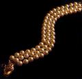
| 05/05/2005 01:10:47 PM | Pearldragonby marvinComment: Thank you for entering the DPChallenge, Jewelry Advertisment.
Great idea showing the pearl jewelry in a serpentine pattern. The overall design is very interesting. A piece of jewelry that will be notice by everyone. The tree rows of pearls on the subject draws the eye to the front and back of the jewelry.
I wonder if you could have fit the entire piece on the frame. The rear portion of the jewelry is out of sight. The head of the piece is a bit blurry, or out of focus.
The gold light bouncing off the pearls makes it attractive. However the overall tone of the image is dark. There seems to be area's in the photo that need some highlights, in order to show more details. There is also some grain/noise on the pearls themselves. This could be from an understated light source. Or even from the light shine projected on them. Wondering if you had re position the jewelry in the opposite direction, if it would have presented better. In other words, have the dragon head piece on the right side instead of the left side, as you have it now. This way it would view left to right. It would have given you a another lighting angle for your photo.
Like the title and the compositional idea's. A bit dark and noisey. Check your image output size to maximize the number of pixels for a better internet display.
Good luck on your next DPChallenge.
|  Photographer found comment helpful. Photographer found comment helpful. |
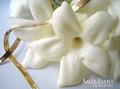
| 05/04/2005 09:49:56 PM | Sales Event: Tropical Goldby khrysComment: Thank you for entering the DPChallenge, Jewelry Advertisment.
It does look very tropical and elegant. The flowers you picked are beautiful and compliment your jewelry selection. The soft blue and white colors creates a soft and calming effect. It does take you somewhere warm and tropical, with a cool breeze coming through the window.
The flowers however seem to overwhelm the subject. They seem to cover and hide the necklace. It appears that the necklace is possibly too long for the display. Its seems to have no beginning or an end to it. If you are selling a product like jewelry, the entire product must be seen. You also get the inpression because of the placement of the elements that this ad is selling flowers or jewelry. A confusion is created and there by some distraction. This very unfortunate, since this is a potentially a very beautiful display.
Technically your shot is sharp and well presented. Your close up of the subject is very good. Your composition is well thought out. I like your font choice. Its the type you see in your newspaper and magazine ads. You do come away feeling that the jewelry was struggling with the flowers for attention.
Overall a good job. Work on your subject presentation emphasis.
Good luck in your next DPChallenge. | | Photographer found comment helpful. |
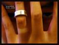
| 05/04/2005 09:29:02 PM | Fidelityby ergoComment: Thank you for entering your photo to the DPChallenge, Jewelry Advertisment.
Very interesting take on the photo challenge. From the title and the subject, it is striking and imaginative. There is a strong message here. The ring, the price, and those haunting eyes in the background. All of those play well to an viewing audience. It is also a very subtle but strong message about trust and relationships. The price posted is also another message. I guess its, you can't put a price on trust, even if its a frugal one.
Technically, there are few things wrong. The lighting and the focus need to be reexamined. There is some pixelation on the image. The finger on the far left is very out of focus. The finger on the far right has a "purple" tint to it.
I like the tan spot on the ring finger. It shows that the ring hardly ever comes off, which adds very strongly to the message of the photo. The overall tone of the photo is reddish. It warm and mellow but it seems to blend in too much with all of the elements of the image. The text on the photo is too small. A larger typeface, would have made it more appealing, and less distracting. Its almost like you have to strain to read it. You could have placed the text on the bottom, toward the middle of the frame. That way the ring would be the first thing seen, and then the text would follow.
Overall it appears that you had some lighting issues. I see that you used ISO 800. I am not sure if you use a flash, or other lighting resources. But the reddish tone and cast takes away from a great idea.
Also I'm still not sure of the eyes, they look angry and scary. This might turn some voters off.
Great idea's, you need to work on the lighting, and create a softer approach.
Good luck in your next DPChallenge.
| | Photographer found comment helpful. |
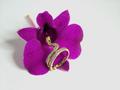
| 05/04/2005 03:31:27 PM | "Wild Thing"by HeavyComment: Thank you for submitting your photo to the DPChallenge, Jewelry Advertisment.
A beautiful and elegant shot of your subject. This photo shows an well composed and appealing piece of jewelry. Almost choregraphed and coordinating with a natural flower. Your choice of the flower color compliments the gold tones of your jewelry ring. The ring placement is also commendable. It hits the viewer straight away. The factor here is that the flower is not too big, as to overpower the ring. You selected a perfect size to make your subject stand out. It leaves no doubt what your intent is.
Creating a metaphor in your title, between the flower and ring was very smart. Again a good balance of colors between the subject and the secondary elements.
Technically you have a great capture. The ony thing that might bother folks voting is the softness and the shadows on the flower. The ring focal point appears well done, The flower generates a softness or slight blurriness. Another area to compliment you on is the framing. Well done, placing the subjects in the center of the frame. You seem to almost give space to the flower shadows when you cropped the photo.
Great job, simple and elegant.
Good luck in your next DPChallenge.
| | Photographer found comment helpful. |
| 05/04/2005 03:13:34 PM | Graceby gudbjargarsonComment: Thank you for submitting your photo the DPChallenge, Jewelry Advertisement.
A good capture of two rings or two earrings. Good use of the frame and negative space. The background in black works in many ways, for and against you. The placing of the jewelry on the glass is a good touch. Mounting the jewelry on each other is a classic retail store type of display. The image does show it self in a mysterious way. Dark, moody, and ambiquous.
The jewelry does not show its natural beauty. The diamonds are visable but the stones are too dark. The shot is hindered by its lack of detail. The dark shadows and lighting are masking the subject of this shot. It also looks like the jewelry has been placed on a glass table, good idea, but the mirror reflections are coming up too dark again.
It looks like your light source is only coming from one side of the frame. The oppposite side, or left side of the frame, as you look at it, is underexposed. This makes the subject a bit unappealing, with lighting preference only on one side.
The reason I said earings or finger rings, is because you can't really tell right off. The rear portion of the jewelry is too dark to exact details.
Technically I see that you used ISO 800. And, of course the higher the ISO the more noise, or grain you will get.
I am assuming that you shot without a flash. Yeah, sometimes jewelry shots, tend to be too bright off the flash lighting. This is one of the hardest shots to do, without making the jewelry appear too shiny.
Great composition idea's. Good use of frame space. Work on your lighting.
Good luck in your next DPChallenge. | | Photographer found comment helpful. |
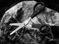
| 05/03/2005 03:28:08 PM | This one's for you, shutterphunkby zenelfComment: Thank you for submitting your photo to the Rock, Paper, Scissors,
DPChallenge.
Very interesting concept that you present here. For the Rock, Paper, Scissors challenge. The scissors, and I am assuming are a few, are up and ready to work on the paper material in the background. One of the scissors is ahead of the others, pointing straight up. Which is a nice effect. It draws the eye to the upper/center of the image.
The design you chose is very geometrical. You have circles, squares, rectangles. The color choices work well together. The background red and gold compliments the color material of the iron/metal scissors in some ways. The viewers eye is immediatley drawn to the elements on the right hand side of your photo.
Technically, the photo does not have too much appeal. Its one of those compositions where it is hard to relate to. Also nameing or titling your photo with a unrelated name makes it hard for voters to relate to it. The color of the scissors are good and work, but some detail is lost. The blades are clashing with the background just a little. But as I already said, its a good combination. Perhaps if the lighting were more favorable to the scissors. There appears to be some harsh lighting coming in just behind the scissors, giving it a lighter glow. Also the scissors, being the main focal point need to stand out more. The scissors points that are on the far left are blurred.
I know that you mentioned that you used a point and shoot camera. And that the lighting was tungsten. But, there many workarounds shooting situations like this one. One is to dim the tungsten lights and add other type of lighting on the subject. The other is to use natural light sources. So you had to experiment with it for while before success shows up.
Great ideas and composition. You did a good job with your camera resources.
Good luck in your next DPChallenge.
| | Photographer found comment helpful. |
| 05/03/2005 01:38:42 AM | Scissors Cuts Rock... On Paperby dahvedComment: Thank you for submitting your photo to the DPChallenge, Rock, Paper, Scissors.
An interesting concept and capture. The idea is a good one. Literally making the words of the title work for you. You show great detail. You have focus on the middle of the frame to relay your message. Somehow, the physical aspect of your action, is not really visible. The scissors cutting, or piercing the rock is not happening. The idea is good the exacution falls a bit short.
I like the black and white conversion. It adds to the drama of the scissors concept. The way the scissors are open to cut helps translate the title back to the viewer. Again, there is no contact with the rock.
Actually the rock looks realistic. If you had not mention it was a printed picture it could almost pass as real. Good one.
Technically there is some harsh lighting on the upper left of the frame. As well as in the upper right hand side. The center of the scissors also looks overdone. I see that you shot this on "Auto" setting. Yeah, sometimes if you have the option on your camera, "Auto" is not the best. It gets trick out with certain room type lighting. Actually it gets confused especially with incandescent lighting. I am not sure if your camera has other settings other than "Auto". But, if it did you could experient with different camera settings.
The scissors also looks suspended somehow in the air. But to your credit, you can't see the glue on or stick on surface on the scissors.
Great idea and concept.
Good luck in your next DPChallenge.
| | Photographer found comment helpful. |
| 05/02/2005 11:03:21 PM | Rasheedby pawdrixComment: Thank you for submitting your photo to DPChallenge, Free Study VIII.
It's a great capture of a man trying to play two wind intruments at the same time. Street musicians are very interesting people. Very talented souls that play their hearts out. Most people are just mildly amused by their skill and talents. It also appears that he has another band member that plays a keyboard or he also doubles as a keyboard player. Now, that I like to see. He is really a one man band.
I like what you tried to do here. Cropping the photo to showcase only the musician. In street photography it is very difficult to isolate a subject. Often times there are many distracting elements in the way. A man that plays two trumphets is very unique in itself. Trying to frame it just right is near impossible in the streets. I am familiar with NYC, so I am guessing this is in Manhattan, near the West Village?
The overall tone is very good. He and the color cast makes it look very retro. Almost like the 1940's era. Even his clothing fits the sepia tone range you selected.
Anyway well done. You have manage to make a diamond out of the rough. The narrow framing is difficult for some viewers. But the subject should have won you over some winners.
Good luck in your next DPChallenge. | | Photographer found comment helpful. |
| 05/02/2005 06:06:53 PM | Mirror Imageby DamianComment: Thank you for submitting your photo to the DPChallenge, Free Study VIII.
Good landscape capture. The reflections are very interesting. The colors and lighting paint a serene mood. The softness in the image also gives it a dreamlike appeal. I am sure that the photo was not intended as angle shot, but the reflections give it a left to right dominance.
It appears to be a bit over processed. The lighting in the background reaches the foreground toward the middle of the frame. The sky in this image has no real color. It is very neutral and bland. I like the reflections in the water a lot. It's not often that you find this type of dominating shadow cast in landscapes.
Technically, it is well done. If you were after a soft dreamlike imagery. This type of photo creates a lot of reactions. You certainly are willing to put it on the line.
Good luck on your next DPChallenge.
| | Photographer found comment helpful. |
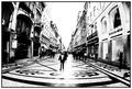
| 05/02/2005 03:59:41 PM | Downtownby DiscraftComment: Thank you for submiting your photo to the DPC, Free Study VIII.
Very interesting perspective and capture here. It shows a day in a life of a retail area. Full of people and stores all around. It is intriguing as well that everything seems to be in order. The way you photographed it, it appears that everything fell into place on cue. The way the man in front is position, and the rest of the objects and elements. The ground has an interesting display as well. Is this a paved street with painting on it?
Your use of black and white is perfect. Giving the image a feel and mood of time and space. The use of an "Fisheye" lens also helped capture the breath of the area. I am assuming its a "Fisheye" lens, because of the f 2.8 aperture opening. Wide angle lens also provide a distortion similar to "Fisheye" lens. I would also guess that a wide angle about 12-24 lens would have also capture the width of the area, as shown here.
Technically speaking, the same thing that makes this image appealing is the same thing that distracts from it. The white balance area's hide details of the photo. The horizon is a white wash eye point. The light that is coming from the background is also hiding the foreground area.
It is very artistic and will generate lots of interest, as long as people take the time to study your composition.
Good luck in your next DPChallenge. | | Photographer found comment helpful. |
Home -
Challenges -
Community -
League -
Photos -
Cameras -
Lenses -
Learn -
Help -
Terms of Use -
Privacy -
Top ^
DPChallenge, and website content and design, Copyright © 2001-2025 Challenging Technologies, LLC.
All digital photo copyrights belong to the photographers and may not be used without permission.
Current Server Time: 04/15/2025 07:25:16 PM EDT.
|