| Image |
Comment |
| 04/14/2005 07:01:46 PM |
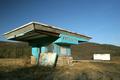
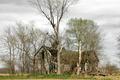
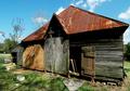
A Dead American Treasure, the ROXY Drive-Inby ClickNSeeComment: I like this image and I don't like this image. I think it is okay as shot a 6. But, if you had changed the perspective just a little bit, maybe gotten lower to the ground so the roof of the building 'soared' over the mountain in the back, I probably would have given it an 8 or better. I tried tilting my monitor for that effect but it didn't work. ;) Maybe outside of challenge you can clone out the white thing. That would make this image pop even more. As it is, good work.
______________________________________
Me again! I have finished scoring all the entries and have adjusted my scores. Now I'm adjusting your in spite of the fact that you didn't like my opinion. Ha! But thanks for calling me young. :) Your image is better than the ones I've rated a 7. I am bumping you up to an 8. I would still give you 2 more points for a lower point of view! |
 Photographer found comment helpful. Photographer found comment helpful. |
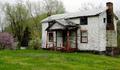
| 04/14/2005 06:58:23 PM |
Abandoned Houseby SJCarterComment: great house! Can't believe the red paint still shines through. The image seems a little oversharpened but other than that, pretty good! |
| Photographer found comment helpful. |
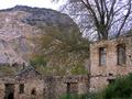
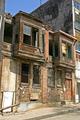
| 04/14/2005 04:22:29 PM |
Abandoned to the Arrow of Timeby PascalComment: beautiful building. Wish we had ones like it here! I like the different textures you've captured. There is a lot going on in this image. Maybe make something specific the focus of the image such as either the small building or the large building. With so much going on, its kind of hard to find a place to rest your eyes and enjoy the view - you might miss something! |
| Photographer found comment helpful. |
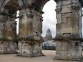
| 04/14/2005 04:14:02 PM |
2000 years unusedby rhipsterComment: Beautiful shot. Like the way you framed the church in the background. I wish you had been able to capture the entire arch in the frame. |
| Photographer found comment helpful. |
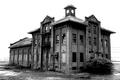
| 04/14/2005 04:12:22 PM |
Buzzard Mansionby sofapezComment: Love birds. Even buzzards. Pretty neat image. My only suggestion is that you might want to crop a little more on the left to pull the tree out of the middle of the shot. Where it is now effectively cuts the image in two. I thinking pulling the image to the left would greatly enhance the image. No one would notice if a couple of trees were gone. :) |
| Photographer found comment helpful. |
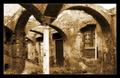
| 04/14/2005 02:36:07 PM |
luxury archs ruinsby opreanComment: wow. ery unique image. That column supports a lot of weight - glad you included it! I think the softness of the focus enhances the image - works with the shadowing and color tones. Also think duotone here works. Only thing here, and not necessarily best choice as I don't know conditions at the location - maybe capturing a bit further back with entire column would have improved. Without seeing that, I can't say if it would improve or not. 7 |
| Photographer found comment helpful. |
| 04/14/2005 02:33:08 PM |
Port of Portlandby MickComment: love the starkness. beautiful building. 7 bumping up to 8. I keep wanting to come back and comment, which I've already done, so its got to be the image drawing me back. :) |
| Photographer found comment helpful. |
| 04/14/2005 02:32:12 PM |
|
| Photographer found comment helpful. |
| 04/14/2005 02:25:25 PM |
|
| Photographer found comment helpful. |
| 04/14/2005 01:53:47 PM |
The Cows Went Homeby Melly8522Comment: creepy place. I hate spider webs! If this image was a little lighter, allowing the details to come out, the score would probably go up. the back wall has excellent detail that almost shines through. |
| Photographer found comment helpful. |
Home -
Challenges -
Community -
League -
Photos -
Cameras -
Lenses -
Learn -
Help -
Terms of Use -
Privacy -
Top ^
DPChallenge, and website content and design, Copyright © 2001-2025 Challenging Technologies, LLC.
All digital photo copyrights belong to the photographers and may not be used without permission.
Current Server Time: 04/21/2025 06:37:00 AM EDT.