| Image |
Comment |
| 04/26/2005 01:56:53 AM |
|
 Photographer found comment helpful. Photographer found comment helpful. |
| 04/26/2005 01:49:15 AM |
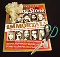
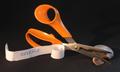
Cuttingby StructorComment: More highlights on the scizzors please (LOL)... Very good overall. Imaginative layout, nicely lit. The scizzors up on the far side of the bag above the black rock would be fine, and would draw more equal attention. |
| Photographer found comment helpful. |
| 04/26/2005 01:44:25 AM |
|
| Photographer found comment helpful. |
| 04/26/2005 01:42:51 AM |
Paper Dolls & Origamiby MrAnalogyComment: How cute.... nice even lighting. The scizzors look awkward to me, maybe just laid down woulda filled the area and given more emphasis (sp sorry) on the hero. Just my opinion... |
| Photographer found comment helpful. |
| 04/26/2005 01:29:21 AM |
Untitledby cwyouComment: I always have a hard time with images that (I feel) are unnecessarily overly sharp, so I won't hold that against you. This is a good composition idea. If you were to reshoot it: for an ad shot, one less pair of scizzors (the red ones on their side partically hidden) would have made the shot cleaner. |
| Photographer found comment helpful. |
| 04/26/2005 01:21:36 AM |
|
| Photographer found comment helpful. |
| 04/26/2005 01:20:52 AM |
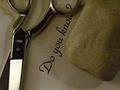
Rock, Rock Paper, Scissorsby neophyteComment: The composition is balenced. Interesting layout choice. I would be happier veiwing it if the focus was more toward the center of the magazine than on the scizzors. Eventhough the headline was not suposedly the focus (subject) of your image, my eyes always want to read the headlines. It also allows the rock and the scizzors to get equal focus. |
| Photographer found comment helpful. |
| 04/26/2005 01:09:42 AM |
Do you Know?by HaimaiComment: Nice composition. Interesting, somewhat symetrical. As my 2 cents worth; a little more contrast between the paper and the forground objects. |
| Photographer found comment helpful. |
| 04/26/2005 01:03:28 AM |
First Paperby glk5406Comment: To bad a shaft of natural light couldn't have mysteriously appearred to help you highlight the bark a little more. A nice reminder. |
| Photographer found comment helpful. |
| 04/26/2005 12:59:38 AM |
REVENGE!!!by barbaraanneComment: If the light were more even across the scizzors with highlights on the scizzor's flat edge (i don't want much) it would be a stronger image. Interesting composition. |
| Photographer found comment helpful. |
Home -
Challenges -
Community -
League -
Photos -
Cameras -
Lenses -
Learn -
Help -
Terms of Use -
Privacy -
Top ^
DPChallenge, and website content and design, Copyright © 2001-2025 Challenging Technologies, LLC.
All digital photo copyrights belong to the photographers and may not be used without permission.
Current Server Time: 04/10/2025 08:10:02 AM EDT.