| Image |
Comment |
| 01/21/2004 09:55:13 AM |
Overhauling Historyby mbardeenComment: I really like this photo. The one thing I'd like to see different, and this is getting a little picky, is having the guys on both sides of the frame. I think it would be a little more balanced of a picture. This is really good the way it is, but in my eyes, it's what makes the 9 become a 10. Nice work at any rate. |
 Photographer found comment helpful. Photographer found comment helpful. |
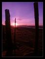
| 01/21/2004 09:50:16 AM |
Getawayby roy204Comment: Great colors. I like the sky colors but am a little disappointed that the foreground details were discarded at their expense. It is a nice shot still, just looks like you could've used a neutral density filter to darken the sky and but keep more of the foreground details. The sand patterns if more visible would really add some life to the bottom of this photo. |
| Photographer found comment helpful. |
| 01/21/2004 09:45:10 AM |
|
| Photographer found comment helpful. |
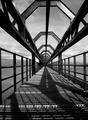
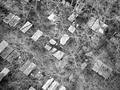
| 01/21/2004 06:43:21 AM |
Geometry by kuarkComment: Congrats! I have mixed feelings about the new guys getting ribbons. On the one hand its good to see new people winning. On the other hand, there were already enough good people to compete with before you guys got here. Just kidding. Good find and good shot. |
| Photographer found comment helpful. |
| 01/20/2004 10:52:12 AM |
Carouselby rad_pirateComment: Well taken photo! Good framing, nice and clean, excellent color. Interesting subject, though not one I normally care for. You did well with this one though. These horses have been subjects of a few pictures on DPC. I think I like this one better than the others. |
| Photographer found comment helpful. |
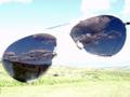
| 01/20/2004 09:41:52 AM |
Cheap sunglassesby kernalklikComment: This is a neat shot. I'm not sure how it fits into the technical scheme of things. I guess I don't care either. This is a pretty cool technique with the glasses. From the thumbnail all I could think of was "blowout city" but now that I see the image, I get it. Good shot and a great idea. |
| Photographer found comment helpful. |
| 01/20/2004 09:33:02 AM |
Points of Viewby mhamiltonComment: I think with just a little less exposure you might have been able to show more of the texture of the icicles. I think its a good shot for this challenge. |
| Photographer found comment helpful. |
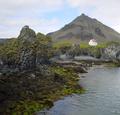
| 01/20/2004 08:10:38 AM |
Mysterious lonleynessby asijComment: Excellent framing and perfect exposure. Nice scenery and good textures shown on the stuff nearest the camera. Good work 8 |
| Photographer found comment helpful. |
| 01/20/2004 08:08:19 AM |
|
| Photographer found comment helpful. |
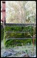
| 01/20/2004 08:06:44 AM |
Mossy Stepsby GeneralEComment: Botton of the photo is exposed pretty well. Top of the photo is blown out. Personally I'd have left the bottom a bit darker and made the top just a little bit brighter than normal. I feel that the top here is substantially more exposed than "normal" |
| Photographer found comment helpful. |
Home -
Challenges -
Community -
League -
Photos -
Cameras -
Lenses -
Learn -
Help -
Terms of Use -
Privacy -
Top ^
DPChallenge, and website content and design, Copyright © 2001-2025 Challenging Technologies, LLC.
All digital photo copyrights belong to the photographers and may not be used without permission.
Current Server Time: 04/22/2025 03:10:43 PM EDT.