| Image |
Comment |
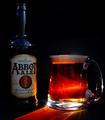
| 07/03/2003 05:01:08 AM |
Beer!by pinbackComment: I'll drink to that!! The backlighting is very very nice. Well done |
 Photographer found comment helpful. Photographer found comment helpful. |
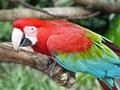
| 07/03/2003 05:00:34 AM |
Bird - The Scarlet Macawby xertionComment: Good subject. Good colors. I think you could've saturated them a little more and still maintained this quality. Nice pic |
| Photographer found comment helpful. |
| 07/03/2003 04:46:18 AM |
Hmmm ... tasty?by ursulaComment: Good subject good lighting, well taken. I like the picture better than most so far |
| Photographer found comment helpful. |
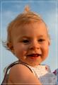
| 07/03/2003 04:42:55 AM |
baby blue skyby shutterflyComment: Harsh shadows on a baby's face generally aren't a good thing. I think a little fill flash would've done the trick on this pic, considering it wasn't way too bright. |
| Photographer found comment helpful. |
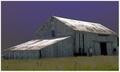
| 07/02/2003 05:06:02 AM |
Barnby rickhd13Comment: I like the framing of this barn. I'm not sure what has happened to the sky but it looks very unnatural. |
| Photographer found comment helpful. |
| 07/02/2003 05:03:17 AM |
B is for Butterflyby agwrightComment: Don't like the border. Not a particularly good choice of border esp for this photo as it is crowding the left antenna. It should have sufficient breathing room except for the border. I hate marking down for them, but this one has gone too far. |
| Photographer found comment helpful. |
| 07/02/2003 05:01:31 AM |
Bee at Workby ChiquiComment: Hate the border. Its dominating an otherwise good pic. I don't normally mark down for borders, but I think this one is distracting enough to make me knock it down a point. Sorry but I think no border on this picture would've been the best thing. |
| Photographer found comment helpful. |
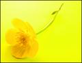
| 07/02/2003 04:59:20 AM |
Buttercupby marboComment: The super monotone. Could someone turn this down? It's awful bright. Flower looks really fake. I'm not crazy about the angle this was taken at either. |
| Photographer found comment helpful. |
| 07/02/2003 04:57:16 AM |
|
| Photographer found comment helpful. |
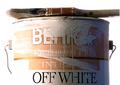
| 07/02/2003 04:54:51 AM |
Behr Paintby ChrisW123Comment: Looks like an advertisement more than anything. Not a bad picture though. I like how the word white is really dark. Good irony. |
| Photographer found comment helpful. |
Home -
Challenges -
Community -
League -
Photos -
Cameras -
Lenses -
Learn -
Help -
Terms of Use -
Privacy -
Top ^
DPChallenge, and website content and design, Copyright © 2001-2025 Challenging Technologies, LLC.
All digital photo copyrights belong to the photographers and may not be used without permission.
Current Server Time: 04/24/2025 03:37:37 AM EDT.