DPChallenge: A Digital Photography Contest You are not logged in. (log in or register
 
Browse Settings
Currently viewing:
Registered Userrjkstesch

Show comments:

Per page:

Order:

Comments:


Comments Made by rjkstesch
Pages:   ... [58] [59] [60] [61] [62] [63] [64] ... [78]
Showing 601 - 610 of ~774
Image Comment
Is anyone watching?
12/03/2005 02:03:36 PM
Is anyone watching?
by ladpupmoe

Comment:
Greetings from the Critique Club.

This is a fun, unique image that meets the challenge well and does it with humor. You've paid attention to some details that really added to the image. The doggy cards, the color choices and the hat all work well together. Your lighting and angle of shot kept this from being an outstanding piece, instead of a solid snapshot.

Technical Quality: Youv'e got a good focus that allows the viewer to see the cards and the eyes of your "cheater." Your dog has a small catchlight in his/her eye, but more would have helped. Your black background helps keep the viewer's attention clearly on the action. The foreground tile clearly ties the scene to a floor, yet the colors work well with the overall feel. Perhaps, cloning out the tile seams would place the attention back on the main action.

The lighting is mostly flat, but there is a strong shadow on the dog's face. It looks like this is an in-camera flash shot. Getting your flash off camera and on an angle might help. Also, bouncing the flash and/or adding a reflector on the opposite side would add to the lighting effect.

Composition: The composition is clear with little/nothing to distract the eye. It feels visually balanced with elements of equal visual weight in top and bottom. The angle of the shot feels high, as though we are looking down on the shot instead of being involved in it. An even lower shooting angle might have helped. I also feel that the crop may have been too tight. The areas of most interest (dog's eyes and cards) are forced off of the 1/3 lines by the crop and is pushing my eyes out of the shot too. The angle of the cards helps create a leading line to the dog's face.

Emotional Appeal: You have used humor to set your image apart. From the comments received, you've appealed to the viewers even though you chose a well used idea (cards up the sleeve) which caused other photographers difficulty. Your dog's expression is fun and you've even caught a very decent "poker face."

Overall impressions: You've got a strong image that needed different lighting in order to give it a WOW. I've loved the idea, execution of the idea, and the opportunity to study your shot. You've got many outstanding images in your portfolio, especially those where the lighting is working with you.

I've enjoyed the chance to share my thoughts and ideas. I hope they provide some help.

Photographer found comment helpful.
The Way We Were
12/02/2005 02:37:05 AM
The Way We Were
by Herblacklist12

Comment:
Greetings from the Critique Club!

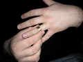
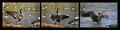
First Impression: As I look at the photo and title, I see a man taking off/playing with/putting on his wedding band. The title leads me to believe he's taking off the band as an ending to the marriage. The hands stand out and the ring is definately the point of focus. There is a strong emotion that comes across in this shot.

Technical Quality: The image is sharp and in focus. Details of the hands and wrists are clear, while the jeans show slightly giving a sense of the body behind the hands. The lighting is not working in this shot. It comes across as flat and too direct on the hands as noted by the comments received. The commenters have given some good suggestions for improving the lighting. It also created an unappealing reflection on the ring. The colors are true to the skin tones and leave no color casts.

Composition: You've created a strong diagnol on the left side of your photo that works quite well, but stops on the right side. The fingers create leading lines that take the eye right to the ring. A crop which placed the ring on the right 1/3 line (cropping out the major part of the ring hand and wrist)probably would have created a stronger, more pleasing image. The thumb tends to draw the eye away from the image and would look better folded down. As noted in the comments, the jeans in the lower corner don't add to this image.

Emotional Appeal: You concept is very interesting. There is a pathos and sadness that comes in looking at the image and the heartbreak it implies.

Meeting the Challenge: When voting on your image, I had the feeling that I didn't know if you were putting the ring on after cheating or taking it off to cheat. I wanted something more in the image to let me know. A small amount of motion blur at the finger tips or tension on the skin at the knuckle might have given that feel. When I look at the title, it takes me away from the "Cheating" theme and gives more of a feel of break-up which takes away from meeting the challenge. Perhaps a title with a theme such as "Time to Face His Wife" or "Good, There's No Mark" may have given stronger direction on your take.

Overall impressions: I really liked the idea and wanted more from your image. You were original in your concept and pushed the idea of cheating into moral grounds. I think your image could be even stronger with a different crop and lighting. I'd like to see what this image would look like in black and white, since the color is not an important element of the image, yet the blackness surrounding the hands is important to the emotion.

In looking at your portfolio, I see some strong graphic elements in your strongest images. This image also has the potential for a strong graphic look. You may wish to consider taking it that direction.

I look forward to seeing your future work.

Photographer found comment helpful.
Touch Down
11/17/2005 11:47:02 PM
Touch Down
by samanwar

Comment:
Wonderful captures, well put together. The peach in the border does not add, however.
Photographer found comment helpful.
Fountains Abbey - A World Heritage Site
11/17/2005 11:44:45 PM
Fountains Abbey - A World Heritage Site
by p2jvr

Comment:
Each of these images are wonderful apart. They don't blend together as well as each works apart, IMO.
Photographer found comment helpful.
Once Upon A Bird
11/17/2005 11:38:51 PM
Once Upon A Bird
by Younger

Comment:
Wow - beautiful detail and sense of lightness. Even your shadows in the borders supports the feel.
Photographer found comment helpful.
Let's Play Some Ball
11/17/2005 11:36:54 PM
Let's Play Some Ball
by Marc923

Comment:
Those balls are too clean - they need some use. LOL Good use of close up while clearly portraying the theme.
Photographer found comment helpful.
Coastal
11/17/2005 11:35:33 PM
Coastal
by cheekymunky

Comment:
Nice set of images - they work well together.
Photographer found comment helpful.
Come To My Window
11/17/2005 11:34:39 PM
Come To My Window
by Balko

Comment:
Beautiful tones and values. I see the full range. Works well as a triptych.
Photographer found comment helpful.
Colorado
11/17/2005 11:33:40 PM
Colorado
by sabphoto

Comment:
Each frame is very nice separately. I really like the lines of the mountains. Small areas of distraction are the green tag in the left frame when everything else is sepia and the hind end of the sheep in the right frame. Overall it's a nice set.
Photographer found comment helpful.
Canadian Slideshow
11/17/2005 11:30:52 PM
Canadian Slideshow
by Katmystiry

Comment:
I like the movement and posturing of this grand goose. Your goose in the right corner of each frame distracts me a bit - I find I want it complete. You've caught the light just right on the goose on the left two frames.
Photographer found comment helpful.
Pages:   ... [58] [59] [60] [61] [62] [63] [64] ... [78]
Showing 601 - 610 of ~774


Home - Challenges - Community - League - Photos - Cameras - Lenses - Learn - Help - Terms of Use - Privacy - Top ^
DPChallenge, and website content and design, Copyright © 2001-2025 Challenging Technologies, LLC.
All digital photo copyrights belong to the photographers and may not be used without permission.
Current Server Time: 04/18/2025 12:57:19 AM EDT.