|
|
|
Showing 3771 - 3780 of ~4217 |
| Image |
Comment |
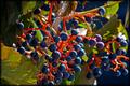
| 10/09/2005 07:46:11 AM | Born in the purpleby holidayComment: 8 - Very nice. Good coloring. Criticism; not much, perhaps more detail on the foremost violet, little less fabric right fore, not sure. Nice lighting. Not sure on the frame. |  Photographer found comment helpful. Photographer found comment helpful. |
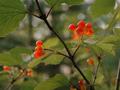
| 10/09/2005 07:24:02 AM | Small red against greenby HoddssonComment: 7 - Nice landscape texture/terrain capture. Criticism; especially for the Challenge I would like to have seen a sharper angle incorporating the red shrub more. | | Photographer found comment helpful. |
| 10/09/2005 07:21:49 AM | Fresh Fruitby kaylaComment: 8 - Wow, very nice colors and yes very complementary. Criticism; water is detracting from the potential in my opinion. I would also like to have seen either closer or a tighter crop, eliminating the green/leaves and gaining a real focus on the colors. | | Photographer found comment helpful. |
| 10/09/2005 07:06:45 AM | pelargoniumby KarisMoComment: 6 - Nice, good potential. Criticism; too close, or else need a more 'macro' if possible. I like the red background (difficult to match reds up), in this, green would have been nice too in my opinion but I like the effect you have gone for here, but think it has more potential, possibly with a different angle and use or elimination of shadow, etc. Extra points for correct name and spelling, but would like to have seen it capitalized - as a title. | | Photographer found comment helpful. |
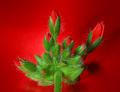
| 10/09/2005 07:05:20 AM | Golden Girlsby BalkoComment: 7 - Very nice. Good title. Criticism; not much, maybe a softer background, not sure, barely discernible stripes(?), blotches, not sure. Perhaps a little more definition, sharpness on the edges. Especially for this Challenge, a slightly more front on angle, eliminating the stems. | | Photographer found comment helpful. |
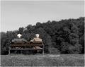
| 09/24/2005 01:26:36 AM | Old fartsby blue_dragonComment: 7 - Good character and angle. Criticism; undecided on the seemingly 'selective desaturation', as it only seems to really show up skin/ears/neck, so not sure. Technically, while no 'expert', seems to me like you have used at least two 'rules' here, and both somewhat 'loosely', but difficult given the 'duo'. | | Photographer found comment helpful. |
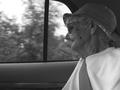
| 09/24/2005 01:17:32 AM | Drive to Sarasotaby KittyseyeComment: 7 - I like this shot, except for one thing; this lady does not look like she wanted her photo taken, but if I am mistaken, forgive me. I like the effect in the car with the window acting as a semi/quasi frame, even more 'movement' outside would make it even more dramatic in my opinion. Technically, while no 'expert' in the rule(s), it looks like you have placed her 'head' as the 'point of interest' on the intersection, and it is the eyes mostly I 'see', but I realize, given this 'composition' and my above related comments, any other placement of the 'poi', would have likely detracted and changed this shot entirely. The b/w works well, but perhaps a little more definition in the lady's face, as appears to be in/on the 'door', may have also made this better, not sure. It is a very 'intimate' (and good) portrait/candid though, and although there is a lot of character in this shot, you (I assume) would see 'personal' aspects here that are 'lost' on me. Just 'feels' like she is being 'intruded' upon, rather than she is 'wistfully watching out the window'. Again, apologies if I am 'way off', or perhaps I am not, or you were capturing 'something else', who knows. It is a personal type shot in my opinion, sorry, difficult to explain, but I tried and yes, just 'my opinion'. Like the title. Message edited by author 2005-10-03 20:06:54. | | Photographer found comment helpful. |
| 09/24/2005 12:20:29 AM | Squashberriesby HVGB_photosComment: 7 - Nice shot. Criticism; I would like to have seen the "point of interest", top right 'bunch', the only one in focus, or at least bolder. Technically, while no 'expert', the placement of 'that poi', is pretty spot on, but in my opinion, it is almost an equal 'point of interest' as the 'bunch' on the other side, therefore I would like to have seen the placement stricter. Nice colors and lighting, though would like to see both emphasized even more. | | Photographer found comment helpful. |
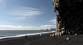
| 09/23/2005 11:18:42 PM | By the seaby GautiComment: 7 - This is a nice scene. Criticism; 'people placement' could be better in my opinion. Given the interesting formation of that cliff/rock wall(?), perhaps showing a little more detail, or 'angle' with that may have made this a better shot in my opinion. On closer inspection, perhaps also a sharper angle, incorporating the dark sand too, not sure. Technically, while no 'expert', seems a good use of at least two rules. | | Photographer found comment helpful. |
| 09/23/2005 11:07:22 PM | Two Shellsby cornettcagComment: 7 - Nice and simple. Criticism; would like to see a little more detail in the texture, perhaps a touch more contrast and the 'base/background' a touch less defined. Technically, while no 'expert', placement is pretty good, but I would like to see it somehow even stricter, especially for the Challenge. It is the seemingly 'natural find' of this little shell in/on the bigger one that you are capturing, that I first liked about this shot. The shadow is nice too. edit:typo Message edited by author 2005-09-28 00:36:29. | | Photographer found comment helpful. |
|
Showing 3771 - 3780 of ~4217 |
Home -
Challenges -
Community -
League -
Photos -
Cameras -
Lenses -
Learn -
Help -
Terms of Use -
Privacy -
Top ^
DPChallenge, and website content and design, Copyright © 2001-2025 Challenging Technologies, LLC.
All digital photo copyrights belong to the photographers and may not be used without permission.
Current Server Time: 04/22/2025 07:40:39 PM EDT.
|