|
|
|
Showing 3901 - 3910 of ~4217 |
| Image |
Comment |
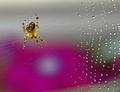
| 08/15/2005 08:30:06 AM | Out came the sun.....by sbeaumontComment: '7' - Really like the potential of this shot, and whilst I can't see any 'rain' (re the Challenge), there's obvious 'residue' on the web - why it is only on one side intrigues me a little. Criticism; given the color (almost a golden) of the spider and the pinkish 'something' in the background, I would really like to have seen the angle changed to get the spider 'over' that pink, perhaps even in the 'purple centre'. A touch more clarity focus on all the drops, and this would have been a superb, and unique shot, in my opinion. It still stands out, even just for the coloring, in my opinion. edit:typos Message edited by author 2005-08-22 06:33:05. |  Photographer found comment helpful. Photographer found comment helpful. |
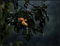
| 08/15/2005 08:26:10 AM | Early Morning Showerby KonadorComment: '7' possibly '8' (but it is just pretend anyway so only 'fyi'). I do like this shot and the color and think you have captured the rain well, especially the 'feel' here. Criticism; not much, perhaps somehow emphasizing the color of the 'fruit' (I am guessing loquats, but I don't think that's what they are, guavas?), might have just given the shot more impact in my opinion. Message edited by author 2005-08-22 06:34:58. | | Photographer found comment helpful. |
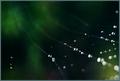
| 08/15/2005 08:23:18 AM | Cobweb borealisby puzzledComment: '6' - Really like this angle and the depth shown for the web 'strands'. I am guessing (perhaps incorrectly) that the 'spots' on the lens are a combination of rain/'flare'. Criticism; those said 'spots', I would like to see them emphasized or 'gone'. The mottled green background is nice, just like to see a sharper focus on the drops (though the 'blur' effect on the ones at the very fore I like) and if possible, some definition of actual rain, especially for the Challenge. | | Photographer found comment helpful. |
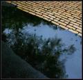
| 08/15/2005 08:19:36 AM | Water Colorsby instepsComment: '7' - Nice shot to meet the Challenge. Criticism; whilst I do like this shot I think it has more potential (if the 'scene' allowed of course), I would really like to have seen a real 'balance' or symmetry here, ie; more asphalt/bitumen, the same amount as the paving/bricks, with the water in the middle. I like the angle, the reflections and the color. An interest in how the b/w might have worked, but I think what you have here is good, just the said 'balance', and it would have been a much better shot in my opinion. edit:typo Message edited by author 2005-08-22 06:38:30. | | Photographer found comment helpful. |
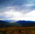
| 08/15/2005 05:42:00 AM | Distant Stormby ShannonLeeComment: '8' - Met the Challenge (in my opinion). A breathtaking shot. Criticism; undecided if it is too dark, not sure. Whilst the rain is not 'tangible', in my opinion, it's evident in the distance and thus you have likely captured a unique shot of rain for this Challenge. Great 'wide' angle and I will be looking to learn what lens etc once the Challenge is over. Very nice colors. Perhaps, a cropping a little of the upper (bluer) part of the sky may have made it more dramatic but not sure on that. Good shot. edit:typo Message edited by author 2005-08-22 06:40:18. | | Photographer found comment helpful. |
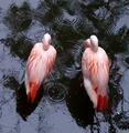
| 08/15/2005 05:33:34 AM | Can't see the fish for the rainby horsemadgirlComment: '8' - Met the Challenge (in my opinion). This shot looks familiar, another great 'set' to take advantage of. Criticism; I would like to see this possibly a little darker, or more contrast. a slightly more 'offset' of the flamingos, yet still incorporating their 'reflections'. Just seems slightly grainy or out of focus, not sure, perhaps it is a close crop. A further zoom out, if possible, capturing more of the rain/raindrops may have made this a better shot in my opinion. They (flamingos) make such good subjects and are for me, always a delight to view. | | Photographer found comment helpful. |
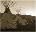
| 08/14/2005 10:06:58 AM | 1865 Rendezvouxby rjksteschComment: 4 - Again the quandry, but it's a game and there are rules/guidelines. Definitely a 7 with just the year. And yes, a photo of this put into a time capsule would depict this era for future generations. I like the sepia(?), especially to tie in with the year/era, but I still wonder how well the color would have worked, especially as it likely brought the mountains into play more. edit:typos Message edited by author 2005-12-08 18:34:26. | | Photographer found comment helpful. |
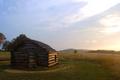
| 08/14/2005 10:00:31 AM | Valley Forge, 1777by APComment: 4 - I do really like this shot and think it does depict the era well (as a photo in a time capsule for future generations) but, yes, in my opinion, only needed the year, as well as that was my interpretation of the Challenge. Criticism; sepia maybe would have worked better to help depict the 'feel' of the era, but I do really like the colors you have here. kperhaps a slightly different angle and a little 'straightening'. Looks and 'feels' like an early morning. Up to 4 from 3. With just the year, 7. | | Photographer found comment helpful. |
| 08/14/2005 09:45:22 AM | 1836by res0m50rComment: 5 - I do like the potential of this shot, and in my opinion you have met the Challenge in respect that a photo of this (barring what I am about to say in the criticism) would depict this era well for future generations if put into a time capsule. Criticism; I just wish those chairs were not on the porch. It was the second thing I saw when I first looked at this shot. I really like the style of the cabin(?) and think you have captured it fairly well, but I would like to have seen a slightly different angle. Either more side on perhaps, or else front on. It seems a touch out of focus to me, but that may be because of the woodwork, not sure. Like to see none of the 'porch' cut off (as in that right side), a full view of the chimney without the tree blocking it, and somehow 'hiding' what looks like (could be wrong) a concrete path, for 'true authenticity'. The sepia(?) does work well, but may attribute to the 'blurring/softening' I mentioned. Of course that could be what you were going for, in that case, perhaps more grain and more 'old' feel. But given the seemingly simple colors that are there, I wonder if the color shot would have done well, even with some grain etc added for 'aged' effect. I just like this shot, but think it has more potential than you have captured. Ok up to 6 from 5. Definitely 7 without those chairs (but I know you perhaps could not have moved them - and if they ARE 'authentic 1836', excuse me). | | Photographer found comment helpful. |
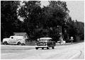
| 08/14/2005 08:22:57 AM | 1955by rexComment: 5 - This feels 'real' to me and meets the Challenge in my opinion (this shot printed and put into a time capsule depicts the era for future generations). Criticism; I like the effort you have seemingly made to get the aged effect, but in my opinion there is alittle too much grain, or 'something'. I like the angle, but would like to see the car driving a little closer. Not sure about the frame. To really nitpick, maybe the road sign needs cropping out, not sure. I like the 'feel' mainly though in this shot, just wish it were not quite so grainy. | | Photographer found comment helpful. |
|
Showing 3901 - 3910 of ~4217 |
Home -
Challenges -
Community -
League -
Photos -
Cameras -
Lenses -
Learn -
Help -
Terms of Use -
Privacy -
Top ^
DPChallenge, and website content and design, Copyright © 2001-2025 Challenging Technologies, LLC.
All digital photo copyrights belong to the photographers and may not be used without permission.
Current Server Time: 04/21/2025 06:31:46 AM EDT.
|