| Image |
Comment |
| 07/29/2005 07:15:41 PM |
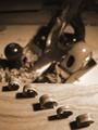
Making Hayby surfdabblerComment: 7 - Met the Challenge. I do like this composition and the concept and think it is very creative. I think the sepia? tone works well and of course really like the 'shaving curls'. Criticism; Those said shaving curls, if they were in super sharp focus, all of them, or perhaps at least the centre one, would make this a much better photograph in my opinion. I like the shadows that play with them and the detail in the grain both on them but especially on the wood they are sitting on and if you could have brought out that aspect more, for me would make this better. I like the 'distant' planes, but perhaps less (or just careful placement) of the shavings on them, so as not to detract from their detail, would make this a better photograph in my opinion. Also they are a little too 'blurred' in my opinion and they lose their definition (especially re this Challenge). Definitely would have been an 8 if at least 3 of those 'curls' were nice and sharp and a little 'nudge' here and there to get them perfectly in line. Good creativity. |
 Photographer found comment helpful. Photographer found comment helpful. |
| 07/29/2005 07:08:53 PM |
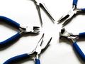
Pliersby bulletheadComment: 8 - Met the Challenge. I like this composition and the use of the three simple colors. Criticism; In my opinion, those said three colors are having trouble with each other. The blue being so bold and dark, has forced the 'steel' to become washed out (though this may be your intent). Also the white base exasperates that. Just seems it is hard to find a 'balance' and 'blend' of the three colors. Aside from that, for me, this would be a better photograph if either the needle nosed pliers had their handle grip in the frame, or perhaps if three were uniform with them, ie no handle grip showing. It is simple and pleasing to the eye but my eye picks out that 'imperfection' to the symmetry. On the symmetry note, I like the 'right alignment'. For me, either really go all out on the 'washed outness' or give some sharpness to the 'heads/cutters/noses/pliers' and show the 'metal'. |
| Photographer found comment helpful. |
| 07/29/2005 06:52:13 PM |
Pencil and Paperby danderson107Comment: 7 - Met the Challenge (based on that IS a real drawing and her hands therefore are a tool also). I like this concept and also the composition. Criticism; I would like to see the shadow of the statue if that were possible. I like the b/w but do wonder (given the simplicity of the composition) how this would have worked in color, or even sepia, the b/w may be just a LITTLE 'washed out', not sure. For me, less of the artist and more of the 'subjects', would make this a better picture. By default that should also give more definition on the pencil?, which I would like to see. This photograph has a nice 'mood' to it and I like the lighting although I would like to see it a fraction darker. If the focus was on the drawing I think it would 'lift' it a little and make this a better photograph (not sure), in my opinion. Original. |
| Photographer found comment helpful. |
| 07/29/2005 06:46:28 PM |
A Shocking Professionby kjenningsComment: 7 - Met the Challenge (just - I see only the gloves and electricity cord as clear 'tools' (although admittedly I have no idea what those black 'switches' are & jury is out on the cable ties (semantics)), the others are material in my opinion). I like this concept and that you have taken advantage of the bright colors used in this field/trade. Criticism; For me this would be a better photograph if there was more sharpness on the colored objects and I am not sure if the lighting is indoor, but seems a touch 'yellow'. The composition is good and aside from a different angle (mainly closer) there might not be much more you can do to make the subject more 'unique'. |
| Photographer found comment helpful. |
| 07/29/2005 06:30:40 PM |
My 'Paintshop'by barbaraanneComment: 7 - Met the Challenge (probably just - there are 2 'tools' here and a box of material in my opinion and as for the 'trade' aspect the jury is still out). I like the composition of this photo and the capture of the bold colors. Criticism; perhaps a slight 'tweaking' of those said colors, ie; the red looks a little orangeish (but that could be my monitor). If the smaller paintbrush tip were shown better and there was more of a 'focal point' somewhere in this picture, it would make this a better photograph in my opinion. Perhaps somehow showing the 'wet areas' too on the actual paints would make for an extra 'edge'. |
| Photographer found comment helpful. |
| 07/28/2005 12:14:32 AM |
horse trainerby dragonladyComment: 8 - Met the Challenge. Not sure if these belong to a real horse trainer or not but either way it fits the challenge. The shot is very nice and clean. I like the b/w. Criticism; Maybe just sharper, a touch more 'contrast', not sure. The background works well and the 'scene' is just 'mellow'. I just noticed you cut off the tips of the straps with your frame, so maybe it might have been best to leave that off. Not sure how this would have worked in color (given the seemingly 'shrubby' background), but as I said, I do like it in b/w. Nice lighting at the top of the 'tools'. |
| Photographer found comment helpful. |
| 07/28/2005 12:08:04 AM |
Mid Day in the Garden of Goodby conglettComment: 8 - Met the Challenge. I like this shot and the perspective. Criticism; Whilst I would like to see a richer color on the spade?, it may blow the white out even more than it already is. I would like to see either the focus further down the handles or else a tighter crop. Perhaps just a sharp focus (or zoom) onto the tools, not sure. More attention to the placement of the tools perhaps, as the shadows could be played on more in my opinion. Creative though. |
| Photographer found comment helpful. |
| 07/28/2005 12:04:23 AM |
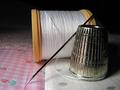
The Patchworker's Toolsby sandabellaComment: 7 - Met the Challenge (just - the jury is out on the 'trade' aspect). I like this shot for its simplicity, colors and textures. Criticism; Although I just mentioned the colors, I do wonder how this would look in b/w. I would like to see a finer focus on the thimble as well. A slight 'rotate' maybe left, to straighten this up as it seems a little crooked to me, though I know the fabric is 'straight'. Maybe a lighter background or just a different color. Perhaps a mirror could have worked well here, not sure.
edit: sp Message edited by author 2005-08-03 00:30:42. |
| Photographer found comment helpful. |
| 07/27/2005 11:58:27 PM |
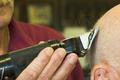
The Barber of Wards Cornerby irishempressComment: 8 - Met the Challenge (I consider hands in this trade a 'tool', thus I see 2 toolS). This photograph has the potential of being very unique. Criticism; I would like to have seen you really 'capture' that 'flying hair' (though I am sure it would be difficult if not impossible, camera dependent). I think a tighter crop at the bottom and perhaps even a touch on the right, primarily to 'erase' the dark mark on the man's ear. That does add some to the character, but in my opinion this would be a 'cleaner' photograph without it. I like how you captured the barber but I think too much of his fingers are in the frame, perhaps even blurring the background more may make the clippers and 'customer' more prevalent. Original. |
| Photographer found comment helpful. |
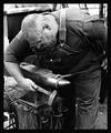
| 07/27/2005 11:55:03 PM |
Hard Metal.....Soft Heartby hdogg4uComment: 8 - Met the Challenge. Well captured use of tools. Good character here. Black and white works well, perhaps sepia may have had more 'effect', not sure. Criticism; a tighter crop, or just losing that background left 'something'. A different angle (though I know you would sacrifice the 'character') but incorporating/emphasizing the tools (including his hands - especially at rear) would make this a better photograph in my opinion. Original and a good capture of a true skilled trade(sman). |
| Photographer found comment helpful. |
Home -
Challenges -
Community -
League -
Photos -
Cameras -
Lenses -
Learn -
Help -
Terms of Use -
Privacy -
Top ^
DPChallenge, and website content and design, Copyright © 2001-2025 Challenging Technologies, LLC.
All digital photo copyrights belong to the photographers and may not be used without permission.
Current Server Time: 04/09/2025 01:45:19 PM EDT.