| Image |
Comment |
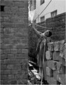
| 01/29/2008 05:36:29 PM |
Wateringby UrfaKComment: Overall I like the image of the man, but the building behind the water doesn't quite fit into the mood of the image for me. The stone and the brick work contrast with that building and I don't think that fits with the story you are telling with the image. For me, and I might be the outlier, I would like a better feel of just what he is using the hose to do. I can't get that from the image. |
 Photographer found comment helpful. Photographer found comment helpful. |
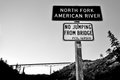
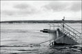
| 01/29/2008 05:32:25 PM |
North Fork American Riverby jdannelsComment: Overall I think I like, but I think I would like to see the bridge get more play in the image. It might help if you just moved back a few feet. But I don't know if you can get the angles right to do the scene justice. |
| Photographer found comment helpful. |
| 01/29/2008 05:29:35 PM |
|
| Photographer found comment helpful. |
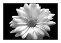
| 01/28/2008 08:42:51 PM |
Daisy-0031by RedDotComComment: You did a great job. The whites came out very well with nothing blown out. With a flower like that it had to be a real challenge to do that. The contrast and detail are just great. |
| Photographer found comment helpful. |
| 01/28/2008 05:11:56 PM |
Weee k 1by SonifoComment: Very well done. And it works well with them centered in the image. |
| Photographer found comment helpful. |
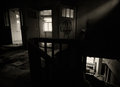
| 01/27/2008 02:19:59 PM |
by MephistoComment: I like this one the way it is. I think the darkness heightens the effect of the interior of an old abandoned building. |
| Photographer found comment helpful. |
| 01/27/2008 02:17:04 PM |
WK 4.jpgby salmiakkiComment: Very good - you might try darkening the clouds a bit, that might make it look more ominous and cold.
|
| Photographer found comment helpful. |
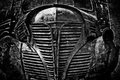
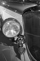
| 01/27/2008 10:13:25 AM |
Week 04 - Studebakerby KenComment: Very good. Made it even better when you caught it in the museum - that could not have made for optimal lighting conditions.
|
| Photographer found comment helpful. |
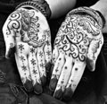
| 01/27/2008 10:12:00 AM |
Henna by AliciaComment: I like it. although the hands themselves took a bit to white. Perhaps this was intentional - not sure. |
| Photographer found comment helpful. |
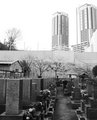
| 01/27/2008 10:09:34 AM |
Graveyardby kolasiComment: I like it. I get the feel that the cemetery looks like it has been crowded into the city. Every tomstone seems to close with so little room. Creates a neat "city" effect.
|
| Photographer found comment helpful. |
Home -
Challenges -
Community -
League -
Photos -
Cameras -
Lenses -
Learn -
Help -
Terms of Use -
Privacy -
Top ^
DPChallenge, and website content and design, Copyright © 2001-2025 Challenging Technologies, LLC.
All digital photo copyrights belong to the photographers and may not be used without permission.
Current Server Time: 04/21/2025 10:20:10 PM EDT.