| Image |
Comment |
| 02/16/2004 07:11:17 PM |
|
 Photographer found comment helpful. Photographer found comment helpful. |
| 02/16/2004 11:35:01 AM |
Mysteriousby crabappl3Comment: I would have marked this higher if it had been plain black and white without the blue eyes. The major interest comes from the composition and form of the fans (assuming they are fans) and the colour seems to compete with that for attention rather than enhancing it. Also it makes it less of a "black" shot. |
| Photographer found comment helpful. |
| 02/11/2004 11:16:23 AM |
Paint By Numbersby bobgaitherComment: OK, I'm s bit stumped as to where "Letting Go" comes into this (and I'm not just dismissing it out of hand - I've sat here and thought about it for a while). |
| Photographer found comment helpful. |
| 02/11/2004 04:30:23 AM |
|
| Photographer found comment helpful. |
| 02/10/2004 01:16:22 PM |
Focusby roy204Comment: This kind of shot is becoming a new cliche on dpc (glasses are the new cats, if you will... :-) ), but this is a good example and definitely meets the challenge. Good choice of passage, too, good composition and the sepia tone definitely adds something. |
| Photographer found comment helpful. |
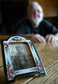
| 02/10/2004 01:08:53 PM |
age 2 to 78by camelotnorthComment: I think this would actually have been more effective as a wide DOF shot - using small aperture to get both the photograph and the man sharp. Obviously then it wouldn't meet the challenge though :-) |
| Photographer found comment helpful. |
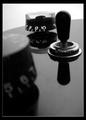
| 02/10/2004 01:00:38 PM |
The Drive-Inby ChrisW123Comment: I really like the image I think you probably had in your head, but I don't think you've quite pulled it off. Whatever that is in the top left-hand corner (a hand holding something?) is really distracting, and I think overall the background would be better a little more out of focus (is that real shallow DOF or Photoshop?). I don't know how much control you had over the surroundings, but if you could have reduced the clutter on the table down to fewer items (and ideally moved the bubblegum machine) then I think it would be less distracting. Finally, I would personally crop the top off at around the height of where the top of the menu is now because I think that would make for a stronger composition. |
| Photographer found comment helpful. |
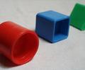
| 02/10/2004 12:43:33 PM |
Shallow Blocksby kim100878Comment: I think this might have worked better as a whole if the surface had been plain white - the texture distracts a bit from the big chunky blocks. |
| Photographer found comment helpful. |
| 02/10/2004 12:41:59 PM |
On Target!by DrakeComment: Great concept and the main subject is very striking, but I wonder if a different crop might have worked better? Or even (this being an Advanced Editing challenge) moving the base of the white target up a bit and then recropping to cut out some of the dead space at the bottom of the frame? I am a big fan of negative space, but this particular area doesn't seem to add anything. |
| Photographer found comment helpful. |
| 02/02/2004 08:10:35 PM |
OREO 'n' MILKby theodor38Comment: Nice take on a popular subject! The focus seems a little soft to me and the lighting on the glass is a little distracting, but the idea is top-rate. |
| Photographer found comment helpful. |
Home -
Challenges -
Community -
League -
Photos -
Cameras -
Lenses -
Learn -
Help -
Terms of Use -
Privacy -
Top ^
DPChallenge, and website content and design, Copyright © 2001-2025 Challenging Technologies, LLC.
All digital photo copyrights belong to the photographers and may not be used without permission.
Current Server Time: 03/12/2025 08:50:36 AM EDT.