| Image |
Comment |
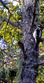
| 01/30/2006 08:07:45 PM |
Woodpeckerby VanBergenComment: I would have liked more of a lurred background to simplify the overall image and give more visual eight to the woodpecker. JMO |
 Photographer found comment helpful. Photographer found comment helpful. |
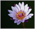
| 01/30/2006 07:57:33 PM |
Awakeningby instepsComment: Very nice. Excellent focus on the centre of the flower. Good work. |
| Photographer found comment helpful. |
| 01/30/2006 07:51:27 PM |
|
| Photographer found comment helpful. |
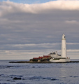
| 01/30/2006 07:33:11 PM |
St, Mary's Lighthouseby barbaraanneComment: This is a gorgeous scene. The clours of the lighthouse and outbuildings are very nice. Something about proportions of the overall image bothers me ... Not quite square but not really the aspect ratio of an 8 x 10 or 5 x 7. |
| Photographer found comment helpful. |
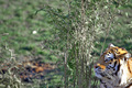
| 01/30/2006 07:31:23 PM |
Staring Into Spaceby Mr_PantsComment: The off-centre composition of the tiger is good. However, I find the branches right in the centre of the image to be very distracting. If you had time, maybe waiting for the tiger to move away from the branches would have helped. JMO. |
| Photographer found comment helpful. |
| 01/30/2006 07:29:38 PM |
|
| Photographer found comment helpful. |
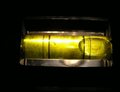
| 01/30/2006 07:28:31 PM |
UnLeVeLby swallaceComment: I get it! The concept is extremely good. I would have liked to have seen stronger focus on the entire visible portion of the level. Other than the top edge, it looks very unfocused, inluding the bubble. So long story short, points for creativity but a slightly better technical shot would have been nice. |
| Photographer found comment helpful. |
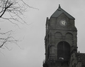
| 01/30/2006 07:16:14 PM |
Clock Towerby HighwayFlowerComment: The composition is very pleasing. The lighting of the day has sort of washed out the clock tower and muted the details. Also, it looks to me that maybe a little too much sharpening was applied looking at the hite lines surrounding the twigs of the tree. JMO. |
| Photographer found comment helpful. |
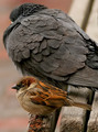
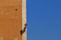
| 01/30/2006 07:13:46 PM |
Mediterranean Afternoonby saiphfireComment: Ireally like the colour of the wall and the shadow from the bird. I would have preferred the ine of the building to have been perfectly vertically. I also wonder if this would have been a little more of a pleasing composition if you had arranged this in a portrait layout ... it would have emphasized the vertical lines a little more. JMO |
| Photographer found comment helpful. |
| 01/30/2006 07:04:37 PM |
Lone Starby srdanzComment: What the heck is "ASTEX"? :) Very nice architecture shot. I like that the star is off centre but even better that you were off-centre from dome instead of standing directly below it and simply composing off-centre. Good job. |
| Photographer found comment helpful. |
Home -
Challenges -
Community -
League -
Photos -
Cameras -
Lenses -
Learn -
Help -
Terms of Use -
Privacy -
Top ^
DPChallenge, and website content and design, Copyright © 2001-2025 Challenging Technologies, LLC.
All digital photo copyrights belong to the photographers and may not be used without permission.
Current Server Time: 04/11/2025 12:55:57 AM EDT.