Nasturtuimby
OddfrogComment: Comment from a member of your own commenting club :-)
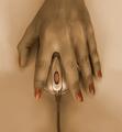
Nice complementary colours.
What is good in this picture?:
1. The colours
2. Nice flower.
What could you do better?:
1. Crop a bit from the bright leaf in the right side, making the red flower almost touch that side. In that way you apply rule of thirds wich is very good for the eyes to look at.
2. You probably only use one light source, In that way the shadows become to harsh, i.e. black. Maybe better to light a bit with another light on the leafs too.
3. I love flowers and flowershots but for many they get boring. It would maybe be good to add a "nose" to the picture or someones face :-)
4. The focus is a bit soft on the red. It is sometimes hard to focus on red things, specially when there is something green beside it. Autofocus, i've heard, uses green light.
5. Another thing about the focus, If you are trying to focus on both near and far subjects you should lower the speed and use a tripod.
6. The frame does imo not help. Maybe better to have it same colour as one of the leafs.
Hope that helps!
Message edited by author 2006-05-10 20:28:12.