| Author | Thread |
|
|
05/09/2006 04:31:45 PM |
Comment from a member of your own commenting club :-)
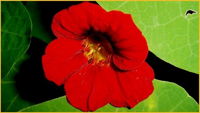
Nice complementary colours.
What is good in this picture?:
1. The colours
2. Nice flower.
What could you do better?:
1. Crop a bit from the bright leaf in the right side, making the red flower almost touch that side. In that way you apply rule of thirds wich is very good for the eyes to look at.
2. You probably only use one light source, In that way the shadows become to harsh, i.e. black. Maybe better to light a bit with another light on the leafs too.
3. I love flowers and flowershots but for many they get boring. It would maybe be good to add a "nose" to the picture or someones face :-)
4. The focus is a bit soft on the red. It is sometimes hard to focus on red things, specially when there is something green beside it. Autofocus, i've heard, uses green light.
5. Another thing about the focus, If you are trying to focus on both near and far subjects you should lower the speed and use a tripod.
6. The frame does imo not help. Maybe better to have it same colour as one of the leafs.
Hope that helps!
Message edited by author 2006-05-10 20:28:12. |
|
 Photographer found comment helpful. Photographer found comment helpful. |
|
|
05/08/2006 01:31:57 PM |
Greetings from the critique club.
What I like about this image is its strong colors. I particularly like the right side of the shot where the black, green and red meet, that is beautiful negative space and shape. What I think your shot could benefit from, maybe be a more interesting compositiion, perhaps cropping the left a little and then doing a horizontal flip of the image. Do you use a tripod when you shoot to help improve the sharpness of the image? Or you can increase shutter speed. I also would have left out the yellow border as I find it distracting.
I hope that helps a little. Keep shooting.
(I have been to kenya 2x and zambia once, I hope to make it to your country one day : )) |
|
| Photographer found comment helpful. |
Comments Made During the Challenge  |
|
|
05/02/2006 11:28:58 AM |
| I wish the focus was sharper on the flower. Nice strong bright red and I love the deep green on the left side. |
|
| Photographer found comment helpful. |
|
|
04/30/2006 09:03:36 PM |
|
| Photographer found comment helpful. |
|
|
04/30/2006 01:06:02 AM |
| Needing sharpness. Nice subject. |
|
| Photographer found comment helpful. |
|
|
04/29/2006 11:07:27 PM |
| God composition, the focus on the flower is a little soft. |
|
| Photographer found comment helpful. |
|
|
04/29/2006 07:39:51 PM |
| Definitely fitting of the challenge. Personally, I'm not keen of the composiion. The strong centre placement of the flower makes for a static image, sort of drawing the eye to the centre target. Also, it doesn't appear that any part of the flower is in focus. Finally, the whole in the top right corner is distracting to me. JMO |
|
| Photographer found comment helpful. |
|
|
04/29/2006 02:32:16 PM |
| great job. i would have prolly cropped out the bruise on the leaf on the right ;) |
|
| Photographer found comment helpful. |
|
|
04/29/2006 02:19:51 PM |
| very good use of colour, though the inside of the flower is out of focus and it might have worked better with a closer off centered crop |
|
| Photographer found comment helpful. |
|
|
04/26/2006 11:29:10 PM |
|
| Photographer found comment helpful. |
|
|
04/26/2006 11:21:24 PM |
| 3 - Looks like quite a bit of detail has been lost, whether in pp/neat image/etc, not sure. Contrast/control of the red also seems an issue, but could be focus. Not sure the centered composition enhances this. Frame detracts in my opinion. |
|
| Photographer found comment helpful. |
|
|
04/26/2006 07:02:28 AM |
|
| Photographer found comment helpful. |
Home -
Challenges -
Community -
League -
Photos -
Cameras -
Lenses -
Learn -
Help -
Terms of Use -
Privacy -
Top ^
DPChallenge, and website content and design, Copyright © 2001-2025 Challenging Technologies, LLC.
All digital photo copyrights belong to the photographers and may not be used without permission.
Current Server Time: 03/12/2025 09:38:02 AM EDT.