| Image |
Comment |
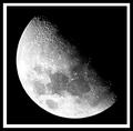
| 01/13/2003 07:06:56 PM |
Lunar Landscapeby marboComment: Whoa. I need a setup that can do this. Great detail in the craters at the top. Good exposure & focus. I'm not keen on the white part of the border, it's too big & overpowering. I would also have left more black space in shot so that the moon wasn't centred. Still, nice work. |
 Photographer found comment helpful. Photographer found comment helpful. |
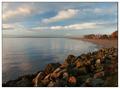
| 01/13/2003 06:49:47 PM |
The Bayby joannsComment: Nice composition. I would have prefered more of the land in shot, though I can't tell what is just out of frame. Great idea to have the rocks in the front of the frame. |
| Photographer found comment helpful. |
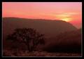
| 01/13/2003 03:24:20 PM |
In the Mendip Hillsby KonadorComment: Congratulations on a sunset shot where you can actually see the landscape, and not just a big black blob!
Composition is great, I don't think it could be better for this scene. It suffers a little through lack of light, but manages to portray a mood. Nice work. |
| Photographer found comment helpful. |
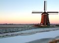
| 01/13/2003 02:16:16 PM |
Battle of the elementsby AzrifelComment: A lovely shot, great colour graduation on the sky. I guess it's a bit flat round there? Holland?
The stream/river/cana/whateverl at the front is very plain - doesn't do much for me, and I think you've cropped a little too close to the windmill, but other wise this is great. |
| Photographer found comment helpful. |
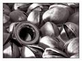
| 01/07/2003 08:55:01 PM |
Am I Nuts by redfigComment: Great idea. Unfortunately the nut gets lost in the nuts because of the B&W. I think it would have made a much stronger focal point in colour. |
| Photographer found comment helpful. |
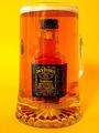
| 01/06/2003 08:17:29 PM |
Too Much of a Good Thing!by PtmanComment: LOL. I can relate to this. Normally I give bonus points for using Jack Daniels but I've seen far too much of the stuff recently ; )
I'm not sure about the positioning of the handle - it may have been better hidden (as well as it could be) behind the glass and if I'm being picky there's some stray reflections.
Having said that, I really do like the shot and the idea. Great work. |
| Photographer found comment helpful. |
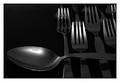
| 01/06/2003 08:10:48 PM |
I am the Soup Forkby KonadorComment: This seems too dark overall, yet too light in places - a tricky effect to achieve! I think the light needed softening, or bouncing to even it out across the scene a bit more.
Not a bad shot, composition is good, and I like the angle you've shot it at. |
| Photographer found comment helpful. |
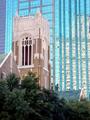
| 01/06/2003 08:04:33 PM |
Stranger In A Strange Landby goodtempoComment: A good shot, and a very good idea for the challenge. I like the message, despite not being religious. Technically the photo is very good, though the trees get in the way a bit too much. Well done. |
| Photographer found comment helpful. |
| 01/06/2003 07:41:26 PM |
Where Men Fear To Treadby mcmurmaComment: OMG ... no! Nightmare! Not a 'great' photo in any artistic sense of the word, but extremely funny. I would have cropped the right hand side where the aisle ends for a less distracting background. |
| Photographer found comment helpful. |
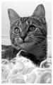
| 01/05/2003 08:32:42 PM |
Liliby JackoComment: Nice shot. Great clarity - you can almost pick out individual hairs, even at such a low reolution. The pixelated effect on the whiskers lets it down slightly though. I like the composition, and the woolly stuff in the foreground works really well. |
| Photographer found comment helpful. |
Home -
Challenges -
Community -
League -
Photos -
Cameras -
Lenses -
Learn -
Help -
Terms of Use -
Privacy -
Top ^
DPChallenge, and website content and design, Copyright © 2001-2025 Challenging Technologies, LLC.
All digital photo copyrights belong to the photographers and may not be used without permission.
Current Server Time: 04/18/2025 10:43:47 AM EDT.