| Image |
Comment |
| 06/29/2006 02:03:17 PM |
nooooooo!!!by SimpaComment: Good humour. The focus is a bit off though, and the lighting could be improved (shadows seem a bit distracting). |
 Photographer found comment helpful. Photographer found comment helpful. |
| 06/29/2006 02:01:27 PM |
|
| Photographer found comment helpful. |
| 06/29/2006 04:50:32 AM |
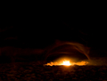
untitled (inspired by http://absurdada.photosight.ru/)by agenkinComment: Originally posted by agenkin:
As to whether I nailed it or not, that's very personall. Not all of Igor's images move me, but some of them move me greately. I hope that this image works for some people, and some of the comments under it indicate that that's the case. |
You're right. It always boils down to personal opinion. Your image doesn't really move me, but I'm very glad to have found Igor's photos. There is some really inspirational stuff in there. And I guess that's what tribute photos are for - to highlight and acknowledge someone else's work.
So thank you for that. You might see some "Igor tribute" photos from me in the near future too... :-) |
| Photographer found comment helpful. |
| 06/28/2006 07:34:22 PM |
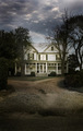
Est. 1912by langdonComment: Feels kinda weird commenting on a Langdon photo. Almost like talking to God... Ok, maybe not exactly.
Anyway, I was perusing, as I am wont to do...
Actually wanted to see how active you still are in the challenges.
There's only one improvement I'd like to see on this photo... crop off the bottom part of the driveway - just above those dark patches. That way you retain the drive leading up to the house as Fotomann mentioned, but you also remove those really distracting dark patches.
I just masked that portion with my hand, and immediately that house leapt out at me much more... |
| Photographer found comment helpful. |
| 06/28/2006 03:51:23 PM |
Still Some Growing Up To Doby carpentsComment: I definitely don't want to go into definitions of bokeh, because that seems to court controversy on this site.
However, I looked at your profile, and I think you probably would have scored much higher if you had shot your entry for the Shallow DOF challenge for this one, and this image had been used for that challenge.
That other picture seems to benefit more from the bokeh than this one does.
This picture is still a wonderful photo though. I really do like the use of the DOF, and the composition is really strong. |
| Photographer found comment helpful. |
| 06/28/2006 12:03:48 PM |
untitled (inspired by http://absurdada.photosight.ru/)by agenkinComment: Yeah, I've checked out his website, and in my opinion, you just didn't nail it.
Yes, he shoots a lot of stuff grainy and blurry, but all of those images have a lot of energy in them. Sometimes the energy is disturbing/depressing, sometimes it is exciting. Your shot lacks any of that vitality - it just doesn't seem to make an emotional connection with me. I'm presuming a lot of the voters felt the same way.
He also shoots some stuff in focus.
And that's an interesting point - the blurry, grainy focus is used for effect. He doesn't just choose it for stylistic reasons. The style enhances the image.
Perhaps you could have chosen a subject that would have been served better by this effect.
The final thing I noticed was that he has an incredible command of tonal range in his photos - from bright highlights to deep shadows. That is something your photo could use a bit more of. The overall tonal range is just a bit flat, perhaps because there is so much sky in the composition. More emphatic contrast would really have gotten this photo to stand out more. |
| Photographer found comment helpful. |
| 06/28/2006 10:06:11 AM |
blue jungleby saintaugustComment: How do you achieve this within the Basic Editing rules? Filters? Or is there a setting for it on the D1 (although I can't imagine there being one on a camera like that)? |
| Photographer found comment helpful. |
| 06/28/2006 07:42:08 AM |
Sundanceby raishComment: It's not my favourite pic. And it has quite a few flaws that preclude it from being a very high scoring shot composition doesn't feel balanced enough, and those little insects? in the foreground are distracting). But at least it showed a good understanding of bokeh and how to use it.
I don't understand why people think there has to be something in sharp focus for this challenge. It's not a DOF challenge, it was bokeh - and the bokeh should be the emphasis. Doesn't matter if there is something in the foreground or not, provided the bokeh is interesting... |
| Photographer found comment helpful. |
| 06/28/2006 05:36:27 AM |
Anatomy of a Golferby NstiG8trComment: Oh... So that's what it is. That's actually pretty cool. Nice idea. I think maybe the single colour makes it feel a bit bland overall. I'd be interested to see what effect some experimental lighting angles and colours would do to it.
I think I'm going to go and get one of these crystal blocks to play with (never knew that had any uses before this). |
| Photographer found comment helpful. |
| 06/28/2006 03:52:18 AM |
Risky Businessby angelfireComment: I never got around to voting all the entries in the Bokeh challenge - my bad. So I'm afraid I never got to see yours.
What could have been improved perhaps was the lighting. If you'd had a bit more light on those background characters, the bokeh on them would have been enhanced, and a silhouette effect on the front character might have made it jump out a bit more.
And as rblanton mentioned, a lower angle also might have served to strengthen the main subject.
As for the graininess, I see that your ISO was set to auto. In low light, the camera would have chosen the highest ISO it has, and that would make the shot very grainy. Next time select the lowest ISO manually, and use a longer shutter speed.
Still, nice idea. I also used to love playing Risk... |
| Photographer found comment helpful. |
Home -
Challenges -
Community -
League -
Photos -
Cameras -
Lenses -
Learn -
Help -
Terms of Use -
Privacy -
Top ^
DPChallenge, and website content and design, Copyright © 2001-2025 Challenging Technologies, LLC.
All digital photo copyrights belong to the photographers and may not be used without permission.
Current Server Time: 04/21/2025 06:27:09 AM EDT.