| Image |
Comment |
| 08/08/2006 12:44:22 AM |
Pianoby discoComment: Greetings from the Critique Club.
Hi Logan,
Welcome to DPC. Congratulations on your first challenge submission.
You have met the challenge and have the basics (in focus, no major blow-outs, etc...) covered. This has placed your score squarely in the realm where most of us reside - between 4.5 and 5.5. The challenge for you now is how to break out of this middle zone. It is a question not of what you have done wrong, but what you could do right to really set your shot apart.
The first area you can look into is composition. This is what seperates the artist from the technitian. The comments below indicate that your shot failed to grab the attention of your audience. The lines of the piano draw the eyes of the viewer right off the image. Loads of space doesn't serve a function. You could have tried any number of different techniques to make this more interesting. I suggest you read the three articles on composition on the following site to get more of an idea of what can be done here. //ronbigelow.com/articles/adv_comp/adv_comp.htm .
The second area you can consider is technical. I notice that you shot at F/5.6 (the widest aperture when fully extended on the kit lens that I assume you used) with a shutter-speed of 1/125 and an ISO of 1600. I assume you set the ISO at 1600 in order to manage to get the shuter-speed fast enough for you to hand-hold the camera in the low light. Given that the piano is stationary I suggest you could have rested the camera so that it was still to take a shot with a low ISO. This would have allowed you to stop-down the aperature for a deeper depth-of focus. This combination would have meant less noise, for a sharper image.
I hope my comments help and Good Luck in future Challenges!
Cheers
Paul |
 Photographer found comment helpful. Photographer found comment helpful. |
| 08/07/2006 08:44:20 PM |
Millie: White on Whiteby hotpastaComment: Greetings from the Critique Club.
Hi Enzo,
A great shot, and no doubt a nice family memory. It's the imploring eyes that make this shot work, along with the expression communicated by the face as a whole. It's been said before - adorable.
I agree that going for white-on-white was a brave move knowing 'how particular dpc voters' cab be. Fortunately it seems to have paid off for you. you sure don't seem to have been hit by the trolls.
How could it have done better? This is a tough call. The dappled light as it is does add to the picture. Nonetheless I think I would have liked to see Millie's face better lit. Perhaps if you could have got her to roate herself (I know, it's difficult enough as it is to work with animals) 45 degrees counter-clockwise to aligh with the light source and wait for a ray to flash on her face.
I hope my comments help and Good Luck in future Challenges!
Cheers
Paul |
| Photographer found comment helpful. |
| 08/06/2006 09:29:05 PM |
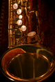
Saxual Goldby cislanderComment: Greetings from the Critique Club.
Hi Charles,
That sure is a beautiful instrument: a wonderful place to start when aiming to create a beautiful image.
I'll start with what works for me in this shot. I like the point-of-view and the rich colour tones. The lighting is good, really bringing out the lines and flow of the sax.
I imagine the image was voted down a little because it does not absolutely 'pop' with gold. As has already been commented - it is dark and red. Personally I like the opulent hue and glow this gives to the shot, but others are different. Anyway, you have not been cut-down by the DNMC trolls - merely just marked down a bit.
I'm guessing the sax is at rest in it's case. It is a little too easy to see that the shot was rotated to veritcal. I think it would have worked better if you has set the sax in a stand with a slightly less dark background. This would have removed the distracting reflections in the inside of the bell.
I hope my comments help and Good Luck in future Challenges!
Cheers
Paul |
| Photographer found comment helpful. |
| 08/04/2006 01:54:47 AM |
Dragon's Hoardby lwiley212Comment: Greetings from the Critique Club.
Hi Linda,
Your shot sure satisfies the challenge - that is a whole lot of gold there. Too much so, in fact, as no part of the composition stands out as the subject and it is difficult for the eye to pick the different objects where they overlap.
An environment such as this where you control every aspect of the composition is a painstaking art, especially when working with highly reflective objects such as these. In future consider cleaning and shining each object - the dust on the dragon takes away from the potential warmth and hue. Try to keep the compositions simple - the simpler it is the less that can go wrong.
I\'m not really sure what you did with the lighting. It\'s great to hear that you learnt a lot working on it. Keep at it - this is an area where you will never run out of things to learn and practice. The blowouts on the globe and lamp stand are a bit too harsh - perhaps if you diffused the light this would have been better. OPr maybe you were aiming for that effect.
I hope my comments help and Good Luck in future Challenges!
Cheers
Paul |
| Photographer found comment helpful. |
| 08/04/2006 01:17:12 AM |
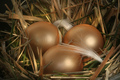
...The Golden Eggsby sfaliceComment: Greetings from the Critique Club.
Hi Alice.
This shot does have a lovely warm glow to it. You have compiling a lovely composition with some excellent well-thought out touches (such as the feathers). The eggs seem a little too soft, and do not really stand-out from the nest - I think they need more yellow in their gold to give them some pop. I'm not really sure how you went about lighting this so all I'll say on the subject is that the slight highlights on the eggs are perfect and the shadows are appropriatly soft.
I notice you used an 8 second shutter speed with a small aperture. I think a wider aperture (say around F10) with a faster shutter would have produced a crisper image.
To grow your vote: The core subject (the eggs) should stand-out better to really capture your audiences eye. This would mean sharper with mroe contrast between them and the background.
I hope my comments help and Good Luck in future Challenges!
Cheers
Paul |
| Photographer found comment helpful. |
| 08/03/2006 09:04:57 PM |
Sailing on Wings of Goldby saracatComment: Greetings from the Critique Club.
You certainly meet the challenge with the striking gold sail in the centre. The shot is technically sound, with nothing fundamentally wrong. There is a richness to this image that I enjoy. Others may feel that the foreground and background are too dark - I imagine this is a result of editing to get the sail just so. Unfortunately all the action in the image is in a band across the centre, and both foreground and background are pretty much dead space. The foreground in particular does not add to the image.
How to grow the vote: The composition should place more emphasis on the yachts (especially that gold sail) to really focus your audiences eye on the subject. I would have liked to have seen the yachts in the foreground (balanced accordign to the rule of thirds) with a bright blue sky in the background.
I hope my comments help and Good Luck in future Challenges!
Cheers
Paul Message edited by author 2006-08-03 21:06:43. |
| Photographer found comment helpful. |
| 07/13/2006 12:26:31 AM |
|
| Photographer found comment helpful. |
| 07/12/2006 09:58:24 PM |
Ripening Red Raspberriesby debapakaComment: I do like this shot - doing the old classic complementary colours thing. I believe I would have liked it more rotated counter-clockwise 90 degrees (or so). This I think would have been better balanced, and led the eye through the progress of unripe in the foreground and ripe in the background. |
| Photographer found comment helpful. |
| 07/11/2006 10:57:13 PM |
Paper Patterns by timfythetooComment: I simply love the balance here. There isn't much that can be improved upon. Perhaps I would prefer it if the background colour was lighter (although perhaps not). |
| Photographer found comment helpful. |
| 07/06/2006 03:10:41 AM |
Apolloby aimeethetooComment: Are those curled post-it notes? Very impressive. I almost put this down as DNMC just because I didn't 'see'. Overall a lovely picture - I'd have given you a decent score even if it was DNMC. My only complaint is the slight blowout peeping out on the left of your sun. I assume this is your light-source. Would have been great to cover that. |
| Photographer found comment helpful. |
Home -
Challenges -
Community -
League -
Photos -
Cameras -
Lenses -
Learn -
Help -
Terms of Use -
Privacy -
Top ^
DPChallenge, and website content and design, Copyright © 2001-2025 Challenging Technologies, LLC.
All digital photo copyrights belong to the photographers and may not be used without permission.
Current Server Time: 04/11/2025 01:36:23 PM EDT.