| Image |
Comment |
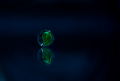
| 06/29/2006 01:02:16 AM |
The Marbleby rinacComment: Nice and simple. Just my opinion but I think this would have worked even better with the marble even more off-centre (further to the left). I would also like to have seen the marble and its reflection to be more distinct. Still, I do like it. |
 Photographer found comment helpful. Photographer found comment helpful. |
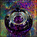
| 06/29/2006 12:59:55 AM |
Kaleidoscopeby sherpetComment: First up - I love the colours; really rich and vibrant. The object in the centre does not stand out sufficiently well to be a distinct focal subject. The net impact is that the whole is just too busy. |
| Photographer found comment helpful. |
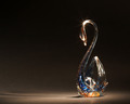
| 06/29/2006 12:48:07 AM |
Graceby pidgeComment: The snaw itself is beautiful. The surface on which it is resting really takes away from it. I think a lovely idea would have been to rest it on a mirror. |
| Photographer found comment helpful. |
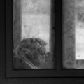
| 06/29/2006 12:45:46 AM |
Worlds Obscuredby ImagineerComment: This was about to be a low vote, but fortunately circumstances allowed time for it all to sink in. I'm not a fan of the overall composition (especially the amount of image given to the frame), but I do think you convey the emotion of the old couple very effectively. I fear this won't do as well as it should because it won't get the time it needs. |
| Photographer found comment helpful. |
| 06/26/2006 08:44:32 PM |
Time Interrupedby accadyComment: I find it interesting that I can only 'count' a few visible seconds on the exposure. Nonetheless I know there are ways arounds. This is by far the best representation of time passing in the challenge. Nice shot. |
| Photographer found comment helpful. |
| 06/23/2006 12:01:20 AM |
He's Going the Distance, He's Going for Speed...by tkjaerComment: A really cool idea. I think this would have worked better if more of your image was filled with the windscreen. The dark foreground gives perspective, but is just too bland to occupy so much of your image. |
| Photographer found comment helpful. |
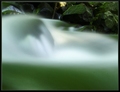
| 06/22/2006 10:19:56 PM |
Water Spiritby LucidLotusComment: I see what you've tried to do here, but don't think it has worked - the image as a whole comes across as too soft. I think it would have worked better with static objects more in the foreground and the soft water less prominent. I would like to try a shot like this myself. |
| Photographer found comment helpful. |
| 06/21/2006 01:18:59 AM |
2am... Still no idea what to shootby TygerrComment: Very effective. The bottom-left pose however takes away from the other two - just not as convincing (and the hand is a bit blown). Nonetheless, the balance across the image is excellent and the angst we all know is well conveyed. |
| Photographer found comment helpful. |
| 06/21/2006 01:10:01 AM |
|
| Photographer found comment helpful. |
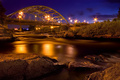
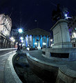
| 06/21/2006 01:06:18 AM |
Wellingtonby MatthewComment: I like this shot a lot, and usually I'm not a fan of wide-angle distortion on buildings. Perhaps it's because i know the area. The tones in the old Stock Exchange are perfect. Shame about the flare in the sky. In a member challenge you would have been able to do something about this. |
| Photographer found comment helpful. |
Home -
Challenges -
Community -
League -
Photos -
Cameras -
Lenses -
Learn -
Help -
Terms of Use -
Privacy -
Top ^
DPChallenge, and website content and design, Copyright © 2001-2025 Challenging Technologies, LLC.
All digital photo copyrights belong to the photographers and may not be used without permission.
Current Server Time: 04/11/2025 01:41:05 PM EDT.