| Image |
Comment |
| 08/27/2014 01:03:14 PM |
Cleomeby posthumousComment: Hello from the critique club.
Don I've gotta tell you I was shocked when I saw who took this. Definitely not your style. Overall I think you did a good job.
In my opinion for this challenge there is too much pink going on. I am sure that affected your overall score. However I do like the focus and the details that you can see in the flower.
Good job. Keep I up
|
 Photographer found comment helpful. Photographer found comment helpful. |
| 08/27/2014 10:57:16 AM |
Regalby Ja-9Comment: Hello from the critique club.
WOW absolutely stunning capture. Overall I feel that this is a great shot. The image is very crisp and clean looking. It is also a good thing that you did not center the flower. For me it adds more interest.
Keep it up... |
| Photographer found comment helpful. |
| 08/26/2014 10:44:18 PM |
c o t t o nby Ja-9Comment: Good day from the critique club...
Interesting shot... Looks very vintage in black and white ( I know b& w challenge). In a way it looks like grandmas kitchen table. I am worried about the amount of grain in this shot. I think I would have left some grain but I would have dialed it back a but.
I hope that I have helped you out.... |
| Photographer found comment helpful. |
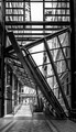
| 08/26/2014 08:09:36 PM |
Modern designby clickodakComment: Good day from the comment club.
Overall this is an OK shot. Not great but just OK. I think it would be much better if the sidewalk ramp was more centered in the shot. As far as the black and white aspect...... I like it. The colors and lighting I feel are spot on.
I hope this critique has helped you out. Keep it up.... Message edited by author 2014-08-26 20:17:56. |
| Photographer found comment helpful. |
| 08/26/2014 06:05:20 PM |
Unconventionalby Dr.ConfuserComment: Good Day from the critique club
I understand that you are not into still life shots as mentioned in your comments. However, I really think that you did a very nice job. The composition was nicely done. The choice of material (props) used was perfect for a black and white in my opinion. However I think I would have wanted the clock more centered in the frame. To me it is only slightly distracting.
The wood grain in this shot is awesome. I love the way it almost pops out at you. It gives depth, which is always a good thing.
I hope this critique has helped. Keep it up. |
| Photographer found comment helpful. |
| 07/22/2014 09:38:53 PM |
|
| Photographer found comment helpful. |
| 07/22/2014 09:37:17 PM |
|
| Photographer found comment helpful. |
| 07/06/2014 01:05:22 AM |
|
| Photographer found comment helpful. |
| 06/23/2014 06:17:42 PM |
|
| Photographer found comment helpful. |
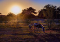
| 06/14/2014 10:00:30 PM |
Supperby beatabgComment: Good shot...poor execution. I love the composure. Nice subject...However the sun was not in your favor. The sunspot in the middle of the frame is highly distracting. You have also lost detail in the trees. I have started experimenting with an ND filter you may give it a try for a similar shot |
| Photographer found comment helpful. |
Home -
Challenges -
Community -
League -
Photos -
Cameras -
Lenses -
Learn -
Help -
Terms of Use -
Privacy -
Top ^
DPChallenge, and website content and design, Copyright © 2001-2025 Challenging Technologies, LLC.
All digital photo copyrights belong to the photographers and may not be used without permission.
Current Server Time: 04/01/2025 08:41:00 PM EDT.