| Image |
Comment |
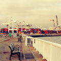
| 08/01/2010 09:00:22 AM |
Idledby beckydiComment: The light and the colors of the buildings are pretty, but I'm on the fence about the inclusion of the fence in the foreground. |
 Photographer found comment helpful. Photographer found comment helpful. |
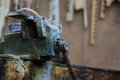
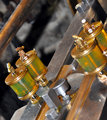
| 08/01/2010 08:57:47 AM |
Workbench IIby PsquaredComment: Some sharpening and some contrast (bringing up the lighter parts, but leaving the darker parts) would make this pop. |
| Photographer found comment helpful. |
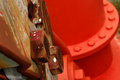
| 08/01/2010 08:53:58 AM |
Industrial painting...by cyparisComment: I really like the detail of the paint splatters, so I might have focused just on that, leaving out the newly painted part. Adding a little more contrast would also emphasize the lovely tones in the rust. |
| Photographer found comment helpful. |
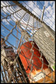
| 08/01/2010 08:52:28 AM |
Legolandby odriewComment: I LOVE your title. It's witty and makes an even stronger connection with the challenge since legos are building blocks and building is, ya know, industrial. Anyway, your title definitely makes your image much better. I rarely give extra points for titles, but yours will definitely get a few : ) I really like the colors of your image, but I think I would crop some of the sky so the viewer won't get lost in al that negative space. |
| Photographer found comment helpful. |
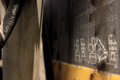
| 08/01/2010 08:38:30 AM |
Old Industrialby BaldurTComment: I love the texture and the color of the metal, but I wish the lovely texture of the wood was also in focus. |
| Photographer found comment helpful. |
| 08/01/2010 08:36:42 AM |
Get Your Motor Runningby phooztComment: Having something in focus on either side of the image with a lot of out-of-focus space in the middle makes my eyes jump back and forth across the image, which makes for a very tiring viewing experience. The drawing is intriguing, so I would have preferred to have the left of the image cropped. |
| Photographer found comment helpful. |
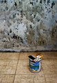
| 08/01/2010 08:33:10 AM |
Time to Repaintby boone168Comment: I wish the can of paint and the brush looked as weathered at the other elements. The bright colors of the can look out of place. That wall is amazing though; would be a wonderful background for a portrait. |
| Photographer found comment helpful. |
| 08/01/2010 08:31:32 AM |
Too Lateby hhuddleComment: I find the white spot at the top too distracting. I think a closer (but not too close--just enough to give a definite "subject") shot of the spray paint can or the electrical outlet would have helped focus the attention of the viewer. |
| Photographer found comment helpful. |
| 08/01/2010 08:27:10 AM |
|
| Photographer found comment helpful. |
| 07/31/2010 01:06:26 PM |
|
| Photographer found comment helpful. |
Home -
Challenges -
Community -
League -
Photos -
Cameras -
Lenses -
Learn -
Help -
Terms of Use -
Privacy -
Top ^
DPChallenge, and website content and design, Copyright © 2001-2025 Challenging Technologies, LLC.
All digital photo copyrights belong to the photographers and may not be used without permission.
Current Server Time: 04/21/2025 06:18:48 AM EDT.