| Image |
Comment |
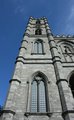
| 06/15/2010 05:14:27 AM |
Notre-Dame Basilica of Montrealby tholmirComment: The light looks very flat. It would look less flat if you moved more to the left so we could see two side of the building, one lit side and one shaded side. I would also back up some so there isn't so much distortion of the verticals. |
 Photographer found comment helpful. Photographer found comment helpful. |
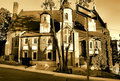
| 06/15/2010 05:03:48 AM |
One Way To Heavenby J-MeComment: I wish you would have popped a flash on the sign to make it stand out more. I didn't notice it until after I read the title. |
| Photographer found comment helpful. |
| 06/15/2010 05:02:18 AM |
|
| Photographer found comment helpful. |
| 03/26/2010 11:26:15 PM |
|
| Photographer found comment helpful. |
| 03/26/2010 11:24:57 PM |
|
| Photographer found comment helpful. |
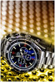
| 03/26/2010 11:24:02 PM |
OMEGA Seamaster Co-Axial Chronometerby hotpastaComment: This maybe sound nit-picky, but if this were shot for a company, it could lose you the job. The reason why the clock hands are usually placed on the three and the ten is because the hands shouldn't cover the brand name. Omega would not be happy if they were paying you and their name was covered up! Just saying : ) Very nice shot otherwise. |
| Photographer found comment helpful. |
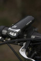
| 03/26/2010 11:23:35 PM |
Cat Eyeby JennieSComment: I wish there was a light back light/rim light to help separate the product from the background. That type of light will also appeal more to the tech people. |
| Photographer found comment helpful. |
| 03/26/2010 11:22:52 PM |
007 Limited Edition: Be as cool as James Bondby daevansComment: Do the number marks glow in the dark? Maybe you should have done a long exposure, setting off a strobe, then leaving the shutter open to expose the number marks just long enough to give them a little color and a hint of glow. Just a suggestion, of course! |
| Photographer found comment helpful. |
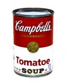
| 03/26/2010 11:19:59 PM |
Quayle Meets Warhol Soup - M'm! M'm! Good!by dahlinComment: Ha! Love it! I might have desaturated the blues a bit so that the silver of the can would be a bit more neutral. I'm not voting you down for that though! Maybe a little oversharpened? |
| Photographer found comment helpful. |
| 03/26/2010 11:19:25 PM |
|
| Photographer found comment helpful. |
Home -
Challenges -
Community -
League -
Photos -
Cameras -
Lenses -
Learn -
Help -
Terms of Use -
Privacy -
Top ^
DPChallenge, and website content and design, Copyright © 2001-2025 Challenging Technologies, LLC.
All digital photo copyrights belong to the photographers and may not be used without permission.
Current Server Time: 04/22/2025 05:59:31 PM EDT.