| Image |
Comment |
| 11/06/2014 12:00:34 PM |
|
 Photographer found comment helpful. Photographer found comment helpful. |
| 11/06/2014 11:59:56 AM |
Memorialby RgarciaComment: Would have been a much stronger image if you were centered (when you took the photo) and you cropped out the sides and top |
| Photographer found comment helpful. |
| 11/06/2014 11:58:19 AM |
|
| Photographer found comment helpful. |
| 11/06/2014 11:57:42 AM |
|
| Photographer found comment helpful. |
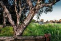
| 11/06/2014 11:56:13 AM |
Cape May Lighthouseby vladoComment: This would have been a wonderful image and in my top choices if not for two things. I can not decide which distracts more for me, the vignette or the boarder. Either one of them ruin what could have been a wonderful image. |
| Photographer found comment helpful. |
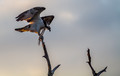
| 11/06/2014 11:54:18 AM |
ospreyby jimmyn4Comment: Wonderful capture and subject. My one bit of advice would be to brighten the area around the eye (Viveza from the NIK collection works great for this). Living things need the eye to be clearly visible and in sharp focus to draw you in, well that is how I feel. Overall the image is a little dark, enough to make you want it brighter but not enough to be a silhouette. |
| Photographer found comment helpful. |
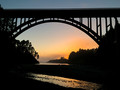
| 11/06/2014 11:50:38 AM |
Sunset Loversby BaldurTComment: Feel it would have been a stronger image if you had cropped out the sky above the bridge. Having it there makes my eye wander up to the brighter area at the top. |
| Photographer found comment helpful. |
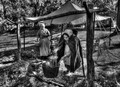
| 11/06/2014 11:49:21 AM |
The Conversationby rooumComment: wonderful subjects. I prefer my B&W with a bit more contrast tho, image feels a bit washed out. |
| Photographer found comment helpful. |
| 11/06/2014 11:48:22 AM |
The candle makerby RulerZigzagComment: A different crop, taking some off from the right would have made a much stronger image. Feel that the girl on the right is just a bit to centered for my taste. |
| Photographer found comment helpful. |
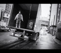
| 11/06/2014 11:47:22 AM |
|
| Photographer found comment helpful. |
Home -
Challenges -
Community -
League -
Photos -
Cameras -
Lenses -
Learn -
Help -
Terms of Use -
Privacy -
Top ^
DPChallenge, and website content and design, Copyright © 2001-2025 Challenging Technologies, LLC.
All digital photo copyrights belong to the photographers and may not be used without permission.
Current Server Time: 04/22/2025 03:10:37 PM EDT.