| Image |
Comment |
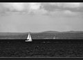
| 11/10/2011 07:42:23 PM |
Sailing Homeby BrianRComment: Not sure about this. While the three tones work well (very bright boats, very dark sea and midtone land/sky) the image lacks of definition and the framing is very static. I think cropping out most of the image left of the boat would give more the impression of directing home, particularly if the vassel was actually oriented more towards the shore. The blotchiness of the image is a bit of a let down. Challenge and basic editing aside, I think it would work better blurring the image and adding quite a lot of fake analog grain in photoshop or some other software. |
 Photographer found comment helpful. Photographer found comment helpful. |
| 11/10/2011 07:34:36 PM |
Steam Powerby dtallaksonComment: Nice texture. Maybe having the background a bit out of focus would have helped creating separation. Thsi way it looks almost painted rather than three dimensional. |
| Photographer found comment helpful. |
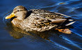
| 11/10/2011 06:56:29 PM |
Mallardby tvsometimeComment: I like the ripples a lot. Much less the hard shadows. It is a pity that the kind of angled light that makes for an interesting water surface also makes for a very extreme range. Maybe a bit of extra fill in flash could have helped lifting the shadows while keeping more detail in the highlights? |
| Photographer found comment helpful. |
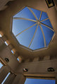
| 11/10/2011 06:49:57 PM |
Pointby LydiaComment: I like very much the shade in the sky, it adds depth. I hate the lamps, along with cctv cams are really a bane for architectural shots. Very good image. |
| Photographer found comment helpful. |
| 11/10/2011 06:45:24 PM |
|
| Photographer found comment helpful. |
| 11/10/2011 06:19:44 PM |
pomeriggio d' inattivitàby tangueraComment: Nice image. I feel a bit more fill light for the shadow and/or no blown highlights (particularly on the grapes, that shade of red whashes out quite easily when overexposing) would have improved the image. Also, I think the balance would be much better without the left arm in sight. Very nice light. |
| Photographer found comment helpful. |
| 11/10/2011 06:13:21 PM |
Kaitby PennyStreetComment: Nice high key, I love the tone. The black point and dense shadows work well here because of the subject tones and complexion. The hint of square in the background works very well in leading to the subject, much better than a uniform background would have. Is this a very subtle tritone or pure grayscale? |
| Photographer found comment helpful. |
| 11/10/2011 06:08:03 PM |
All rules should be edibleby hajekaComment: Funny :) What about a reflector on the right side and/or a diffuser to soften the shadows a bit? Also, I wonder how a 'from the top' angle would have worked. |
| Photographer found comment helpful. |
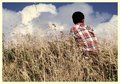
| 11/10/2011 05:57:26 PM |
Head in the cloudsby NeatComment: Nice idea. If there was wind, allowing for a slower shutter speed to blur the vegetation while keeping the subject sharp could have made for a different but still interesting image and enhance the feeling the boy is lost in his thoughts. |
| Photographer found comment helpful. |
| 11/10/2011 05:52:23 PM |
Blue Suede Shoes...by thrumyiisComment: Interesting, more detail in the highlights (e.g. underexposing for the flowers) would have helped, I think. Composition is good. |
| Photographer found comment helpful. |
Home -
Challenges -
Community -
League -
Photos -
Cameras -
Lenses -
Learn -
Help -
Terms of Use -
Privacy -
Top ^
DPChallenge, and website content and design, Copyright © 2001-2025 Challenging Technologies, LLC.
All digital photo copyrights belong to the photographers and may not be used without permission.
Current Server Time: 04/22/2025 03:16:42 PM EDT.