| Image |
Comment |
| 03/15/2006 12:16:53 PM |
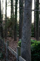
Fence1by CyndaneComment: Interesting seeing your comments - when I was looking at the thumbnail, the thought I had was "wow, that's framed really nicely" :-) |
 Photographer found comment helpful. Photographer found comment helpful. |
| 03/15/2006 12:16:32 PM |
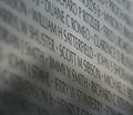
Remember2by CyndaneComment: With the grainy feel of the letters, it might have been nice to see the whole shot in focus - right now I feel like there are so many names there and I'm missing them all. The line on the right is a bit distracting. But as with the other shot, I like the angle. |
| Photographer found comment helpful. |
| 03/15/2006 12:14:52 PM |
Rememberby CyndaneComment: The angle and the focus give this shot a unique look. It seems like the focus ends very abruptly, which is a little overpowering for me, but overall it really works. |
| Photographer found comment helpful. |
| 03/15/2006 12:11:12 PM |
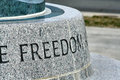
Freedomby CyndaneComment: Oh man, I just love stuff like this, with a word on a memorial or part of a statue or engravings on a wall.
I like the crop a lot. The blue at top left is intriguing without being distracting. The only thing I could see to improve is that maybe it would look better if you shot it from a lower angle? But I'm not sure about that, and that is nitpicky anyway. |
| Photographer found comment helpful. |
| 03/14/2006 11:55:47 PM |
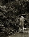
The Photographerby LucidLotusComment: I would have liked to see colors, and maybe a 3/4 angle on the person instead of strait from the back. But it's really nice overall. |
| Photographer found comment helpful. |
| 03/14/2006 10:24:20 PM |
|
| Photographer found comment helpful. |
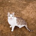
| 03/14/2006 06:23:53 PM |
Curiousby MadMan2kComment: A tighter crop would probably have made this more interesting. I like the background because the colors and "short lines" feeling matches the coloring of the cat, but as others have noted, the background is a bit overpowering. |
| Photographer found comment helpful. |
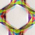
| 03/14/2006 06:20:36 PM |
Twist of colourby bluenovaComment: I like photos that are a bit more abstract, like yours. Great job taking an ordinary object (I am assuming napkin or papertowel) and making it look like art. |
| Photographer found comment helpful. |
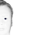
| 03/14/2006 06:18:00 PM |
Blue Eyeby birgirComment: I very much like this. Great focus, good use of color (or lack thereof) and attention to detail. I like the half face as that leaves more room for the background, bringing attention to the fact that the background and face are so alike. |
| Photographer found comment helpful. |
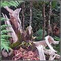
| 03/14/2006 06:15:09 PM |
Ancient Forrestby sherpetComment: As mentioned before, it looks oversharpened - makes it seem like a cardboard cutout to me. But I really like the earthy colors, and composition, except for the tree in the middle of the background "growing" from the stump in the middle. I think that takes away some of the depth, adding to the cardboard cutout look.
Edit:
Forgot to say that if you adjusted the angle so the tree doesn't seem attached to the stump, the stump would probably be at a less flattering angle. If that'd be the case, I think what you have done would be the better choice. Message edited by author 2006-03-14 22:27:46. |
| Photographer found comment helpful. |
Home -
Challenges -
Community -
League -
Photos -
Cameras -
Lenses -
Learn -
Help -
Terms of Use -
Privacy -
Top ^
DPChallenge, and website content and design, Copyright © 2001-2025 Challenging Technologies, LLC.
All digital photo copyrights belong to the photographers and may not be used without permission.
Current Server Time: 04/06/2025 10:17:18 PM EDT.