| Image |
Comment |
| 05/06/2007 08:08:10 AM |
Hiddenby RetroesqueComment: Interesting shot, I like the bright negative space above her, I think an interesting variaton may be to lighten up the bed cover she is leaning on and her bluse and gone more high key. Great detail in her hair and nice skin tones though.
Jack |
 Photographer found comment helpful. Photographer found comment helpful. |
| 05/06/2007 08:00:54 AM |
BananaTreeEmbraceby UrfaKComment: This one has a little too much going on for my taste, but the conversion looks very good. |
| Photographer found comment helpful. |
| 05/06/2007 07:49:06 AM |
Britney.jpgby robgs57Comment: Really nice tonal range, looks like you used on camera flash which tends to lose some natural contrast that exists with a differently lighting sceme. I'm not sure you can get that back in pp so in terms of that I think you've done a great job with the processing. Only other thought is that you caught her while she was talking and her mouth looks a bit in mid-postion.
Jack |
| Photographer found comment helpful. |
| 05/05/2007 09:44:39 AM |
Hold on to your hatby robgs57Comment: Great points in the comments here.. "brackgrounds make or break a picture" is right on and really summarizes why this is a good picture not a great one. The car is aproblem as are the white posts - you are right there tho.
Jack |
| Photographer found comment helpful. |
| 05/05/2007 09:41:09 AM |
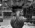
Fountain .jpgby robgs57Comment: great sharpness and range of tones. I think, as you can see, your kinda between on your shutterspeed, a little slower more blur faster of course more frozen and detail. Kinda depends on what your looking for but I guess I prefer more blur. The other suggestions are cropping below the top of the fountain bowel adds some mystery to the shot, and bluring the background or cloning out some of the benches and detail in the background.
Nice shot though, you are doing some very nice stuff, I really like your RofThirds challenge entry. Here it is for those that didn't see it

Jack |
| Photographer found comment helpful. |
| 05/05/2007 09:33:44 AM |
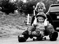
Some Adviceby robgs57Comment: Great shot, I really like these candid shots that capture a unique moment. You really nailed the focus, great clarity on the boy. In a perfect world it would be nice to have some of the background a bit blurry just to set him off, but otherwise a great shot. I just wanted to add a word about the lighting on his face which is really nice too.
Jack Message edited by author 2007-05-05 09:34:53. |
| Photographer found comment helpful. |
| 05/05/2007 07:37:06 AM |
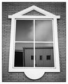
Day 5by edmengComment: Very nice, I really likke the tonal range, the sharpness and the contrast, including the contrast between the soft, diffuse image in the window and the roof/shingles, etc. To that end the reflection of the building seems somewhat out of place. The other comment is did you look at trying to improve the distortion due to the pov? Ideally since everything is squared off the window would be square too. Overall great vision, excellent B&W conversion, keep working on this it could be really specatular.
Jack |
| Photographer found comment helpful. |
| 05/05/2007 07:31:11 AM |
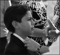
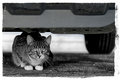
Day Four: CORNEREDby Art RoflmaoComment: I'd consider cropping down a bit, the bumper with the dark/bright areas and shapes tends to compete with your main subject. Beautiful clarity and great catch lights in the eyes.
Jack |
| Photographer found comment helpful. |
| 05/05/2007 07:28:34 AM |
Day Five: Catching Fliesby Art RoflmaoComment: Great capture, he is a natural! Very minor point, but his hand on the bottom is somewhat distracting. I really like his skin tones, perfect for a child.
Jack |
| Photographer found comment helpful. |
| 05/05/2007 07:26:12 AM |
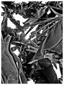
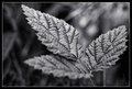
Day Six: Appena una piantaby Art RoflmaoComment: I like the framing and the high contrast really bringing out the detail in the leaves. The lighting here is fantastic. If I could change anything I would like a bit better dof on the leaves, the lowest is somewhat distracting since it's blurred. The background between the upper and R leaf is also somewhat distracting and would would be better if it were simpler and a bit darker. Finally the small blade of grass in the LL corner is somewhat intrusive (imo of course). Overall nice job,
Jack |
| Photographer found comment helpful. |
Home -
Challenges -
Community -
League -
Photos -
Cameras -
Lenses -
Learn -
Help -
Terms of Use -
Privacy -
Top ^
DPChallenge, and website content and design, Copyright © 2001-2025 Challenging Technologies, LLC.
All digital photo copyrights belong to the photographers and may not be used without permission.
Current Server Time: 04/23/2025 02:49:16 AM EDT.