|
|
| Image |
Comment |
| 01/16/2003 10:02:03 PM | Stand Tallby TurbotechComment: Nice framing with the trees and good use of the available light to catch the reflection. Nice rich colors in the scenery, a shame there is not the same richness in the tower. Good luck JG |  Photographer found comment helpful. Photographer found comment helpful. |
| 01/16/2003 09:59:43 PM | Serenityby lykofosComment: I love the contrast in textures of the water and stones. The composition is very good, and the dark rich colors of the trees on the left makes for a very striking picture. The sky does nothing for the picture, and distracts from the overall image. Still, you have have a very good eye for the natural beauty of your surroundings. Good luck. | | Photographer found comment helpful. |
| 01/16/2003 09:52:02 PM | Overlooking God's creationby Delta_6Comment: Less sky and more foreground, try the same shot and this time lay down on the ground and see what you'd get...I think you'll like the shot...Good luck | | Photographer found comment helpful. |
| 01/16/2003 09:43:00 PM | Lunada Bayby daysezComment: Almost a perfect 10. I love the picture. The couple could be anyone, the sky puts off just enough color not to be to detracting. The grass frames the people and the light reflecting off the grass is what puts this photo into the very special catagory. I ill definitely add this to my favorites. Why not a 10? The small patch of green at the foot of the man. Was it sun glare. A shame you could not touch it up. Good Luck 9.95 | | Photographer found comment helpful. |
| 01/16/2003 09:14:34 PM | Land, Sea, and Skyby kposeyComment: I don't know if you could have gotten closer to your subject, but much of the foreground is very distracting to the beauty of this picture. There is also several things on the right which are distracting as well. The lighting could also have been better. I'm sure you were trying to capture the sunset with the masts as your point of interest which is very eye catching and a beautiful sight. Good luck. | | Photographer found comment helpful. |
| 01/16/2003 08:25:27 PM | Ice House : Electric Blueby HBunchComment: Beautiful color, striking image, and the title and name of the band meets the challenge perfectly. Two things which might have improved the image...1st, photographs because of their very nature are flat. If you could have made the picture look three dimensional some how that may of helped. 2nd, If you were to have off-set the center of the electric flow, instead of having it in the middle, you would force the viewer's eye to travel around the picture more instead of just going to the center. Normally the longer someone looks at a picture the higher they will grade it. My suggestion would be to experiment on your own to see if these suggestions would improve the image in your own eyes. If so, then hopefully I was a help. Good luck in the future. JG | | Photographer found comment helpful. |
| 01/15/2003 03:55:52 AM | Beach Boys - Surfin' USA by byetkoComment: You've just taken first place and I'm suppose to critique this picture...One of the things I tell my class is, " If everyone was to take a picture of sunsets, or hands or what ever, only one or two would reach out and grab you as an outstanding picture." Yet everyone had the same topic to shoot, so why are some pictures just better than others? Composition, how the image fits on your paper, that's the key. Take away the person with the board in the foreground and your picture is not as good. Take away the pier and your picture would have been in the middle of the pack. What I'm saying is, Yes! you saw a beautiful sunset, but you also did a great job of composing your picture. Great job! You deserved the Blue Ribbon. In your photograph information you put down you shot the picture at 1/25th of a second, was that a typo? Should it have been 1/125? Just wondering. | | Photographer found comment helpful. |
| 01/14/2003 01:33:35 PM | Tulips from Amsterdamby johnmkComment: The flowers are beautiful, the idea excellent, but three things bother me about this picture. (1) The flowers are bunched together. (2)The majority of the flower are on the same level. (3)The lighting on the flowers, although good, could have been better. If you would have taken a few of the flowers out of the vase and placed the remaining ones at varying heights the viewers eye would have moved around the picture more. As it is, the eye follows the line of flowers down and off the page and we miss some of the intricate beauty that you captured. As far as the lighting is concerned, I assume you used available light. If so then it becomes even more important that you thin out the flowers for maximum use of the light. Pleased do not feel this critique is a cut-down of your work. You obviously put a lot of thought and effort into this photo and I,m just trying to make suggestions that might help in the future. JG | | Photographer found comment helpful. |
| 01/14/2003 01:07:13 PM | Blue Comet Bluesby lcamargoComment: Creativity is seldom rewarded, because the average person does not understand and cannot see anything but what lies before their nose. Your work is simple, yet elegant. I, for one, appreciate the thought behind the work almost as much as the work itself. Don't be discouraged because of others lack of creative processes. Continue and let those of us that appreciate what you do enjoy. :-)JG | | Photographer found comment helpful. |
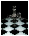
| 01/14/2003 12:49:16 PM | I'm Still Standing.......by agwrightComment: When I critique my students work I seldom give 10's. I feel perfection is almost impossible to achieve. Yet every once in awhile a photograph comes along that I feel is worthy of that elusive 10. Your work falls into that catagory. The lighting, contrast, elements of design, (perspective, point of view, shape and form, pattern, texture, and reflection), all add up to an outstanding photograph. Plus you met the challenge. But, being the person I am, I always try to see if I could make the picture better. I don't know if this is a good or bad fault. I would like you to try something...Instead of having the king centered squarely on the queen and at a 90 degree angle, could you possibly turn the king slightly towards the viewer and move it off center a little. I feel this would give it a more 3D effect. Non the less, a quality photograph and it should have been rated much higher than the 6.02 you received. (9.5) Sorry, I couldn't help myself | | Photographer found comment helpful. |
Home -
Challenges -
Community -
League -
Photos -
Cameras -
Lenses -
Learn -
Help -
Terms of Use -
Privacy -
Top ^
DPChallenge, and website content and design, Copyright © 2001-2025 Challenging Technologies, LLC.
All digital photo copyrights belong to the photographers and may not be used without permission.
Current Server Time: 03/12/2025 09:51:51 AM EDT.
|