| Image |
Comment |
| 07/23/2008 09:34:11 PM |
|
 Photographer found comment helpful. Photographer found comment helpful. |
| 07/01/2008 12:10:48 PM |
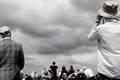
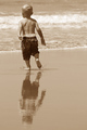
Sightingby spencerwoodComment: I'm not allowed to vote this challenge, as I'm only a registered member. Your image caught my eye as I was looking through the thumbnails. What a pleasant surprise when I opened the image. The leading lines send my eyes directly to the center of the image. I love how I'm left to my imagination to determine what everyone is trying to look at. Wonderful sighting on your part. Adding to my favorites.
Tim |
| Photographer found comment helpful. |
| 05/02/2008 08:00:01 AM |
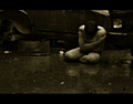
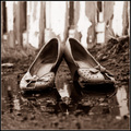
Tearby shoggyComment: Hello from the Critique Club,
I didn't vote the macro challenge so this is the first time I've seen your image. My first impressions are that the colors are wonderful, the lighting is well done, and the image meets the macro theme. For me there is too much out of focus area in the front of the image. Instead of providing a leading line to the water drop, it acts like a wall or barrier to my eye. However, I not a huge fan of the front out of focus images to begin with so I want you to be aware of this bias. If I had voted on this challenge I would have given you a 6 to start with for excellent execution of your idea and then compared it to the other submissions for creativity and possible bumping. Nicely done and a solid entry for this challenge.
Feel free to send me a PM if you have any questions regarding this critique.
Tim
|
| Photographer found comment helpful. |
| 05/02/2008 07:37:53 AM |
Strawberry timeby Rino63Comment: Hello from the Critique Club,
I didn't vote the macro challenge so this is the first time I've seen your image. My first impressions are that the lighting and composition are well done and the shallow depth of focus helps the strawberry look like it is coming out of the frame (slight 3D effect). Overall, it looks like a fairly standard set-up that the voters have seen many times. This would provide a "I could have easily shot that" feel instead of a "I wish I had thought of that" feel. I also think that your score suffered a little bit for not being "macro" enough. A very solid, technically strong image that might have scored closer to 6 if entered into current healthy food challenge.
Feel free to send me a PM if you have any questions regarding this critique.
Tim
|
| Photographer found comment helpful. |
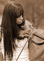
| 05/01/2008 08:13:42 AM |
Grandma's Fiddleby JammurComment: Back to comment and bump: The tonal range in the main subject is amazing. A slight curve adjustment would help separate the "fiddle" from the background a bit more. 9 |
| Photographer found comment helpful. |
| 05/01/2008 08:09:59 AM |
Splat... splat... splat...by VenomComment: Back to comment and bump: Love the title and the memories this image brings back. A slight curve adjustment would help separate the subject from the background a bit more. 9 |
| Photographer found comment helpful. |
| 05/01/2008 08:05:36 AM |
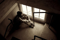
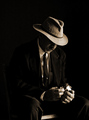
Some time to myself...by breadfan35Comment: Back to comment and bump: You did a nice job with the exposure and post processing on this image. Lots of nice angles to frame the subject and the lighting is dramatic and enhances the mode of the image. Hope there is enough sepia to get you a 6+ score in this challenge. Bump to an 8.
Back to bump again: I can't justify giving this any score less than a 10. This image has a very calming effect and has earned a spot in my favorites. |
| Photographer found comment helpful. |
| 05/01/2008 08:02:03 AM |
Out in the Coldby jodis_evaComment: Back to comment and bump: The creativity of this image earns it space in my favorites. Everything in this image works, the shallow depth of focus, the play between urban chic and urban decay. The sepia tone pushes this beyond what b&W could have achieved. Nicely done. Bump 10 |
| Photographer found comment helpful. |
| 05/01/2008 08:01:26 AM |
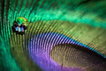
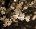
Dogwoodby banmornComment: Back to comment and bump: The sepia tone really enhances your image nicely. The composition is wonderful and the lighting was perfect to bring out all of the delicate details. Nicely done. 9 |
| Photographer found comment helpful. |
| 05/01/2008 07:59:11 AM |
mastersby tcmartinComment: Back to comment and bump: The lighting is expecptional and the sepia tone adds to the mood of the image. My only suggestion is to crop some off the top and left to strengthen the limited negative space on the right. 9 |
| Photographer found comment helpful. |
Home -
Challenges -
Community -
League -
Photos -
Cameras -
Lenses -
Learn -
Help -
Terms of Use -
Privacy -
Top ^
DPChallenge, and website content and design, Copyright © 2001-2025 Challenging Technologies, LLC.
All digital photo copyrights belong to the photographers and may not be used without permission.
Current Server Time: 04/12/2025 01:15:22 AM EDT.