| Image |
Comment |
| 12/29/2006 02:11:53 PM |
dream abandonedby MichaelCComment: I really feel that this would have been so much more moody and effective without the heavy processing and layers. It could have been left more "real" to have greater impact, instead of becoming a type of cartoon - "Dream" and "Harsh" seem to me at odds with each other.Sorry, I know I am coming from a position of anti-high definition photos, and this is very subjective. |
 Photographer found comment helpful. Photographer found comment helpful. |
| 12/29/2006 08:08:59 AM |
|
| Photographer found comment helpful. |
| 12/29/2006 08:07:43 AM |
|
| Photographer found comment helpful. |
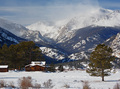
| 12/29/2006 08:04:24 AM |
Winter Refugeby hahn23Comment: Very beautiful...not sure it screams "harsh environment" at me...? |
| Photographer found comment helpful. |
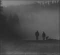
| 12/29/2006 08:02:15 AM |
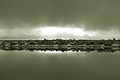
Into the Fogby aberrationComment: I absolutely love this: I can almost hear that silence that hangs around in the fog. The desaturation works so well (if in fact you did desat)...because it emphasises how fog desaturates the world: stripping it of colour,light and sound. |
| Photographer found comment helpful. |
| 12/29/2006 07:57:13 AM |
Bone Yardby xianartComment: I'm just going to go right out and say it: these extremely long thin images just don't work for me in a challenge situation: after paging through images that fill the page with big bold beautiful pictures, a long skinny, is a shock to the system which has been mesmerised up to that point. Now suddenly I've got to lean in close to the screen and scroll up and down because I can only see part of the image at a time, and so ultimately I get to see an image about 1/8 the size of the rest.
Having said that: I think your subject and composition are brilliant...if this had been a large square image it would have had so much impact. |
| Photographer found comment helpful. |
| 12/29/2006 07:49:07 AM |
|
| Photographer found comment helpful. |
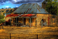
| 12/29/2006 07:45:30 AM |
Delapidatedby hotpastaComment: It's dilapidated all right, but the High Definition has smothered all that lovely patina and it's ended up being dreamlike and surreal, and not gritty or harsh at all. The blur also makes it difficult to see what's going on in terms of perspective. I can't make out if the "vehicle wheel" sign is in the distance or part of the wall alongside the red corrugated iron. |
| Photographer found comment helpful. |
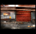
| 12/29/2006 07:38:22 AM |
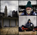
In the Bowels of the Cityby timfythetooComment: Fantastic subject and I like the way you've collaged the images to create a real story/full picture of the guy's life. Great idea to use the crumpled paper technique too...like a tatty piece of newspaper litter. 10 |
| Photographer found comment helpful. |
| 12/29/2006 05:19:04 AM |
|
| Photographer found comment helpful. |
Home -
Challenges -
Community -
League -
Photos -
Cameras -
Lenses -
Learn -
Help -
Terms of Use -
Privacy -
Top ^
DPChallenge, and website content and design, Copyright © 2001-2025 Challenging Technologies, LLC.
All digital photo copyrights belong to the photographers and may not be used without permission.
Current Server Time: 04/23/2025 12:57:24 PM EDT.