| Image |
Comment |
| 11/15/2006 12:26:24 PM |
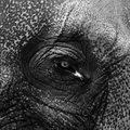
Spot the Spotsby TimComment: Very nice B&W work - but I wish the composition had been less centered. |
 Photographer found comment helpful. Photographer found comment helpful. |
| 11/15/2006 12:24:34 PM |
|
| Photographer found comment helpful. |
| 11/15/2006 12:23:52 PM |
|
| Photographer found comment helpful. |
| 11/15/2006 12:20:10 PM |
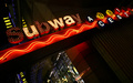
u waby LN13Comment: Neat... (Would have done well in the Neon challenge as well I believe) |
| Photographer found comment helpful. |
| 11/15/2006 12:19:10 PM |
|
| Photographer found comment helpful. |
| 11/15/2006 12:18:38 PM |
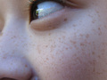
Frecklesby helloiloveyouuComment: I'm not crazy about your cropping but like the concept. A little more contrast would lift the picture I think. |
| Photographer found comment helpful. |
| 11/14/2006 02:30:45 AM |
|
| Photographer found comment helpful. |
| 11/13/2006 07:12:28 PM |
|
| Photographer found comment helpful. |
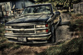
| 11/13/2006 11:46:49 AM |
chevyby arsenalComment: Overdone by a large margin IMO. Looks more like a paintbrush painting than a photograph... |
| Photographer found comment helpful. |
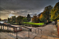
| 11/13/2006 11:44:24 AM |
Market Streetby MAKComment: I think you should have held back just a little on your HDR conversion here - it's still nice, but I would have rated it a little higher if it wasn't overdone like this. |
| Photographer found comment helpful. |
Home -
Challenges -
Community -
League -
Photos -
Cameras -
Lenses -
Learn -
Help -
Terms of Use -
Privacy -
Top ^
DPChallenge, and website content and design, Copyright © 2001-2025 Challenging Technologies, LLC.
All digital photo copyrights belong to the photographers and may not be used without permission.
Current Server Time: 04/22/2025 11:36:40 PM EDT.