| Image |
Comment |
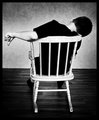
| 09/28/2010 07:03:56 PM |
Solitude Is Blissby fotofanComment: Simple but effective pose. I like the lighting especially with the catch lights in the eyes |
 Photographer found comment helpful. Photographer found comment helpful. |
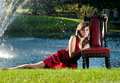
| 09/28/2010 06:59:33 PM |
My Little Princess Grown Upby jomernerComment: great image. Its almost taking on too much however with the fountain in the background. I think simpler would be the way to go here. |
| Photographer found comment helpful. |
| 09/28/2010 06:58:35 PM |
|
| Photographer found comment helpful. |
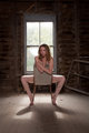
| 09/28/2010 06:58:12 PM |
forgottenby jbrobesonComment: simple, elegant and procative. Nice choice of environment and great lighting. |
| Photographer found comment helpful. |
| 09/28/2010 06:57:29 PM |
Passionby gyabanComment: I like the dramatic pose which is complemented by the tie. Too bad his hair wasn't looking like it was blowing :) Message edited by author 2010-09-29 01:50:13. |
| Photographer found comment helpful. |
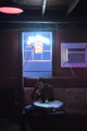
| 09/22/2010 01:42:38 AM |
Bourbonby wyverndragonComment: Wow...this scene has so much potential but sooo many pitfalls to overcome. I think the first item of interest is the Jack Daniels sign. We want that nice and clear. Its a little overexposed and fuzzy. If you shot this with a smaller aperture (I am guessing you shot this wide open) and actually under exposed a bit we'd see the colors better and it would be clearer and a lot sharper.
The light from the sign is spilling nicely onto the table. Again, underexposing a little bit would allow those colors to come through better.
The subject? Well..he's soft and I think thats just because of missed focus. Unfortunately he's too under exposed and if we under expose everything else he'll be even more so. (See what I mean by pitfalls?) So we can't rely on the ambient light to light him up. We might be able to reflect some of the sign's light at him but I don't think its going to be enough. So we need flash. It doesn't need to be a lot but just one flash shaped to just light him and bench a bit then fall off. We definitely don't want it to hit the table because that would kill those cool colors that are reflecting off the edge of it. Maybe we gel the flash to warm it up and get a nice contrast to the cool light from the sign.
The ceiling light could go. Maybe crop it out because its not really adding anything to the scene. I wish we could get rid of that air conditioning unit but its photography not home renovation after all :)
I'd have to say that this was definitely a shot worth trying and maybe even revisiting. |
| Photographer found comment helpful. |
| 09/20/2010 04:41:57 PM |
|
| Photographer found comment helpful. |
| 09/20/2010 10:50:38 AM |
Free Spiritby ThingFishComment: Well I have to say that I like it enough to add it my favorites. It does evoke an emotional response and I think that should always be one of our goals as photographers. |
| Photographer found comment helpful. |
| 08/26/2010 04:51:23 PM |
Bike-Tacoby CoryComment: A buddy of mine took my bike over a double at the BMX track and only made it over the first jump. He slammed into the second jump straight on. My front tire was bent but nothing like this. And that was with a cheap Canadian Tire bike... |
| Photographer found comment helpful. |
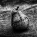
| 08/23/2010 06:43:43 PM |
The Reconstructed Pear by VitaminBComment: oh...I meant to put this in my previous comment. Is it possible to see the color version w/o editing? Just curious about the monochrome conversion. |
| Photographer found comment helpful. |
Home -
Challenges -
Community -
League -
Photos -
Cameras -
Lenses -
Learn -
Help -
Terms of Use -
Privacy -
Top ^
DPChallenge, and website content and design, Copyright © 2001-2025 Challenging Technologies, LLC.
All digital photo copyrights belong to the photographers and may not be used without permission.
Current Server Time: 04/01/2025 11:25:04 PM EDT.