| Image |
Comment |
| 10/13/2009 12:58:55 PM |
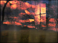
eye in the skyby skewsmeComment: Like your sense of composition, and the concealment of those little secret moments works well; I wonder if, for such a complex and fractured image (in a good way), a little reduction of the overall dynamic range might not make it more accessible? Allow a little stronger a sense of reality, and the chaos of the funky reflections and so on will still prevail? |
 Photographer found comment helpful. Photographer found comment helpful. |
| 10/13/2009 12:53:15 PM |
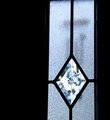
Chimesby snafflesComment: Intriguing sense of the graphic; not sure if it's to my taste, but made me think at least. The high contrast vibe is certainly up my street, but there's a sense that, in such a regimented and basically rectilinear composition, the distortion of a slightly obtuse angle of shot is undermining your intent. Maybe that was a sense of conflict you were after, but maybe also it isn't carried out well enough to have proper impact. |
| Photographer found comment helpful. |
| 10/13/2009 12:50:46 PM |
|
| Photographer found comment helpful. |
| 10/13/2009 12:50:07 PM |
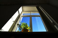
office viewby kolasiComment: Now this intrigues - has a sense of hyper-realist painting, more so because of the great point of view. I really like the geometric structure of that frame , almost like a square spiral. Neatly done. |
| Photographer found comment helpful. |
| 10/13/2009 12:42:19 PM |
Somebody's Watching Meby colorcarnivalComment: I quite like the threat level, although the slightly noir cliché aspect of it is undermining things. The wacky low level tonality is pretty cool though. |
| Photographer found comment helpful. |
| 10/13/2009 12:40:50 PM |
Mrs. M's Cakesby SiouxComment: I think your framing is squeezing your subject here - to the extent that I thought I'd scrolled down too far and cut off the top of the image. Quite well executed as a shot, but lacks real punch - as a window display it's quite cluttered, and your photo hasn't really done anything to reduce that, or to add any dynamic. |
| Photographer found comment helpful. |
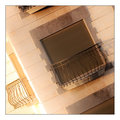
| 10/13/2009 12:38:45 PM |
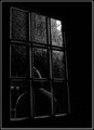
Inward against unforgiving blindsby HighNoonerComment: Whilst the technical stuff is all spot on - faultless, one might almost say - the subject, the fact that I'm thinking 'why show this to me?' and not finding an answer that makes me want to look longer, is the down-side. That, and the tilt that I'm struggling with comspositionally. |
| Photographer found comment helpful. |
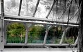
| 10/13/2009 12:36:13 PM |
Glasshouseby PaulComment: Not doing a whole lot for me, is this: mainly because the desaturation seems wholly arbitrary. Looks like a cool greenhouse though, so to speak. |
| Photographer found comment helpful. |
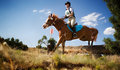
| 09/03/2009 07:11:59 AM |
Landingby RistyzComment: There's a strange sense of surveillance in this shot - probably simply from the extreme foreground stuff on the left - just makes it feel like you were hiding. Nice contrast, and nice timing - having the horse moving into the lighter area of sky is a good move, giving you your dynamic. Good colour tone too, and balance of details in both highlights and shadows without the often dumb results of high dynamic range software. A couple of things stop it being a real high-impact shot for me: a slight clumsiness in cropping/framing - unsure about the tree on image right, and the presence of the red sign is a pity, as it visually interferes with the organic flow of the horse's head. |
| Photographer found comment helpful. |
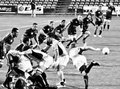
| 08/28/2009 04:30:05 AM |
Wheres it goingby keriboiComment: Not bad at all - and it stopped me from the thumbnail, so that's a good sign. A couple of things let the image down, in my opinion, when one gets to 'full size': the crop (or possibly angle of view) just leaves everything too close to the edges - the left wing, the ruck (especially the player who appears to be smiling at someone out of frame), and indeed the ball. Like the black and white though, you've avoided the mistake that a lot of people make of having too much grey. |
| Photographer found comment helpful. |
Home -
Challenges -
Community -
League -
Photos -
Cameras -
Lenses -
Learn -
Help -
Terms of Use -
Privacy -
Top ^
DPChallenge, and website content and design, Copyright © 2001-2025 Challenging Technologies, LLC.
All digital photo copyrights belong to the photographers and may not be used without permission.
Current Server Time: 04/02/2025 07:23:11 PM EDT.