| Image |
Comment |
| 03/06/2006 11:49:36 AM |
lost in thought...by IreneMComment: Greetings from the Critique Club...
Hi IreneM :)
I think this is an excellent character portrait of your husband. The mood you were trying to convey came out nicely, especially in the duotone. The tones you chose work very nicely in this image. It seems like all of your comments are rather positive, but the image didn't score much above average, and I think I can probably tell you why, to some degree. Portraits of any kind have a very difficult time connecting with viewers who aren't associated in some way with the subject. I don't 'know' your husband, so it does make it difficult for me to really connect with the portrait. As a disconnected viewer, I need something very special in the portrait that jumps out and grabs me in order for me to make a connection that moves me with strong emotion.
I think your composition and technicals here are excellent and woudln't change anything about them...
Nice work :)
John Setzler
|
 Photographer found comment helpful. Photographer found comment helpful. |
| 03/05/2006 09:20:31 AM |
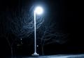
A Walk in Blueby LedZeppelin588Comment: Greetings from the Critique Club...
My critiques consist of commentary on specific elements of photographs that I look for in other images, as well as my own. All of these items will not apply to every photograph, and I will indicate that if it applies to yours.
Your Score
This photo scored rather poorly in the challenge. In my opinion, there is simply nothing of interest in the image. The mood you may have been trying to convey just didn't come through due to the lack of interest in the subject.
Meeting the Challenge
The image meets the challenge but doesn't go much beyond that.
Subject Choice
I believe the subject choice here is very weak. As I stated above, there is nothing of particular interest to look at in the scene.
Emotive value / Emotional Impact
This photo doesn't score any points from me in this area either.
Composition
I don't believe the composition of this photo matters. In a perfect world, the lamp post would not be positioned as close to the center as it is, but it doesn't really matter here. Not many people will get past the lack of subject to even evaluate the composition.
Technicals
I don't think there is anything wrong with this image technically.
Creativity
There may be some element of creativity in this image if you are a beginning photographer. Working a long exposure on a tripod is a good learning tool.
Additional Notes
Spend some more time thinking about how a viewer will perceive your photo before you post :)
|
| Photographer found comment helpful. |
| 03/04/2006 01:14:54 PM |
Father and Sonby LadyLuna22Comment: Greetings from the Critique Club...
Hi LadyLuna22 :)
This photograph scored rather poorly in the greater scheme of the challenge. I believe that many of your comments sum up the reasons quite well. The lighting is rather weak and uninteresting. The tonality in the image isn't very expansive either... it's rather flat.
Maybe a good critique of this image would start with a question to you. If this wasn't your own photo, how would you feel about it? Since the subject(s) of this image have a different level of appeal to you personally, it's hard to look past that. You have a personal connection with the subjects that no one else here has.
You definitely need to do some experimenting with light. I'm guessing that this is lit with the on-camera flash, which isn't creating a great moood for the photo... |
| Photographer found comment helpful. |
| 03/04/2006 11:14:21 AM |
Snow Addictionby bseifipourComment: Greetings from the Critique Club...
This photo meets the challenge but it doesn't seem to have any special interest subjectively or in technique. I can't really find much in this image that grabs my interest. There is nothing really wrong with the image. The composition and technique are ok, but there is just no real appeal to me in the subject. I can't really offer you much more than the idea that the 'idea' itself is just weak.
John Setzler
|
| Photographer found comment helpful. |
| 03/03/2006 06:21:01 PM |
Silhouette_in_Blackby phayanakComment: Greetings from the Critique Club...
I think this is an excellent image but I don't think the border you chose for it works particularly well. The white at the top leaves 'holes' in the overall composition. A black border would have done the same thing at the bottom of the image. There is a nice median that you may wish to try on something like this though. You could possibly create a 2 pixel white border around the original image and then add a black border. This would give you the separation you need. You could also reverse that idea and use a thin black border with white padding as well...
|
| Photographer found comment helpful. |
| 03/03/2006 06:01:27 PM |
Young manby gadjikanoComment: Greetings from the Critique Club...
If you request a critique from the critique club, you should always fill out your 'Photographer's Comments' field when you submit your photo. When you don't include your own thoughts on the image, you can't really expect someone else to give their time and effort to give you a critique. It makes me think that you don't care enough about your own photo to take the time to post your thoughts on it...
This photo seems to have received a mediocre score in the greater shceme of the challenge. It has no real issues other than being a little flat in tonality. This particular composition is a bit stereotypical these days. It doesn't really strike me as unique or flattering to your subject in any way. It doesn't create much of a mood or emotion in me as I view it. |
| Photographer found comment helpful. |
| 03/03/2006 04:10:49 PM |
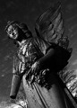
Vigil.by NospeakComment: Greetings from the Critique Club...
First of all, I think it's important that you include your camera settings when requesting a critique. That information is beneficial to me when offering you suggestions on how to improve your work :)
I think this is an excellent subject for a black and white photo. I also applaud the camera tilt. I do that quite frequently myself to create imbalance and added dynamics. This particular subject seems to have a lot of smaller composition opportunities within the field of view you have presented here as well.
Per your notes, I believe you were going for a dark sky effect, and it seems to have worked out to some degree, but I believe the rest of the image may be slighly underexposed by the methods you chose to achieve that effect. The highlights are almost there, but not quite. You may be able to improve this effect by using a polarizer. The polarizer will darken the sky without much loss on the existing highlights in the scene... |
| Photographer found comment helpful. |
| 03/03/2006 08:44:48 AM |
Formalities Asideby O'HolleranComment: Greetings from the Critique Club...
If you request a critique from the critique club, you should always fill out your 'Photographer's Comments' field when you submit your photo. When you don't include your own thoughts on the image, you can't really expect someone else to give their time and effort to give you a critique. It makes me think that you don't care enough about your own photo to take the time to post your thoughts on it...
The lighting on this image needs some help. The color tones are a little bland for my taste. I also think the composition is a little too tight overall, but I'm definitely no source on this type of photography. The image also appears to be slightly soft. Some additional sharpness would be excellent in this photo. |
| Photographer found comment helpful. |
| 03/02/2006 02:49:17 PM |
Giorgio Armaniby sangeethComment: Greetings from the Critique Club...
This is definitely an interesting photograph and well executed considering it's a basic editing challenge. I like the whole concept you present here, but I don't think it really meets the challenge. I do, however, believe that the challenge title and description for "Fashion" are a bit ambiguous and contradictory. In my personal experience, fashion photography usually involves models (people) being used to showcase clothing, jewelry, and accessories. What you have presented here is more along the lines of product photography than fashion photography. The score you received is not bad though.
Nice work :) |
| Photographer found comment helpful. |
| 03/01/2006 11:03:28 PM |
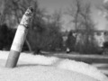
A new pastimeby beggsComment: Greetings from the Critique Club...
Hi Beggs :)
There is nothing particularly wrong with this photo as far as composition and execution is concerned. It also meets the challenge. Where I think this photo failed is simply by the fact that it doesn't show any particular strength in the realm of photography itself. There is nothing about it that has visual impact. It doesn't stir any real emotion in me as a viewer. I find myself using this type of comment quite frequently. I may start to sound like a broken record, but I believe that meeting the challenge alone is simply not good ground work for building a great challenge score.
I never owned an Atari. Lots of my friends had Atari and I really wanted one. I managed to bypass the Atari craze and I got an Intellivision. At the time, Intellivision was much better than Atari, but that was soon followed by Colecovision, which was better yet :) |
| Photographer found comment helpful. |
Home -
Challenges -
Community -
League -
Photos -
Cameras -
Lenses -
Learn -
Help -
Terms of Use -
Privacy -
Top ^
DPChallenge, and website content and design, Copyright © 2001-2025 Challenging Technologies, LLC.
All digital photo copyrights belong to the photographers and may not be used without permission.
Current Server Time: 04/21/2025 06:24:02 AM EDT.