| Author | Thread |
|
|
03/06/2006 11:49:36 AM |
Greetings from the Critique Club...
Hi IreneM :)
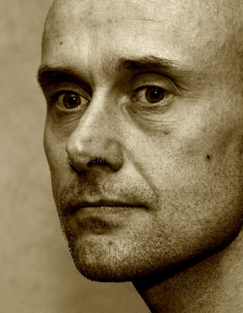
I think this is an excellent character portrait of your husband. The mood you were trying to convey came out nicely, especially in the duotone. The tones you chose work very nicely in this image. It seems like all of your comments are rather positive, but the image didn't score much above average, and I think I can probably tell you why, to some degree. Portraits of any kind have a very difficult time connecting with viewers who aren't associated in some way with the subject. I don't 'know' your husband, so it does make it difficult for me to really connect with the portrait. As a disconnected viewer, I need something very special in the portrait that jumps out and grabs me in order for me to make a connection that moves me with strong emotion.
I think your composition and technicals here are excellent and woudln't change anything about them...
Nice work :)
John Setzler
|
|
 Photographer found comment helpful. Photographer found comment helpful. |
Comments Made During the Challenge  |
|
|
02/27/2006 02:07:14 PM |
| So basic ...yet so very effective. |
|
| Photographer found comment helpful. |
|
|
02/26/2006 03:26:07 PM |
| Wonderful portrait and very good use of duotones. |
|
| Photographer found comment helpful. |
|
|
02/26/2006 02:25:06 PM |
| Really good crop/composition on this one. |
|
| Photographer found comment helpful. |
|
|
02/26/2006 01:14:22 PM |
| Very nice character study exhibiting great use of tinting. 7 |
|
| Photographer found comment helpful. |
|
|
02/25/2006 10:18:47 PM |
| Very natural, sharp and well done. Like the expression you captured. Hope this does well for you. 10 |
|
| Photographer found comment helpful. |
|
|
02/25/2006 04:19:38 PM |
|
| Photographer found comment helpful. |
|
|
02/24/2006 10:42:08 AM |
| Beautiful composition, detail, tonality. Wonderful unobtrusive, yet not totally plain background. Title fits, too. I think my only thing is that the focus is just a little bit off on the eyes, which are usually so important for a portrait. I wonder if advanced editing outside of the challenge could help you apply some additional focus to the eyes and change this from a good to a great photo. I would also crop just a bit more off the top. Small stuff though, I like this shot! |
|
| Photographer found comment helpful. |
|
|
02/23/2006 10:49:21 AM |
| Great detail in the face. TOnal range is excellent. Position of the head plays well with the light. |
|
| Photographer found comment helpful. |
|
|
02/22/2006 07:16:39 PM |
| More catchlights would have really made this come alive. Nice conversion tho. |
|
| Photographer found comment helpful. |
|
|
02/22/2006 04:02:46 PM |
| i dont care for green on a face |
|
|
|
02/22/2006 03:12:28 PM |
| sad thoughts - very expressive eyes |
|
| Photographer found comment helpful. |
|
|
02/22/2006 01:45:33 PM |
| i like how you captured such a sincere expression. the eyes say it all. your use of sepia also complements his facial hair and skin tone. |
|
| Photographer found comment helpful. |
|
|
02/22/2006 01:35:18 PM |
| Great detail and a really nice job maintaining a full tonal range with the sepia conversion. |
|
| Photographer found comment helpful. |
|
|
02/22/2006 04:39:18 AM |
| excellent portrait, good colour choice. |
|
| Photographer found comment helpful. |
Home -
Challenges -
Community -
League -
Photos -
Cameras -
Lenses -
Learn -
Help -
Terms of Use -
Privacy -
Top ^
DPChallenge, and website content and design, Copyright © 2001-2025 Challenging Technologies, LLC.
All digital photo copyrights belong to the photographers and may not be used without permission.
Current Server Time: 03/12/2025 03:47:27 PM EDT.