| Image |
Comment |
| 05/03/2008 12:07:49 PM |
Reposeby MichaelCComment: Simple but elegant! I like the plain background here. She seems to be lost in her own little world for the time being. I like how she seems to be holding a necklace or locket hanging around her neck. -BB |
 Photographer found comment helpful. Photographer found comment helpful. |
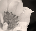
| 05/03/2008 11:49:28 AM |
A Rose for Grandmaby 777STANComment: This feels almost too much like a B&W to be sepia.
If you could've added a little red and taken out some blue it would've had just a touch more "tan/brown/sepia" color to it. -BB |
| Photographer found comment helpful. |
| 05/03/2008 11:46:07 AM |
Flower Girlby timfythetooComment: Aww, you have a very pretty model. She looks so pleasant lying in the grass amongst the flowers. I don't actually have much of a critique for this image sorry. -BB |
| Photographer found comment helpful. |
| 05/03/2008 11:04:30 AM |
|
| Photographer found comment helpful. |
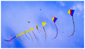
| 05/03/2008 11:02:05 AM |
Big Boys Kiteby JimiRoseComment: Kites are GOOD! Your's is a little bigger than mine. I like seeing the other kites in the background also. They're a little distracting but in a good way.
My eyes follow the string from the top right down to the lower left. Then can go up to the three above and lastly to complete a figure 8 in the image to end up on the little blue kite in the lower right-hand corner. Nicely done -BB |
| Photographer found comment helpful. |
| 05/03/2008 10:56:39 AM |
Spassky vs Fishcer 1972by vladoComment: With only the pawn in focus the overall image feels really fuzzy and all of the pieces feel like they are leaning a little to the right. -BB |
| Photographer found comment helpful. |
| 05/03/2008 10:55:00 AM |
Surprisedby wei1108Comment: I like her expression. It's a classic! lol. Your overall coloring feels a little soft. The colors could be a little brighter to help emphasize the "children" here. -BB |
| Photographer found comment helpful. |
| 05/03/2008 10:52:14 AM |
New Rules; I Win.by StreamtmComment: Feels a little too grainy and I'm a little confused as to what the chrome colored bar coming out of the right side of the frame is. -BB |
| Photographer found comment helpful. |
| 05/03/2008 10:50:22 AM |
:: Games are Fun ::by jprezantComment: The way your tiles are set up I want to read it like "Agrae mfeusn". I wonder if you could've set the tiles a couple rows farther apart if we could differentiate between the words easier? -BB |
| Photographer found comment helpful. |
| 05/03/2008 10:47:25 AM |
Poker Faceby meneleComment: I like his smirk. One little touch that might've turned out cool would be to allow the cards to be reflected in his glasses. Maybe have an Ace or Pair of Kings reflected? -BB |
| Photographer found comment helpful. |
Home -
Challenges -
Community -
League -
Photos -
Cameras -
Lenses -
Learn -
Help -
Terms of Use -
Privacy -
Top ^
DPChallenge, and website content and design, Copyright © 2001-2025 Challenging Technologies, LLC.
All digital photo copyrights belong to the photographers and may not be used without permission.
Current Server Time: 04/12/2025 06:18:45 AM EDT.