| Image |
Comment |
| 05/31/2004 12:44:18 AM |
|
 Photographer found comment helpful. Photographer found comment helpful. |
| 05/31/2004 12:43:43 AM |
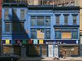
Three Blue Buildingsby BikeRacerComment: Very nice! It's rare when you see blue buildings let alone THREE of them right next to each other! Are you sure you didn't photoshop them? :)
Nice job getting three people in the same frame, too! Shame there aren't three cars! 9 |
| Photographer found comment helpful. |
| 05/31/2004 12:41:17 AM |
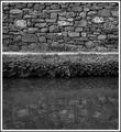
Signedby instepsComment: Very nice b/w photo. Crisp details of the stone wall and even of the plants along the water. Contrast is nice and even. I would have cropped more of the water out so you have just a bit of it showing but I know you probably wanted to show the graffiti in the water. Also, the border is a bit busy for my tastes. |
| Photographer found comment helpful. |
| 05/31/2004 12:37:34 AM |
|
| Photographer found comment helpful. |
| 05/31/2004 12:32:05 AM |
|
| Photographer found comment helpful. |
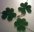
| 05/31/2004 12:29:41 AM |
Theee leaf Cloversby TikicharmComment: Clovers appear to be unfocused and lighting is harsh on the foam(?) surface and flat on the clovers. |
| Photographer found comment helpful. |
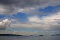
| 05/31/2004 12:27:44 AM |
Ships IIIby ellamayComment: Excellent use of negative space for this challenge. Good job cropping, too. Sharp details of the clouds. At first, I didn't see three ships in the thumbnail but I was impressed when I actually saw the photo. Only thing I would change: make the ships a bit larger next time. Good job! 9 |
| Photographer found comment helpful. |
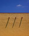
| 05/31/2004 12:22:52 AM |
Shadowsby rickhd13Comment: Very nice architecture shot. Nice deep blue for the sky and vibrant tan color of the wall and excellent details of the stucco, as well. Only thing I would do is crop a smidge off the bottom and it would be perfect. 8 |
| Photographer found comment helpful. |
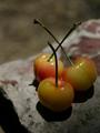
| 05/31/2004 12:21:07 AM |
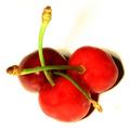
Hard Rock Cherriesby pmichaudComment: Nice macro setup. Lighting is too direct from above causing uneven lighting along the bottom half of the cherries. The dark shadow in the lower left is distracting and should have been cropped out. |
| Photographer found comment helpful. |
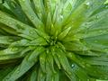
| 05/27/2004 02:59:04 AM |
Lilyby melismaticaComment: I agree that the first attempt is much nicer in terms of lighting and focus. This is an interesting macro subject so keep exploring! :) |
| Photographer found comment helpful. |
Home -
Challenges -
Community -
League -
Photos -
Cameras -
Lenses -
Learn -
Help -
Terms of Use -
Privacy -
Top ^
DPChallenge, and website content and design, Copyright © 2001-2025 Challenging Technologies, LLC.
All digital photo copyrights belong to the photographers and may not be used without permission.
Current Server Time: 04/22/2025 03:26:29 PM EDT.