| Image |
Comment |
| 11/23/2009 05:05:36 AM |
|
 Photographer found comment helpful. Photographer found comment helpful. |
| 11/21/2009 06:40:58 AM |
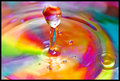
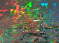
Mr. Rainbowby bnileshComment: Nice try but the big drop lacks definition, looks like you were not able to completelly stop the action or get the right focus on the drop. Colors on the background are cool but the big drop would be much more cooler if you could make it sharp and with colors appearing clearly on it. The background don't need to be sharp. 4. |
| Photographer found comment helpful. |
| 11/20/2009 10:20:05 PM |
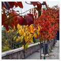
Rainbow on the earthby Rino63Comment: The focus only on the foreground leaves is no good. When I see the image I take some time to find what's is the subject and then I suppose you want it to be the foreground leaves because they are the only thing which is in focus. Lacks composition, focus and sharpness. 3. |
| Photographer found comment helpful. |
| 11/20/2009 10:16:36 PM |
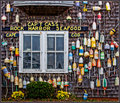
The Fishmonger's Wallby Bear_MusicComment: Those things in the wall look over exposed or washed. THe composition looks good, however I'm asking myself what you want me to see or feel with this image. It lacks interest. 4. |
| Photographer found comment helpful. |
| 11/20/2009 10:14:47 PM |
Crayon rainbowby tinkie2010Comment: Increasing from 3 to 4. It's well executed considering the lighting, the focus. But I don't like the composition, nor the choose of colors, nor the format of the extremity of the crayons. 4. |
| Photographer found comment helpful. |
| 11/20/2009 10:09:38 PM |
Rainbow Galaxyby KarenNfldComment: There should be more of the big drops that are sharp in the right. More than 50% of the photo looks OOO or softer than I like (drops from green to red). The composition lacks interest and impact. 3. |
| Photographer found comment helpful. |
| 11/20/2009 10:07:14 PM |
Pete'sby dswannComment: The composition is not good for me. The stairway detracts my attention. The overall feel is not very impacting. 4. |
| Photographer found comment helpful. |
| 11/20/2009 10:05:30 PM |
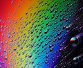
Concoction of Colorby Keith_WComment: I've given 4 before, but have increased it to 5 now that I'm commenting. The drop stands out from the rest of the picture and looks very good. The remaining of the picture however looks washed or artificially over exposed. 5. |
| Photographer found comment helpful. |
| 11/20/2009 10:03:10 PM |
Memoriesby kleskiComment: Noisy on the cyan and green part. A bit of Neat Image should cure it. The composition is good, the colors cause impact, but what is it at all? For me it is more of a color demonstration or an image painted using the gradient fill on the computer than a photograph. I'm curious anyway to know what is this. The title is good. 4. |
| Photographer found comment helpful. |
| 11/20/2009 09:56:32 PM |
Reflected, Refracted, Refulgentby sfaliceComment: too abstract for my taste. Also looks low quality because the colors are not clearly divided, there are many places where one color invades the other. 3. |
| Photographer found comment helpful. |
Home -
Challenges -
Community -
League -
Photos -
Cameras -
Lenses -
Learn -
Help -
Terms of Use -
Privacy -
Top ^
DPChallenge, and website content and design, Copyright © 2001-2025 Challenging Technologies, LLC.
All digital photo copyrights belong to the photographers and may not be used without permission.
Current Server Time: 04/01/2025 09:59:46 PM EDT.