| Image |
Comment |
| 11/19/2009 06:17:54 AM |
Rainbow Reflectionsby bcrantsComment: not leveled, you can see the ligh reflexes on the water are tilted. Lacks sharpness on the buildings too. Don't appeal to me. 5. |
 Photographer found comment helpful. Photographer found comment helpful. |
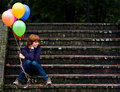
| 11/19/2009 06:15:50 AM |
|
| Photographer found comment helpful. |
| 11/19/2009 06:14:40 AM |
Digital Rainbowby pacpintoComment: Another CD. This one is more interesting than many, however, if you could have cropped on drop only, only that one which is in focus, you would differentiate your photo from the other CD photos. It would look like something else and would add interest to me. 6 |
| Photographer found comment helpful. |
| 11/19/2009 06:12:16 AM |
Home madeby mitalapoComment: This is a good composition but if you planned to do this, you could make the rainbow in the background a little bit more noise free. Also the lower right detracts me from the real subject which should be the pencils, maybe cropping it out would make it better. 6. |
| Photographer found comment helpful. |
| 11/19/2009 06:05:51 AM |
It's been a hard days light...by eclypsedComment: I'd like to see it with the very top a little bit more cropped to eliminate the hash light in that part. Also, a deeper depth of field to get the cups more sharp, or even eliminating the cups from the composition, maybe could make it better. 6. |
| Photographer found comment helpful. |
| 11/19/2009 06:03:04 AM |
Rainbow Lorikeetby karenkComment: The lighting is making it look a little bit washed. And in some parts it looks over saturated. The composition is good for me. Also looks like the focus is a little wrong. 6. |
| Photographer found comment helpful. |
| 11/19/2009 05:59:49 AM |
Waitingby vawendyComment: The composition is very good, lighting, colors, etc. It's not big impacting for me but I like it. 7. |
| Photographer found comment helpful. |
| 11/19/2009 05:57:21 AM |
Water Colours by Anthony_D_ArcherComment: The composition is good, the colors are good, well exposed but it's not impact myself. There is something that I don't like regarding the details on the pencils. 7. |
| Photographer found comment helpful. |
| 11/19/2009 05:52:53 AM |
Edible spectrumby snafflesComment: It's somehow lacking impact. I think it's the composition and contrast that should be improved. A tighter crop would make the composition pop much more, and the lighting is not looking good, part of the fruits are on the shadow. 6. |
| Photographer found comment helpful. |
| 11/19/2009 05:48:43 AM |
L I V I N G in C O L O R by michaelmonnComment: Looks like magazine photo, well done. Not so well because there is something in the lower right that I don't know the name, a kind of rose colored line. 6. |
| Photographer found comment helpful. |
Home -
Challenges -
Community -
League -
Photos -
Cameras -
Lenses -
Learn -
Help -
Terms of Use -
Privacy -
Top ^
DPChallenge, and website content and design, Copyright © 2001-2025 Challenging Technologies, LLC.
All digital photo copyrights belong to the photographers and may not be used without permission.
Current Server Time: 04/01/2025 10:02:10 PM EDT.