|
|
| Image |
Comment |
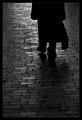
| 07/29/2005 02:56:50 PM | On the Road Againby tyt2000Comment: As a man of the theatre, I constantly associate images with texts, and every time I look at this picture I can't help but think of the one and only Willy Loman of 'Death of a Salesman' by Arthur Miller. It is one of my favourite plays, and this photo so encapsulates the play it's remarkable! That's quite an achievement considering the emotional content of 'Death of a Salesman'!
Great work, I added the photo to my favourites as soon as the challenge finished. I haven't a clue why it took me so long to add this comment.
A pleasure to view.
Peace be.
Lee |  Photographer found comment helpful. Photographer found comment helpful. |
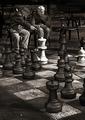
| 07/29/2005 02:44:30 PM | Kibbitzers for Eternityby jjbeguinComment: This photo is very surreal. It looks almost like an allusion, where the chess board is farther away from the two men and you are shooting across it, but then you look more closely and it's a giant chess board!
You captured a good moment. The two men look very much into playing chess, the one active pointing, and the other one contemplating with his cigar. Very good.
As usual JJ, you have an incredible eye.
Peace be.
Lee | | Photographer found comment helpful. |
| 12/28/2004 02:32:29 PM | | | Photographer found comment helpful. |
| 09/10/2004 07:01:41 PM | I Eyeby shutterflyComment: holy mother F@&^$ER... this is superb. Where did you get the picture of the world from? Is it a globe?
This whole technique is so nice, just love all of them!
I need a print.
Lee | | Photographer found comment helpful. |
| 09/01/2004 01:12:57 AM | Looking throughby JinjitComment: I think this is an excellent photo, well composed and well thought out. Except for one major detail! In this type of photo, I think that the object your framing should be in focus. Think about it, what is the point of a frame? To accent the subject contained within the frame, not to show off a nice frame. This is excellent, but with a little more care it could be spectacular. Nonetheless I'm still giving you a 10 cause i love it. | | Photographer found comment helpful. |
| 08/15/2004 04:06:42 AM | LEDby k4ffyComment: Greetings from the Critque Club!
I think what you need to think about with this photo is subject - what is the audience supposed to be looking at? What is supposed to draw my eye? At the moment, all that I have to look at is a bright light surrounded by blue fog, while this is a very interesting effect, it is in no ways a sophisticated or interesting subject matter.
Effects like this should be used to enhance subject matter, not AS subject matter. Perhaps using this kind of lighting to illuminate a manakin head (LOL I know, but it would look cool) could provide a very erie effect.
Good Luck!
Lee | | Photographer found comment helpful. |
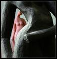
| 08/15/2004 04:03:12 AM | Allureby dr rickComment: Greetings from the Critique Club!!
I think the trickiest thing about macrophotography is that many things look interesting up close, but few look spectacular up close, and it is very hard to seperate that two as a photographer. Your image lies right on the center of these two, it is definetly an interesting subject, but lacks the detail that is the true sign of macrophotography.
I suppose part of the problem here is also context. This is a concept I have been dealing with lately, and it is a very important one, and very difficult one since it can be a very subtle technique. I think what people need here is a bit more context as to what you are photographing. Yes, it is some weird spiky type thing, but who cares about that? NOW, if the viewer had known, this is the inside of a flower, up really close, they would have been like WOW I've never looked at a flower like that before - which is essentially what most photographers are looking for. You've almost given some context with the background color, but with a little more of the flower in view, that aspect of the photographer would become clear, and your subject would become much more interesting. I really hope this is a flower, and if not I apologize, I'm regularly known as a complete dumbass at times
You've done many things correctly in this image, the DOF you chose creates an interesting visual effect, which is important with a subject that could easily become visually 'flat'. The way you've done it gives depth to the image, something that photographers can really get caught on (A BIG THING I'm having troubles learning). The image is colorful, especially with the orange against the purple and green. Exposure is perfect, as is contrast.
In these sort of technical aspects you nailed it, creating a good image, but with a little more thought into composition, this could've really made a lot of people go WOW, I've never seen that like that before!
Good Luck!
Lee
| | Photographer found comment helpful. |
| 08/11/2004 02:40:29 AM | Sittingby LuxvichComment: I love this. I love images that use childrens toys! I wonder if all these such images in the past challenges are from the same individual? Have you been working on a series perhaps? Very nice, a creative original approach that captivates the viewer, and really makes me ponder 'Whats goin on with this girl?' It's a very emotive photo, that makes a good use of vanishing point in an symbolic, abstract way. This photo has DEPTH, something a lot of challenge photos lack. 10 | | Photographer found comment helpful. |
| 08/11/2004 02:36:51 AM | Walk with me.by jkuangComment: This is a beautiful photo, and yes, I believe it fits the challenge very nicely. However, I think most people are going to decimate you for two reasons: 1)It isn't an obvious, smack you in the face 'vanishing point' 2)the border is a bit strong. I believe in nice wide borders, and the so on, but yours just has a bit too much going on, I think if you cut the outside black it would be very nice. Also, your photo has a lot of detail in it that isn't visible because you chose to upload such a small image, another reason people will choose to makr you down. As for me, all that stuff is secondary to the fact that this is an excellent image, that makes a logical use of vanishing point in a strong image. 10 | | Photographer found comment helpful. |
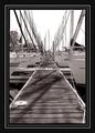
| 08/11/2004 02:28:41 AM | Xtreme Docking!by parrotheadComment: I'm a fan of big borders, and get PO'd when people complain about a simple thick black border, but this is even too much for me. It draws attention away from the photo ( which is VERY strong). This photo is fantastic, but would've been GREAT if you had just gone for the inner part of the border (black/skinny white/black). | | Photographer found comment helpful. |
Home -
Challenges -
Community -
League -
Photos -
Cameras -
Lenses -
Learn -
Help -
Terms of Use -
Privacy -
Top ^
DPChallenge, and website content and design, Copyright © 2001-2025 Challenging Technologies, LLC.
All digital photo copyrights belong to the photographers and may not be used without permission.
Current Server Time: 04/02/2025 07:06:17 PM EDT.
|