|
|
|
Showing 151 - 160 of ~422 |
| Image |
Comment |
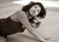
| 09/01/2004 03:55:34 AM | CRW_2825-01by NusbaumComment: Great feeling in this one. I wish the background wasn't so distracting but short of cropping the top left corner or a shallower depth of field I just can't imagine a better shot here. Your model hit a great pose and kudos to both of you for this setup. The dress, the pose and the water element give this photo dimension and create a visual context into which the viewer is invited. |  Photographer found comment helpful. Photographer found comment helpful. |
| 09/01/2004 03:52:18 AM | CRW_2707by NusbaumComment: David,
This photo is a fantastic portrait. I like the creamy bokeh in the background, the depth of field is deep enough for the whole subject, the composition allows her to sit on one side of the photo and have room to look out the other side. I like that you got her eyes on the top thirds line, that her stole gives a nice, sweeping element that the viewer can follow down to the broach at the intersection of the bottom and lefthand thirds lines. The only things I think you might want to think about would be adding a little bit of blur to this or if you USM'd it you might want to raise the 3rd setting to around 4 to maintain a softer, more feminine feel to the skin and hair. The placement of the broach clasp also makes it a very strong element because it is much lighter in comparison with its surroundings and it sits very close to the intersection of the two thirds lines I mentioned before. Perhaps burning it in a little might keep it from competing so much with the subject's face. Then again, I just don't think its that distracting. Oh well, something for you to think about.
I love this shot as it sits. Wish it had just a touch more softness to the skin and hair but its a fantastic composition, well-lit and well executed.
Kevin | | Photographer found comment helpful. |
| 08/30/2004 11:39:11 PM | On The Boatby Kha0SComment: I, too, like this shot better. It's the warm tone that the lighting imparts to the face. This isn't what I would consider a posed portrait but it is an outstanding candid shot. The burnished metal is a little distracting so perhaps spending a little time on that element (especially the edge that is closest to the viewer and the lightest in tone) might help minimize the effect it has on the photo. Your subject is warm and has a feeling of depth to her. From the leading shoulder to her nose/lips/teeth to the curve of her cheek you managed to capture some nice depth and contour here even at f/2.7 aperture; that is a function of the lens and sensor size as I would expect 2.7 to yield a much shallower depth of field. With available light in a candid shot like this I would expect some shadows so the shadow on her chin and running down across her neck impart some vivacity to this image; she just "feel" alive as the main element in this shot. Some of the shadows, however might be better touched out of the shot just to keep from providing one of those subconcious elements that your mind notes but you don't really think about. The line of shadow that comes from the burnished metal edging falls from the edge of her right eye down towards her lip. I don't think you need to retouch all of that as it gives a little character to the shot. What I think can be distracting is how the leading edge of that shadow falls in line with your girlfriend's nose. I think it might be worthwhile to dodge the edge of that shadow so that it becomes more of a gradual shadow between the area directly under her right eye and the area on her cheek. Likewise, the area under her left eye has a darker line leading away from the "corner" of the eye. Using the Healing Brush tool ("J" key) in PhotoShop and setting its mode to "Lighten" would help that line to blend into the cheek.
I think you have a great image and a beautiful girlfriend. She has nice structure and I hope you two have more fun taking photos together. I like your composition with more room on the side of the photo to which she has turned her gaze.
Keep on shooting and sharing.
Kev | | Photographer found comment helpful. |
| 08/25/2004 07:17:27 AM | Carla 2by HRoxasComment: Henry,
Here�s what you want! You got this one. You nailed it.
What makes this composition better than Carla_1 is the focus on the model, the pose, the depth of tones, your cropping and the background.
In this photo you have created the incredibly important non-visual element of separation. Separation for a portrait is something that doesn�t show up like an umbrella or the dress the subject wears; it is something that deceives the viewer and drags them into looking at what you think is important in the composition. You nailed it here. You left the viewer no options other than to feast their eyes on your subject. Even the surrounding elements hold no enticement for a viewer. They are darker and have less definition than your subject. This is a wonderful execution.
The pose is just a good pose here because it all fits in the frame (that right elbow intersects but we�ll give you that one on such a good shot). Normally you don�t want a female model to display her knuckles as viewers tend to view this negatively. In your shot it doesn�t detract because you�ve converted it to quadtones and the knuckles are no lighter in color than the face (and the face here gives more than enough for a viewer to spend time looking at). The arms create beautiful lines that become easy for a viewer to follow down . . . and right back up towards the subject�s face. Hmmm, maybe you�ve chosen to have the face as the principle element in this . . . ya think?!?
However you captured this lighting-wise you got a good photo that was helped by the depth of tones you can deliver to the viewer. We can see texture in the subject�s body and you don�t lose definition in the model�s clothing. I can see slight ripples in the center of the top (between the model�s arms) but they aren�t distracting; they just serve to give some texture or depth when my eyes begin to wander from the model�s face. The texture of the hair is awesome. I love that you can see the lines and strands throughout the hair. I�m with Gordon on the catchlights. They would be helpful here as your model�s eyes are slightly closed but I don�t think that a flash unit would give you want you want; I think a reflector might maintain the even tones you�ve captured and you would end up with some catchlights in the subjects eyes (if the light from the reflector was a little too much you could always speed up the shutter just a hair and the only thing you�d lose is a little definition in the darker tones which you could just dodge later). Very nice work.
The cropping on this shot is superior to Carla_1 because you got all the pertinent elements within the frame and left nothing to distract the viewer. I mentioned the elbow earlier; to hell with it. Forget it. This is a much cleaner composition. I like the room you left at the top because the model�s body continues to extend down past the line of the photo and you couldn�t �give more room� at the bottom without including more of her torso which I think would just diffuse the impact that this composition already has.
The background is nice in the photo for two reasons: you blurred it the heck out (great DoF) without losing all the definition in it and its consistent. At this distance from the model the 24-70 f/2.8 (and I�m assuming it was wide open on this shot) gives just enough of a narrow plane of focus so that the model is totally in focus (from the nose on her face to the farthest element of her body that we can view) while the background isn�t. In this shot (as opposed to Carla_1) you have moved your subject away from the background and allowed the large aperture to lend its effect to the photo. I don�t think a 70-200 f/2.8 would have achieved this shot with the same depth as the 24-70 (the longer the lens, the flatter the photo). Even the difference in the brick and what appears to be concrete in the background at the bottom of the photo doesn�t detract for me.
Overall this is a fantastic photo. I think you can be proud of this image. If you intentionally set everything up this way then congratulations for getting it. If you think you lucked into it then all I know to say is at least you had the eye for capturing a great shot.
Hope this eval helps.
Kev
| | Photographer found comment helpful. |
| 08/25/2004 06:53:04 AM | carla_1Aby HRoxasComment: Henry,
Of the two shots Carla_1 (even rotated) is the weaker. The reason IMO is the angle of approach to the model, the pose, the cropping and the background. On the angle of approach, based on the model's movements, you're shooting up into her face, which causes her chin knows to be prominent and flattens her face. It also creates deep shadows on the neck.
One of this model�s strong attributes IMO is her well-proportioned facial features which are suited by being framed by her hair. In this pose her hair is pulled back from one side and flat on the other (over her right ear). Never mind that this can look odd on any subject (one side behind the ear and the other side in front of the ear), on this model it detracts IMO from giving her lovely face a frame in which to set its classical beauty. Coupled with the angle of approach (which is something you can control) is the subject�s pose (which is generally something she controls unless you pose her). In this composition she is turned at the waist. This can be a wonderful move and I�m sure you can capture it well so I have no problem with that. The problem for me comes in how we don�t see the full turn (see cropping later). It also comes in how her she places her left hand behind her ear (which also has an earring in it that doesn�t add to the composition and isn�t offset; it�s a single element that isn�t strong enough to add much but is strong enough to detract given its placement. Because the arm forms a left darker area, it continues the coloration that moved up the subject�s body from the lower left of the frame. That�s a good thing. It sets a nice backdrop against which her lightened face becomes the point of interest. The problem here is that the subject�s left hand is turned so that it catches light and competes with the face. This is exacerbated by the loss of her fingers. If the hand didn�t compete with the face (by being lighter than the hair and skintones around it) or if all the fingers were visible (generally not as appealing) then the viewer wouldn�t be drawn to this area as much and could linger on the face. Now the earring I mentioned before comes into play. Since the viewer�s gaze seems to travel down the lighter face towards the hand, the viewer�s mind notices that the fingers are abbreviated and that the ear makes some odd connection (in skintone) with the index finger. This becomes slightly more confusing and the earring being a hard outlined, shiny object just adds to the disorientation. IMO this area (due to lighting and the outline of the subject�s hairline) becomes slightly more impacting that just a �nit� because it diffuses the interest of the viewer by being so close to the model�s face and being slightly disorienting visually. Perhaps if her head was resting lightly on the palm of her hand and her hair hung free down past her ear on her left side then the lack of symmetry would be offset by the strong visual element that her dark hair lends to her face would create a photo that displayed her beauty better.
The cropping in this shot also doesn�t help the strength of the image. . While you got the model�s head in the frame and showed terrific ability to capture different tones throughout the composition and the model�s body (great job on that, btw), you�ve cropped the model�s hand in a distracting manner. The inclusion of just a little thigh where the leg actually becomes difficult to distinguish is distracting, too. I don�t know that you can recrop this image to produce a stronger shot as far as the bottom of the photo goes, perhaps this is just a crop from a larger composition. If so, then I�d suggest trying a couple of different crops but don�t but into the hand and don�t crop at the wrist if you can help it.
Finally I find the background to be a weaker element of this composition in some sections of the photo. The floor just under the model is well-captured and displays those levels of tones that I mentioned you getting earlier. This is a pleasant view of this background and it doesn�t detract from your composition at all. The top section of the photo, however, becomes contentious with your subject due to the hard, straight lines in the top left of the photo and the bright light directly behind the subject�s head and extending to the right corner. I�m not sure what you could do here as these elements (the strong lines and bright spot) could be important elements to a photo; they could lend some emphasis to a photo so I�m not saying that they�re bad to use in general. In this photo, though, you have a subject in a more classical beauty pose where her face appears to be the strongest element (or the one you wanted to present the most) and her body is well-captured and presented through the use of multi-toned treatment where you maintained the definition of her skin and clothing throughout the tones. A subdued background looks like it would lend itself to the look of the model and the way you edited it.
Kev | | Photographer found comment helpful. |
| 08/09/2004 12:44:31 AM | Samantha152by cbellerComment: Chris,
Wow!
Let me try again: WOW!
Yeah, that was closer to what I meant. Dude, this is awesome. You blew the doors off with this one. Sweet buttermilk biscuits, that's an incredible shot. The lighting, the composition . . . if I ever got speechless this would be the time (thank God I can still type, though). You got a shot where the model filled the frame, you got a great depth of field (awesome bokeh on the trees to generate the separation between your subject and her environment). I like the light on the face (no catchlight but the angles, tones and texture are what generate the story in this shot so that's not a negative here). The only thing I'd say (and this is no criticism of the model as everyone has physical quirks that make them unique) is that the sharp line of demarcation on her nose makes it stand out due to the incredible quality of the rest of the shot. I don't think you would have wanted her to turn her head anymore (thus keeping the nose from breaking the plane of the cheek) but you might want to selectively highlight the brighter edge of that noseline and give it a little fade or drop the contrast or something. Then again, I can't imagine anyone ever getting a shot that better captures the essence of a look from this model. Others may take a shot thats as good as your capture of her but I can't see anyone taking one better. You really hit a homerun with the elements of this one IMO.
Looks like good post-shot production work, too.
Congrats,
Kev | | Photographer found comment helpful. |
| 08/09/2004 12:36:32 AM | Samantha139by cbellerComment: Chris,
Love this pose and the outfit. I think this has a few elements that you might want to think about. Your lighting here is decent but not up to the 1st, 3rd and 4th pictures that you posted (sure hope you remember the order). Just a little more fill would have helped this out (like I should be telling anyone to use fill flash). You got awefully close to the model's toes on her left foot with the crop but at the top of the shot you have some tree limbs that don't completely fill across the frame with gives an incomplete kind of feeling to the crop up there (IMO). Added to the limbs are some power/telephone wires that are visible. Those would probably be a quick clone out if you were going to use this in a portfolio but I figured they were worth mentioning. Now as for composition I find little in any of these shots to fault you on; maybe just some ideas that you might want to try and see if they fit your style. Since you have a model who is pretty thin and you're shooting her at more of a profiled angle alongside a light pole and seeing as how you have another vertical pole in the background with a slanted line of demarcation (the grass/water line), you might want to try playing with tilting the camera so that you're not shooting her straight on vertical. Maybe having the model lean farther back or putting her feet farther forward so that her back is at more of an angle and then tilting the camera until she comes into plumb vertically will throw off all the other lines in the shot and give it an arbitrary sense of style (at least IMO). Its not to say this is a bad shot, just something that if you start setting up a shot like this and noticing similar elements you might want to play with that idea for a few frames next time and see if you like the effect.
Kev | | Photographer found comment helpful. |
| 08/09/2004 12:27:38 AM | Samantha009by cbellerComment: Chris,
Great lighting. Fantastic lighting. Love the slight catchlight in the eyes (could be a little more pronounced), the lips (perfect there) and the shoulder (gives a sun-kissed kind of look). The setting is wonderful; it provides a nice backdrop that with several elements but you've managed to capture it with some blur to keep it from competing too much with the subject yet the color and texture of the rocks and grass can be appreciated for enhancing the smoothness of the model's skin. They kind of allow you to show her feminine smooth side without resorting to a "plasticky" feel that something like too much NeatImage might give you. Now this is just a nit from my initial view of the shot; keep in mind that I think this is a great photo. I think that in this pose if you'd had the model turn her hips more in profile it would have accentuated her femininity a little better. Say, something like taking the knees around about 4-6 inches to the model's right would have closed her hips more to you but left her upper body at roughly the same angle. This would have helped to accentuate her chest and back curves. As it is the edge on look at the subject's left arm shows that she is a young lady with little body fat content as her arm looks trim. While she doesn't look large at all, there is an illusory discrepancy between how thin her arm looks and how full her chest looks at about bicep level. Added to that (IMO) is the line across her hips such that if her hips were closed just a little more to the camera it would tend to downplay the illusion that her arm is too thin for her body (I think the dark shadow down the her tricep adds to that feeling).
Kev | | Photographer found comment helpful. |
| 08/04/2004 06:15:29 AM | Crossing The Lineby bongoComment: Perhaps the best in this challenge. Good lighting, you actually have something by which to gauge that the primary subject actually IS miniature. Heck, you even managed to capture some lovely lighting in the background that doesn' throw off your lighting of the subject but can be easily identified by anyone who's had to drive home at 3:00 AM from someone's house and barely been able to keep those eyes open. Very good composition and execution. | | Photographer found comment helpful. |
| 08/04/2004 06:12:16 AM | My mustangsby paha_lComment: Good idea but you need to stop the lens down to get more definition in the toy truck on the left of the frame and your background is already clearly in focus. I'd suggest a different location so that the backdrop of trees, wires and buildings doesn't detract from the optical illusion you're crafting. In any photo you also might want to watch to be sure you don't have any well delineated objects appearing to come out of a person's head. The white edge of the building in the background bisects the human subject's head and while you might want to set apart two hemispheres to enhance the differences or the symmetry or some other facet of your composition, in this instance you lose that impact because both the tree limbs and the power/phone lines cross that imaginary boundary and dilute the separating power of the dividing line. | | Photographer found comment helpful. |
|
Showing 151 - 160 of ~422 |
Home -
Challenges -
Community -
League -
Photos -
Cameras -
Lenses -
Learn -
Help -
Terms of Use -
Privacy -
Top ^
DPChallenge, and website content and design, Copyright © 2001-2025 Challenging Technologies, LLC.
All digital photo copyrights belong to the photographers and may not be used without permission.
Current Server Time: 04/10/2025 11:26:53 PM EDT.
|