| Image |
Comment |
| 12/29/2003 12:34:09 AM |
Rise Above The Rest..by buzzrockComment: A border and some text could have brought this together to explain the focus and motivation but this is a lovely photo. |
 Photographer found comment helpful. Photographer found comment helpful. |
| 11/25/2003 01:32:19 AM |
Clenched Fists: An Attempt at Resistanceby HRoxasComment: I see a political or religious element within the photo (the star of David) and I like the technical merits of you photo but I don't understand its statement. Based solely on technical quality and presentation I score this moderately highly (7 although I'll revisit that). For presenting a clear message I find this intriguing. Is this a statement of repression of the state of Israel? If so, by whom? A reference to western political pressure to deal with neighbors or perhaps a statement of the pressure imherent in constant suicide bombings. The statement seems ambiguous but I am not voting on that, just commenting and wondering apart from the quality of your photo. |
| Photographer found comment helpful. |
| 11/25/2003 01:24:40 AM |
Chaos after the bombsby ChezComment: Great subject and nice capture. Sadly a little soft focus (what could you do, looks like you were in the middle of it). 9 |
| Photographer found comment helpful. |
| 11/25/2003 01:23:23 AM |
Trust the smiling menby JeansebComment: Great composition; incredible color. I don't know that I see much correlation with Propaganda and the blue background seems to soften the focus on the edges of the cookies (it tends to blend in the shadows) but overall this is an impressive photo. |
| Photographer found comment helpful. |
| 11/25/2003 01:21:04 AM |
Final Instructionsby jpb56nyComment: I like this from a photojournalistic angle but some of the whites in the lower righthand third appear to be very hot. The rest of the image looks to have solid color saturation and good depth (nice separation in the hair color of the individuals to the left of the green jacket). Not sure much could have been done to limit the severity of the white areas. |
| Photographer found comment helpful. |
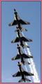
| 11/25/2003 01:13:57 AM |
Cross into the blueby JasonComment: Great subject, great perspective and impressive use of your border. I would have liked to see a little more space at the bottom of the photo (although that may have yielded too much room to the contrails and they may have competed with the planes for attention). |
| Photographer found comment helpful. |
| 11/25/2003 01:04:20 AM |
All You Needby byshenComment: Great use of shallow DOF. Very good lighting. If you don't actually shoot product photos, you ought to after this challenge. The only two little things I could even point out is a little side light from the right would have filled in and removed the shadow from in front of the jar (although you might want that shadow for depth) and the crop you selected cuts your BG model off at a joint; just a slightly wider crop would have left his elbow intact. |
| Photographer found comment helpful. |
| 11/19/2003 04:06:45 AM |
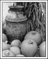
Untitledby byetkoComment: Critique Club
Composition:
This is a good selection of subjects for your still life submission. One of the most noticible things about the photo is your choice for a black & white medium. This approach takes advantage of the linear elements throughout the composition. From the basically vertical lines of the corn stalks and husks in the upper righthand corner through the rounded, horizontal lines of the milk urn and down to the oblong curves angled in all directions on the pumpkins at the bottom of the photo you have selected subjects that invite the viewers eyes to wander through your photo. Your decision in regards to cropping the photo is a good one, too, as it is generally vertical which underscores the height of the milk jug in contrast to both the squat nature of the pumpkins and the much taller height of the truncated cornstalks. You helped your presentation by choosing a fairly wide crop to compliment all the elements within the photo, though, and keep from overemphasizing the vertical aspect. I think your presentation shows a very good balance in both the dimensions you selected and where you chose to apply the crop. Whether by design or just artful luck I find your presentation well suited to your subjects and the goal of the challenge.
Color:
Since you selected a B&W color scheme this area turns more to tonal quality and definition. Here the photo might benefit from slightly less exposure or from a little touch up in the photo application of your choice (I'll refer to PhotoShop/PS). It seems that your exposure metered for the center as the elements found therein seem to have the best tonal range and have the most definition. Some of the elements in both the upper lefthand and lower lefthand corners range from totally blown out details to slightly overexposed. Another solution using the photo you have might be that before you convert this to B&W (if done via software) you duplicated the blue channel and overlay it as a layer and blend it back onto the photo using Multiply or Darken with a gradient that is slanted to the left side to provide more color detail on that side of the photo. The majority of the tones are strong and solidly defined but you might just want to try something like that last method to see if you can get a slightly more balanced tone in the lefthand corners.
Lighting:
It looks like this was shot in natural sunlight but with no direct light on it. The two larger pumpkins towards the bottom righthand side seem to have a few highlights that may have been introduced by a flash but either way they provide catchlight to help define angles and textures. This is a good use of lighting in most of the photo although I'll refer back to the Color section on the lefthand corners.
Focus:
The focus throughout the composition looks good. I'd be interested in seeing a similar shot with a more shallow depth of field.
Overall:
This composition is a pleasing, artistic expression of still life that, while having a few minor technical points that could be worked on, succeeds in promising an interesting photo and delivering many points of interest to its viewers. Its major strengths are the subtle use of lines and arcs, the crop applied and the depth of tonal range. The photographer's choice to use a double border was not to my liking but that is a personal preference. As an artistic enterprise, this photo is a valuable it presents many elements well and seems cohesive in its message as a Still Life entry. |
| Photographer found comment helpful. |
| 11/17/2003 11:02:00 PM |
Don't Put All Your Eggs in One Basketby jefalkComment: Composition:
This composition shows that you have talent for both coloring and lighting. The vertical crop adds some definition to what you present the viewer. You've provided a continuous gradiation from the blue at the bottom to the black at the top on the righthand side while on the lefthand side you cropped into the solid shadow of a basket. The angle you chose allows you to show the viewer both the basket with many eggs and the contents of the less full basket which gives good object contrast. I like the broken egg as a visual cue to reinforce the "grain of truth" inherent in this saying. You chose and setup your physical elements well for your interpretation. I would also be interested to see what kind of impact you might create if you chose to zoom & crop with only part of the overfull basket and the broken egg. In my thinking that would be a more traditional shot, though, and I think you have created a unique composition with your choice of a vertical presentation.
Color:
My initial feeling is that one of the more important color elements of this photo is the yellow of the yolk on the blue background. It immediately presents a contrasting color for both the blue and white (perhaps complimentary for the blue; I just don't have my color wheel handy right now). The natural coloration of the baskets help to reinforce the organic curves of the eggs. Good use of 4 or 5 basic colors to present an idea on a couple of levels.
Lighting:
Now here's another area where you stepped out a little from what I might expect. The lighting is almost too harsh with hotspots on some eggs in the overloaded basket. The shadows are also strongly defined and yet the don't seem to add any particular nuance to the presentation beyond another "color". The shadows produced don't seem to present any special texture to your composition. I do like the catchlight within both the yolk and the albumen as well as the less harsh shadow within the broken egg shell. I would be interested in seeing this same photo with a scrim or some diffuser cutting the glare a little on the subjects.
Focus:
Pretty good focus. I don't know if you USM'd this shot or not. It looks like it has a decent focus but because of the amount of space you put into the top and bottom and because the photo is cut down for this competition you weren't able to present very close looks at any edges. I have no doubt that you have sharp focus in your original and that some of that sharpness might have gotten lost in the translation to DPC's resolution.
Overall:
This is a good approach to still life and you selected good subjects to work with. You created a good color scheme and you definitely have your take on the lighting. I think the lighting and the cropping make this a unique presentation and it is that different look at this common adage that makes your photo a fun presentation to look through and a challenging to view for others to apply to their own creations. |
| Photographer found comment helpful. |
| 11/16/2003 07:52:52 AM |
Glen Abbeyby ToddhComment: Nice panorama and I like the border to artificially hem this photo in. I think you could have cropped it a little more on the top and both sides to focus more on this fairway with the 3 or 4 trees at the cartpath by the water bounding the top edge and gotten just as good a shot with less distractions on the edges. The smoothness of the grounds at the bottom of the photo contrast sharply with the bare trees at the bottom and that's good but they also compete with the branchy activity of the trees at the top of the photo and, to me, that's not so good. Both sandtrap and water have a few hotspots but remarkably less than I would expect given the harshness of the lighting you were working with (see the shadows of the tree in the middle-right of the photo for a realistic expression of the time of day). Oddly, because of the mound between green and tee box at the bottom of the photo, the smaller trees' shadows appear to be shot much later in the day. This might make for a surprising shot someday. You could utilize midday lighting (who would do that) but give the aspect of being later in the day. Just a thought. |
| Photographer found comment helpful. |
Home -
Challenges -
Community -
League -
Photos -
Cameras -
Lenses -
Learn -
Help -
Terms of Use -
Privacy -
Top ^
DPChallenge, and website content and design, Copyright © 2001-2025 Challenging Technologies, LLC.
All digital photo copyrights belong to the photographers and may not be used without permission.
Current Server Time: 04/18/2025 10:26:47 AM EDT.