| Image |
Comment |
| 10/30/2008 12:55:48 AM |
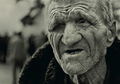
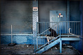
Bad luckby ZigomarComment: Looks like you had a great capture. The green tint was a bad choice. Very bad in my opinion. I think that it actually ruined the photo. You had an awesome subject. I like the crop but why why why the green tint????
You should have either stuck with color or gone B&W. Also needs contrast/levels/curves adjustment.
If it wasnt for everything I mentioned, I think this would have been a winner. |
 Photographer found comment helpful. Photographer found comment helpful. |
| 10/30/2008 12:44:02 AM |
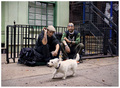
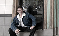
White Dog + Punks On Dopeby pawdrixComment: You really caught a great shot here. I dont really care for the white border. Something darker would have brought the subjects together better and a nice vignette would have made them pop.
You really need a levels/curves adjustment as well.
I just love the photo though. It's just not quite there as far as being "finished" IMO
Best of luck to you. Despite everything I mentioned, its one of my favs in the challenge. |
| Photographer found comment helpful. |
| 10/30/2008 12:43:03 AM |
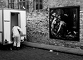
October 2008by e301Comment: I would love to see this one in color. I think the B&W might have been a mistake. The painting on the wall looks to be colorful. It would have been a nice contrast. I hope you post the color version after the challenge.
Best of luck, its a great capture. |
| Photographer found comment helpful. |
| 10/30/2008 12:42:14 AM |
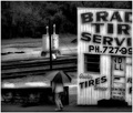
Rainy Dayby tfarrell23Comment: nice capture. A bit too soft for my liking. I think you brought down the Clarity level way too much for the overall shot. |
| Photographer found comment helpful. |
| 10/30/2008 12:41:30 AM |
Aloneby dougi555Comment: great capture. great color and I like the vignetting, it really helps to bring focus in on the subject.
lighting is really nice as well. 9 |
| Photographer found comment helpful. |
| 10/30/2008 12:41:19 AM |
waitin' for pub o'clockby MichaelCComment: great capture. Perhaps a tighter crop would have benefited this photo IMO. The right side is a bit distracting.
It also seems maybe a little too much PP went into the photo? Needs a bit more sharpness as well.
Best of Luck. |
| Photographer found comment helpful. |
| 08/28/2008 06:08:38 PM |
|
| Photographer found comment helpful. |
| 08/20/2008 02:01:34 AM |
The Offeringby sherpetComment: This is still my favorite image out of the challenge. I think it should have made top 3. Top 10 is good though.
1st place in my book though. lol great job and congrats. |
| Photographer found comment helpful. |
| 08/20/2008 01:53:22 AM |
Untitledby citymarsComment: Originally posted by colorcarnival:
after I read the last comment you received, a word popped into my head that I have not used since grade school: whir-dey... and we used it to put emphasis on all meanings behind the word "DUH". It's too bad that someone could not tell from the image that you had a glowing duck. I'm sure that if you had titled it "duck" that it would have been much clearer and garnered you some more votes. Think about it, man...
I do like the simplicity of this photo and the duck has a nice glow about it too. |
Obviously you missed the whole point of my comment too. lol |
| Photographer found comment helpful. |
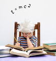
| 08/19/2008 02:11:01 AM |
Young Einstein!by JudiComment: great shot. I would have liked to have seen this with more dramatic lighting. Something a little darker and moody to really pull you in. But I still think it will be top 3 for sure. good luck and great capture |
| Photographer found comment helpful. |
Home -
Challenges -
Community -
League -
Photos -
Cameras -
Lenses -
Learn -
Help -
Terms of Use -
Privacy -
Top ^
DPChallenge, and website content and design, Copyright © 2001-2025 Challenging Technologies, LLC.
All digital photo copyrights belong to the photographers and may not be used without permission.
Current Server Time: 04/25/2025 05:33:36 PM EDT.