| Image |
Comment |
| 08/26/2003 10:29:28 AM |
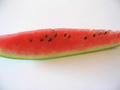
Mellonby TellopazzoComment by Spork99: I see what the idea is, but something is missing. I think the lighting should either make the color pop, or there need to be some more elements here to provide more visual appeal. The composition is pretty static too, basically, just a line through the middle of the frame. That could work, but it really doesn't here |
| 08/23/2003 06:32:27 PM |
|
| 08/23/2003 12:56:31 PM |
Mellonby TellopazzoComment by Fayech: the idea is there, but i don't think it was well executed. the watermelon seems to be slightly blurred and the background is very sterile. |
| 08/23/2003 06:19:27 AM |
|
| 08/22/2003 09:48:23 PM |
Mellonby TellopazzoComment by dr rick: Nice composition here. The white space above and below help the watermelon stand out and help emphasize its colors. It would be better if the entire subject was in focus and the shadows were eliminated (especially the ones in the corners). |
| 08/22/2003 04:16:26 PM |
|
| 08/22/2003 02:06:15 PM |
Mellonby TellopazzoComment by faidoi: I would love to see the whole slice of watermelon. The part that is showing doesn't give it a nice composition. |
| 08/20/2003 09:58:40 AM |
|
| 08/20/2003 02:44:15 AM |
|
| 08/20/2003 01:27:28 AM |
Mellonby TellopazzoComment by mtreit: I like the subject and the abstractness of putting it on a white background. The focus is not very sharp, though, and the colors are a bit dull. |
 Photographer found comment helpful. Photographer found comment helpful. |
Home -
Challenges -
Community -
League -
Photos -
Cameras -
Lenses -
Learn -
Help -
Terms of Use -
Privacy -
Top ^
DPChallenge, and website content and design, Copyright © 2001-2025 Challenging Technologies, LLC.
All digital photo copyrights belong to the photographers and may not be used without permission.
Current Server Time: 03/12/2025 06:05:49 PM EDT.