Sistersby
PERCOMComment by David.C: After looking thru your BetterPhoto gallery I'm not so sure I should be the one giving the critique -- simply outstanding photos there. But, I drew the image, so I will give it a shot.
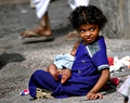
A vivid and bright image -- it is not surprising it gathered a lot of attention during voting with 3 favorites, 15 comments and a top 20% finish. There are a few reasons why I feel it placed as well as could be expected in the challenge though.
The bright sunlight served with two edges by giving enough light to use a shutter speed fast enough to stop the motion completely. This added to the vivid sharpness of the image, but also produced deep harsh shadows that had to be dealt with. You did a marvelous job of handing the light in selecting a moment to take the image when her face was not heavily shadowed.
Compositionally I feel a number of things hurt this image, the most noticable for me is that she is looking behind her, out of the frame. This pulls my attention heavily out of the image to the right and leaves the left 1/3 of the image unobserved. There is just nothing there but the background foot to balance the pull out of the frame. And while I'm speaking of the background, those feet (especially the leg coming out of her head) are quite distracting, and it would have been better to have waited until they were gone. This being a candid that may not have been possible, but they detract from the image just the same.
Her eyes are the biggest detraction from the image though (and I'm certain others will disagree with this), because they do not involve me as a viewer. It would have been welcome to have had a sense of interaction with the scene by involving her eyes within the frame.
In post-processing it seems to have been oversharpened just a bit (there are halos in a few places, mainly around her arm) and could have handled a bit less saturation (but that is heavily a matter of taste).
I feel the reception of this image in the challenge suffered further by the use of a relatively large depth of field. While it is small enough to include only the subject, it is not prominant enough to isolate the subject from the rest of the image. There is good seperation between the childs head and the background, but that seperation is lost most everywhere else.
Once again I enjoyed browsing your portfolio at BetterPhoto and was not surprised to see you praise Librodo's work in the comments you've made -- his influence is very evident in your own work. Wonderful work.
David
Critique Club
Message edited by author 2006-01-03 06:29:15.