| Image |
Comment |
| 06/04/2002 09:46:00 AM |
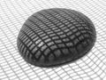
grid rockby lecookComment by FranziskaLang: Nice, simple, effective - a very good shot for b&w. I've been trying to play around with the crop to move the stone off center, but I don't like any of those variations, yours is better. |
| 06/04/2002 05:13:00 AM |
grid rockby lecookComment by lisae: A very interesting concept. It's odd that the grid lines are contoured on the white background in the lower right hand corner, which detracts a bit from the effect, to me. |
| 06/04/2002 12:05:00 AM |
|
| 06/03/2002 07:39:00 PM |
|
| 06/03/2002 05:06:00 PM |
|
| 06/03/2002 03:39:00 PM |
|
| 06/03/2002 03:36:00 PM |
|
| 06/03/2002 12:55:00 PM |
grid rockby lecookComment by langdon: Very interesting shot, so simple, yet effective. The waves in the grid work great. |
| 06/03/2002 10:57:00 AM |
grid rockby lecookComment by dmward: Well done. I like the tonal range. The whte seems to be just a few % below the highlight on the rock. I the composition would feel better for me with a bit more space on the left and the top, right a bottom equal. (bottom is a bit too much.) Another alternative would be more space at the top with right and bottom equal. One criterian I use for B&W is if I would rather see the image with color. This image passes that test easilly, color would be a distraction. |
| 06/03/2002 07:53:00 AM |
|
Home -
Challenges -
Community -
League -
Photos -
Cameras -
Lenses -
Learn -
Help -
Terms of Use -
Privacy -
Top ^
DPChallenge, and website content and design, Copyright © 2001-2025 Challenging Technologies, LLC.
All digital photo copyrights belong to the photographers and may not be used without permission.
Current Server Time: 04/27/2025 12:16:15 PM EDT.