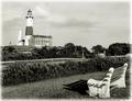
The View of Decadesby
LtHousLadyComment by photom: Hi Nancy,
I one of the guilty folks who gave you a 5 on "The View of Decades." I do not dislike lighthouses - as a matter of fact - I have quite a few in my collection as well. I'm sure not as many as you - you have a fantastic and elegant collection.
So - why a 5?
a) The biggest reason for me is the composition. The bench and the lighthouse seem like two different images. The bench, instead of being a lead-in has become a competitor for attention. Perhaps a slight different angle, placing the lighthouse and the bench in closer visual arrangement would help.
b) The second reason, almost as important as the composition to me, is that I am a huge fan of black and white. But I am also very "picky" about it. This image does not meet my requirement that there should be at least "some" very white whites as well as some black blacks - and there should be a good tonal range as well. I just don't see the white whites I expect in a great B&W image.
c) The lighthouse appears slighty crooked.
d) Although I do like some versions of lightened edges to form a border - I don't think this one works very well.
e) Finally, the sky is rather bland for me. I would love to see some puffy cumulus clouds pop out of a nice blue sky. There are clouds in your image but they are not tonally much different than their surroundings.
Another thing you should consider is the VAST amount of really powerful images in this challenge. I gave more high scores for this than any I remember. Some voters may judge "on the curve" so that scores for less than "really wow" images would tend to be lower.
I hope you find these blunt and honest opinions a help - so you can at least understand my reasoning. If you have questions or comments, feel free to e-mail me. (PM does not work for me for some unknown reason.)
Message edited by author 2004-07-09 21:18:49.