| Image |
Comment |
| 09/28/2014 07:44:57 PM |
|
 Photographer found comment helpful. Photographer found comment helpful. |
| 09/28/2014 07:31:15 PM |
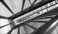
Turn and Turnby clickodakComment by Garry: Greetings from the Critique Club!
I think for the choice of right angles for the challenge, the decision to go with a staircase was a solid one. In fact it was the first idea that came to mind when I considered entering. So, I think your concept was great. It just lacked in the execution a little in my opinion.
The really great stairway shots typically have a lot of space between levels to look down over the railing, but here the space looking down is very small and cramped (as most emergency stairwells are), and so the viewer loses the ability to see a nice staircase winding its way down. We see just a fraction of the stairs, which is a pity. So, more space between the flights would've been so much more powerful.
The other thing is the very tight crop. You used a wide-angle lens and shot at 24mm, so you've obviously cropped quite a bit which makes the composition look very tight and "uncomfortable". I would've liked to have seen more of the stairs, since they'd give nice details, but also they would provide some more right angles to the railing. So a double-benefit!
Lastly, I felt the processing was a little bland. No real highlights or shadows, very flat. Would prefer a much more dynamic B&W treatment.
I'll be glad to discuss my comments with you via PM if you so wish. Hope you found this review helpful!
Kind regards,
Garry |
| Photographer found comment helpful. |
| 09/26/2014 02:44:42 PM |
|
| Photographer found comment helpful. |
| 09/26/2014 10:56:35 AM |
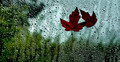
September Rainby clickodakComment by MadMan2k: Great composition and I like the bit of light shining through the leaves. Also very sharp focus throughout. This would look great printed and framed I think. |
| Photographer found comment helpful. |
| 09/23/2014 06:59:44 AM |
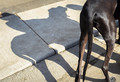
The cowboy and his horseby clickodakComment by JakeKurdsjuk: Critique Club Comment:
Marcel, so here we meet again. LOL
As I mentioned below, I thought this was a nice use of shadows, but compositionally it didn't seem to work for me. I've now been staring at this to try and explain why, but I may have been wrong in that assessment and I want to now blame the treatment. While I do believe that the composition is a little cramped, what doesn't work for me is that there are too many distractions to keep me from wanting to look at the shadow (which also lacks punch). From the green fleck to the piece of white paper to the lines in the road and sidewalk, it's a little messy there.
Darken the shadow and this helps some. Getting rid of the green and the paper would be nice, but you run the risk of rules violations, but if make convert this to B&W those become almost non-issues.
Well seen and captured. I gave the original a 5, but I believe with a different treatment that removed distractions and made the shadow stand out against the dog I would have easily bumped it up a few points. |
| Photographer found comment helpful. |
| 09/22/2014 04:36:32 PM |
|
| Photographer found comment helpful. |
| 09/18/2014 07:10:01 PM |
|
| Photographer found comment helpful. |
| 09/17/2014 05:47:59 PM |
|
| Photographer found comment helpful. |
| 09/17/2014 01:57:57 PM |
Turn and Turnby clickodakComment by aliqui: Overall, it's a little flat. Looking through the narrow opening also makes me feel nervous. I almost feel like I'm gonna get stuck somehow, even though it's just a photo. Ahhh, let me out!
...I like the leading lines coming from (or going to) the left corners. |
| Photographer found comment helpful. |
| 09/17/2014 07:01:03 AM |
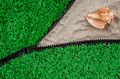
Openness on my next vacationby clickodakComment by JakeKurdsjuk: Critique Club Comment:
I really liked this one a lot. The green grabs you and offsets the sand and shell nicely. Composition is very good, though I would have preferred the zipper to lead from the corner rather than the edge. The shell might have been better placed in the center of the spread of the zipper, more towards the crossing of 1/3 lines, or a second object placed there. Regardless, the shell feels like it's too close to the edge given all the sand. As I mentioned below, I'd also like to have had the green on the top zipper pushed back so that it exposed the teeth as with the zipper below.
A fine image that I gave a 7. A very deserving top 10. |
| Photographer found comment helpful. |
Home -
Challenges -
Community -
League -
Photos -
Cameras -
Lenses -
Learn -
Help -
Terms of Use -
Privacy -
Top ^
DPChallenge, and website content and design, Copyright © 2001-2025 Challenging Technologies, LLC.
All digital photo copyrights belong to the photographers and may not be used without permission.
Current Server Time: 04/12/2025 07:29:02 PM EDT.