| Image |
Comment |
| 09/10/2014 05:53:15 PM |
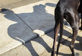
The cowboy and his horseby clickodakComment by MadMan2k: Interesting part of the horse to include as the only part of the shadow's source.
...Going back I realize it's a dog, that's worth a point bump up :) |
 Photographer found comment helpful. Photographer found comment helpful. |
| 09/10/2014 05:22:21 PM |
|
| Photographer found comment helpful. |
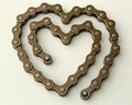
| 09/09/2014 02:01:10 PM |
In memory of Robin Williams, American actor recently diedby clickodakComment by JakeKurdsjuk: Critique Club Comment:
Interesting that I should get this as I was a huge Robin Williams fan since before anyone knew who or what a "Mork" was. That said, even while I knew he was a cyclist and had seen him on broadcast of Le Tour several times I did find the title a bit out of sync with what I would expect for a tribute image and I suspect that may have put some people off.
That said, even before I scrolled down I really liked this image for its stark simplicity. The color tonality is very basic and the off-white background works well with the color of the chain. There's not a lot else going on here, so what us there needs to be exacted perfectly and here's where I had a couple issues, ultimately giving you a 6 when I really wanted to give you more. There are really only two issues that I have - not enough depth of field and skewed orientation.
For the life of me I tried to find a reason why it would make sense to have the top and bottom out of focus, but without there being something in the center, on the chain, that would be emphasized by the lack of focus elsewhere I found the blurred sections to be distracting and would have much preferred the entire chain be in focus. The other thing is the right lean of the heart. While this is definitely not a perfect shaped heart, a 2-3 degree rotation of the image to the left gives the shape a straighter feel, and a more pleasing orientation - at least for me.
Otherwise I think that the only other thing this suffered from was being too simple in a challenge that normally shows off some wild images, so voters may have been inclined to undervalue it when held against some of the other images. Not necessarily fair, but that's the way things tend to work around here some times. |
| Photographer found comment helpful. |
| 09/09/2014 03:44:12 AM |
|
| Photographer found comment helpful. |
| 09/08/2014 10:41:44 PM |
|
| Photographer found comment helpful. |
| 09/08/2014 10:07:57 PM |
Openness on my next vacationby clickodakComment by jgirl57: How creative is this! This has been awesome to see and different a bit bright on the bottom but the thought is there... very different and yes I love things like this |
| Photographer found comment helpful. |
| 09/08/2014 03:43:32 PM |
|
| Photographer found comment helpful. |
| 09/08/2014 03:03:15 PM |
Back to school - Back togetherby clickodakComment by JakeKurdsjuk: Critique Club Comment:
A very familiar site to many of us, and a sure sign of back to school. A nice image, for sure, but not anything that really grabbed my attention after I got past the familiarity. Given the lack of a specific subject all I am left with is the overall symmetry within the shot, which would be fine if you nailed it.
Alas, there are two main issues with that symmetry. First, the centerline of the symmetry is off center - the center of the aisle runs to the right of center. But that's not all that's wrong, the plane of reference is rotated slightly right as well. So while the crop looks like you left too much to the left, if you look along the windows you have more of the right side showing - sure evidence of the need for horizontal perspective correction. This image greatly benefits from first correcting the horizontal perspective, pulling the right side towards the front slightly, and then cropping so that the center line runs directly down the center.
You still have some issues after that in that the bus is empty and there is a lot to distract you outside the windows. You need something to command the viewer's attention. Maybe boost the contrast between the seats and the aisle to pull the eye through the photo down the center to the back of the bus? Darken the seat covers while lightening the center strip, allowing the metal ridges that border it to focus the attention through the frame. While I am not particularly a fan of selective color, perhaps you could have played off the black and white dreariness of the inside of the bus taking you to school with a full-color view outside the windows, highlighting the freedom you're now losing for most of your day?
Again, not a bad photo, outside of the symmetry issues. But not one that holds the attention. |
| Photographer found comment helpful. |
| 09/08/2014 02:53:44 PM |
|
| Photographer found comment helpful. |
| 09/07/2014 07:43:17 PM |
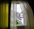
Breeze that blows through the windowsby clickodakComment by cowboy221977: Hello from the comment club....
You chose the perfect setup for the "wind" challenge. I can almost feel the breeze coming in. This was a difficult challenge to enter but you hit the nail on the head.
I like the contrast between the white and green curtains. I just would like to have seen a little light...(not much) in the room where this was taken. I think that would have added more detail to the curtains.
I did not vote in this challenge but I prob would have given this a 6. Good job |
| Photographer found comment helpful. |
Home -
Challenges -
Community -
League -
Photos -
Cameras -
Lenses -
Learn -
Help -
Terms of Use -
Privacy -
Top ^
DPChallenge, and website content and design, Copyright © 2001-2025 Challenging Technologies, LLC.
All digital photo copyrights belong to the photographers and may not be used without permission.
Current Server Time: 04/12/2025 05:44:18 PM EDT.